Title pages

title1.jpg

Ghost Stories and Phantom Fancies (1858) by James Hain Friswell.

The vast repository of copyright-free images from the British Library is still being sifted into Flickr sets. These are a few examples from a set of 786 title pages which range from elegant book plates to Dime Westerns and Penny Dreadfuls. A Plunge into Space is a science-fiction novel about a journey to the planet Mars in a spaceship called The Steel Globe. Robert Cromie was also the author of A New Messiah (1901), and The Crack of Doom (1895). The latter—which has some great chapter titles: The Universe A Mistake!, The Murder Club, A Telepathic Telegram—may be read here.

title5.jpg

Vom Amazonas und Madeira (1874) by Franz Keller-Leuzinger.

title2.jpg

Yorkshire Rivers. Reproduced from The Yorkshire Weekly Post (1890) by Tom Bradley.

title3.jpg

A Plunge into Space (1890) by Robert Cromie.

title4.jpg

Idylls of the King (1898) by Alfred Tennyson. Illustrated by George and Louis Rhead.

Previously on { feuilleton }
A Trip to Mars

London ruins

gandy.jpg

Soane’s Bank of England as a Ruin (1830) by Joseph Gandy.

Joseph Gandy’s painting of the Bank of England does indeed show the building as a ruin but the painting was also intended to show the architectural layout of the place, hence the intact quarters in the lower left. The architect, John Soane, was a friend of Gandy’s, and owned the painting which usually hangs in the Soane Museum, one of my favourite places in London. Gandy’s painting is currently on display at Tate Britain as part of a new exhibition, Ruin Lust, which also features some other favourites of mine including John Martin’s The Destruction of Pompeii and Herculaneum (1822), and Cornelia Parker’s Cold Dark Matter: An Exploded View (1991), a work which really needs to be seen in situ. Soane’s Bank of England, incidentally, had a less Romantic ending when it was demolished in the 20th century to make way for a newer building.

dore.jpg

The New Zealander (1872) by Gustave Doré.

Also included in the exhibition is Gustave Doré’s surprising view of London in the distant future, the last plate in London: A Pilgrimage (1872). Visitors to Italy and Greece in the 18th and 19th century were fascinated by the idea that a city with the former splendour of Rome could have been reduced to a handful of marble ruins. This prompted the obvious thought that equally splendid cities such as London—in Doré’s time the most populous city in the world—would themselves be reduced to ruin one day. Doré’s picture illustrates a fleeting reference in Blanchard Jerrold’s text to a passage by Thomas Babington Macaulay concerning the longevity of the Roman Catholic Church. At the end of a lengthy paragraph Macaulay writes:

And she [the Church] may still exist in undiminished vigour when some traveller from New Zealand shall, in the midst of a vast solitude, take his stand on a broken arch of London Bridge to sketch the ruins of St. Paul’s.

I hadn’t traced this quote before but can see now that Doré was evidently familiar with it since he’s given his future New Zealander a sketch book. It’s typical of Doré to expand on a tiny detail in this way. There are plenty of recent views of London in ruins but this is a rare example from an earlier century. If anyone knows of any others then please leave a comment.

Previously on { feuilleton }
Mérigot’s Ruins of Rome
Pleasure of Ruins
Vedute di Roma

Steampunk: The Art of Victorian Futurism

steampunk.jpg

Those who were wishing a few years ago that steampunk would crawl into a hole and quietly die must be gnashing their teeth at the way the sub-genre continues to flourish. (See Pinterest for examples from the increasingly wild world of steampunk fashion.) If anyone reading this is visiting Seoul in the next couple of months—or even living there—then they’ll find some of my book covers on display at Artcenter IDA. Steampunk: The Art of Victorian Futurism is a look at the wide range of steampunk aesthetics, from graphic works to three-dimensional constructions, clothing, and so on. I’d like to credit the promotional design above but I’m not sure who’s responsible. Good type design whoever it was.

jeter.jpg

Five of my covers are on display, including the three I’ve done for KW Jeter’s novels. Mr Jeter, as mentioned before, is the man who first coined the term “steampunk” in the 1980s. This isn’t the first time my artwork has appeared in South Korea—when I was painting cards for Magic: The Gathering in the 1990s there were Korean editions printed—but it is the first time anything of mine has been exhibited there. The exhibition runs to mid-May.

Previously on { feuilleton }
Steampunk Calendar
Words and pictures
Nathanial Krill at the Time Node
Fiendish Schemes
Ghosts in Gaslight, Monsters in Steam
Steampunk Revolution
The Bookman Histories
Aether Cola
Crafting steampunk illustrations
SteamPunk Magazine
Morlocks, airships and curious cabinets
The Steampunk Bible
Steampunk Reloaded
Steampunk overloaded!
More Steampunk and the Crawling Chaos
Steampunk Redux
Steampunk framed
Steampunk Horror Shortcuts

Weekend links 202

carrington.jpg

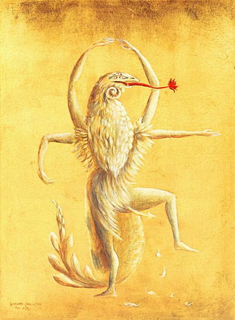
Figuras Miticas: Bailarin II (1954) by Leonora Carrington.

• The 26th Annual Lambda Literary Award Finalists have been announced. Ghosts in Gaslight, Monsters in Steam; Gay City: Volume 5 made the LGBT Anthology list, so congratulations to editors Evan J. Peterson & Vincent Kovar, and everyone else involved. I illustrated and designed the cover of that volume which also contains a piece of my fiction, Study in Blue, Green, and Gold.

Music in School (1969), episode 4: “A New Sound”. Amazing BBC TV programme for schools showing children playing avant-garde compositions using bowed metal sheets, tape loops, and primitive electronic equipment. I was at school then, and can’t help but feel a little jealous. Related: Delia Derbyshire Day approaches.

Voices Of Haiti (1953), recorded during ceremonials near Croix Des Missions and Petionville in Haiti by Maya Deren.

These days it’s hard to remember that Whistler’s Symphony in White, No. 1: The White Girl caused a bigger uproar at the Salon des Refusés of 1863 than Manet’s Déjeuner sur l’herbe, or that Monet was more influenced by Whistler than vice-versa. The delicacy of Whistler’s perceptions and his willingness to sacrifice everything for the sake of harmony make for an art less bracing than that of Degas or Pissarro. And yet how much life there is in his little Thames riverscapes. Perhaps we need another major exhibition—there hasn’t been one for twenty years—to re-evaluate him.

Whistler’s Battles by Barry Schwabsky

• Mix of the week (and a very good one it is): Abandoned Edwardian Schoolhouse by The Geography Trip.

Morton Subotnick tells Alfred Hickling how recording Silver Apples of the Moon blew his mind.

• The fantasy artwork of Ian Miller. A new book, The Art of Ian Miller, is published next month.

Queen for a Day by Alison Fensterstock. A look at the Mardi Gras Queens of New Orleans.

Tex Avery (1988): A 50-minute BBC documentary about the great animation director.

• The Gentle Revolutionary: Peter Tatchell talks to Joseph Burnett about Derek Jarman.

The Soaring and Nearly Forgotten Arches of New York City.

Dennis Hopper‘s photos of American artists in the 1960s.

Vodun at Pinterest.

Litanie Des Saints (1992) by Dr. John | Dim Carcosa (2001) by Ancient Rites | Far From Any Road (2003) by The Handsome Family

Heliotropic

heliotropic9.jpg

Arriving in the post this week was a catalogue for a Maison & Objet exposition of design and decoration which includes one of my paintings among the listed “Inspirations“. The event was held in Paris at the end of January but I’ve been so busy for the past few of months I forgot to see when it was on. Not that I could have said much about it since this is a showcase event you have to attend rather than experience remotely.

Catalogues for big art and design events often tend to the lavish and expensive but the Elsewhere book is the most lavish I’ve ever encountered. The production runs the gamut of the many expensive options which modern printing can provide: metallic inks, varnish effects, iridescent and translucent sheets, embossing, die-cutting, tipped-in inserts, and variable page sizes. The inflexible icing on the cake comes in the shape of a small square of polished marble glued to one of the pages. Excess aside, the print quality is excellent, and I’m very pleased with the way my Elvis painting appears.

sunking.jpg

Sun King (1996).

Sun King was commissioned by Creation Books in 1996 as cover art for a Jeremy Reed novel which ended up being dropped by the company. The concept was the author’s, and while I’m pleased with the way it turned out I always felt it should have had more of a Gustave Moreau quality. This is the first time the picture been used anywhere although I did reuse the Elvis-in-a-Cadillac idea recently for one of the Alas Vegas Tarot cards.

heliotropic1.jpg

My painting is included in the Heliotropic section of the book which shows some of François Bernard’s inspirations. I’m pleased they placed one of the die-cut overlays before my piece. The photos below show some of the pages from the other sections which concern the inspirations of Elizabeth Leriche—her section includes the chunk of marble—and Vincent Grégoire whose section features futurism, space scenes, metallic effects, and Daft Punk.

heliotropic2.jpg

heliotropic3.jpg

Continue reading “Heliotropic”