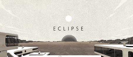
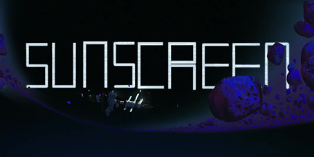
Weekend links 770

finlay.jpg

Abstraction #51 (1965) by Virgil Finlay.

• “I think the world venerates him as this deeply religious composer who tackles eternal themes in his music, but I think it’s also good to remember that he also has a playful experimental side.” Maria Juur discussing Estonian composer Arvo Pärt in a review by Geeta Dayal of a new recording of four Pärt compositions.

• “Rubycon feels like an epic soundtrack to a great lost film…” Jeremy Allen on the 50th anniversary of a Tangerine Dream album that’s always been a favourite of mine.

• At the Internet Archive: Browse the catalogue for a forthcoming auction of rare books and artworks from The Library of Barry Humphries.

• At Public Domain Review: Through a Glass Lushly: Michalina Janoszanka’s reverse paintings (ca. 1920s).

• At Colossal: “Vintage postcard paintings by David Opdyke demonstrate an ecological future in peril“.

• At the BFI: Michael Brooke offers suggestions for ten great Slovak New Wave films.

• DJ Food unearthed four sheets of Dave Roe wrapping paper from 1968.

• New music: Doppelgänger by Ian Boddy & Harald Grosskopf.

Ten minutes of Sun Ra and the Arkestra on French TV in 1969.

Depictions of Atlantis in retro science fiction art.

• Old music: Flora (1987) by Hiroshi Yoshimura has been reissued.

Atlantis (1961) by The Blue Bells | Atlantis (1969) by Donovan | Atlantis (1971) by Deuter

Dormitorium: The Film Décors of the Quay Brothers

crocodiles.jpg

The Tailor’s Shop from Street of Crocodiles.

I’m back home after a whirlwind visit to London, having earlier received an invitation from the Quay Brothers to the opening night of their Dormitorium exhibition at the Swedenborg Hall in Bloomsbury. The show is the London debut of a display of sets and puppets from all the Quays’ major films. This is also a slightly expanded exhibition, previous outings such as the one at the Museum of Modern Art in New York having been staged before they made their more recent films. New additions include several cases devoted to characters from The Doll’s Breath, and one that features characters and tiny set elements from their new feature film, Sanatorium Under the Sign of the Hourglass.

dolls.jpg

Characters from The Doll’s Breath.

One of the curious things about looking at art in our mediated age is that you can become very familiar with certain paintings or drawings yet only have a vague idea as to the actual size of the originals, even when dimensions are printed along with reproductions in books. So too with the Quays’ puppets and décors. All the details are very familiar yet I wasn’t prepared to see those familiar details differing so much in size. The box that contains the puppets from This Unnamable Little Broom, for example, is very large, yet the boxes you see shortly after this, containing sets from Street of Crocodiles, are much smaller, a factor which makes everything inside those boxes seem dizzyingly concentrated. Choice of materials has obviously determined some of this. In the films where the Quays have used ceramic doll’s heads the sets have had to be constructed to the scale of the found artefacts. All of the more recent puppets have been constructed at a larger size.

calligrapher.jpg

The Calligrapher.

The other surprise of the exhibition was the cabinets themselves. A few of these have been built to take advantage of the exhibition setting: the box featuring ‘The Calligrapher’ has a large distorting lens set into its front glass panel, while the cabinet next to it, showing the rippled landscape from The Comb, has glass sides which allow the viewer to more easily read the anamorphic lettering stretched over the hills. Several other cabinets present their contents like peepshow exhibits, their portholes being filled with yet more distorting lenses which offer mutable views of the illuminated exhibits within.

rehearsals.jpg

Rehearsals for Extinct Anatomies.

All these wonders will be on display at the Swedenborg Hall until 4th April. Entry is free if you’d like to disturb the sleep of the inhabitants. In return they’ll do their best to disturb your dreams.

dormitorium-plan.jpg

Elsewhere on { feuilleton }
The Quay Brothers archive

A Grammar of Japanese Ornament and Design

japan01.jpg

Among the new uploads to the Internet Archive is A Grammar of Japanese Ornament and Design (1880) by Thomas W. Cutler. The title is an echo of Owen Jones’ landmark study, The Grammar of Ornament (1856), a much larger volume which devotes several pages to Chinese decoration but says nothing about the Japanese. Japan’s self-imposed isolation from the rest of the world only ended in the 1860s, a restriction which had limited the spread of Japanese culture for over two centuries. Cutler’s book capitalised on the new openness and a growing interest in the country which fuelled a fervour for “Japonisme” among Western artists.

japan02.jpg

Where Owen Jones condensed whole cultures and histories into a few pages, Cutler examines a wide range of Japanese art and decoration, from details of plants and animals as found in ukiyo-e prints, to the stylised kamon emblems used by Japanese families. His book is distinguished by many pages of precise line drawings, together with reproductions of whole prints. More details like these may be found in the books of waves and clouds by Yuzan Mori and Korin Furuya.

japan03.jpg

japan04.jpg

japan05.jpg

Continue reading “A Grammar of Japanese Ornament and Design”

Weekend links 769

koitsu.jpg

Araki Street in Yotsuya (1935) by Tsuchiya Koitsu.

• “Cambridge, home of analytic philosophy, was also a hotbed of psychical research. How did this spooky subject take root?” Matyás Moravec on philosophers and precognitive dreams, Alan Turing’s interest in telepathy, and more.

• DJ Food remembers Doug Lear, founder of the Magic Lantern Narrowboat Theatre. Related: Lear’s Magical Lanterns, a TV documentary from 1983.

• New music: WEM Dominator (Live in London NW1, 2016) by Earth; and Rubber Band Music by Kate Carr.

• At Public Domain Review: Master of Claude de France’s book of flower studies (ca. 1510–1515).

• At Colossal: Landscapes, customs, and culture shape the 2025 Sony World Photography Awards.

• At the BFI: Carmen Gray offers suggestions for ten great Baltic films.

• Mix of the week: DreamScenes – March 2025 at Ambientblog.

• At Dennis Cooper’s: Room Temperature Day.

Vinyl sleeves from Supraphon.

Telephone And Rubber Band (1981) by Penguin Cafe Orchestra | Rubbermiro (1981) by Liquid Liquid | Onions Wrapped In Rubber (1994) by Tortoise

M-A-N-C-H-E-S-T-E-R

manchester.jpg

Presenting a new item for sale at Redbubble. I was intending to upload this quickly then get on with other things, but after examining the artwork it became apparent that the piece would benefit from an overhaul in order to make something that worked well at poster size. The original design dates from 2004 when I was asked by friends at the Manchester District Music Archive to contribute to a limited run of postcards they were putting together based on Manchester’s music history. Since I was working for postcard size I didn’t finesse the artwork as much as I would have done had I been working for a larger printing. What you see here is a replication of the original design at a much larger size, with a couple of details adjusted and a more substantial change in the substitution of the black-and-white photo (see below).

The original postcard set appeared two years before I began writing these posts so I’ve never had the chance to compile a list of all the references. Some of these will be familiar to Mancunians (and many Britons) of a certain age but I was trying to be allusive rather than obvious while also following three simple rules:
1) Ten panels, each one of which contains a different letter of the city’s name in a different typeface.
2) Each panel referring to a different musical trend, a notable group or venue.
3) The whole design to proceed chronologically, from the 1960s to the present day.


M.jpg

The music: Psychedelia.
The type design: Decorated 035.

The first two letters are rather vague attributions since the city didn’t have much of a national musical profile until the late 1970s. Popular Manchester groups of the 1960s included The Hollies, Herman’s Hermits, and The Mind Benders but there wasn’t a discernible Manchester scene the way there was with post-Beatles Liverpool. So “M” stands for the psychedelic era in general, while Decorated 035 is one of the typical mid-century sign fonts that you would have seen around the city.


A.jpg

The venue/music: The Apollo Theatre/Punk.
The type design: Jackson.

“A” is for the Apollo Theatre in Ardwick Green, the city’s most prominent music venue in the 1970s, although I doubt that anyone would guess the attribution. The Art Deco building is a good venue but here’s never been anything distinctive about its signage, hence the choice of Jackson, another very decade-specific font which has conveniently wide letterforms. The rip refers to torn posters and punk graphics while the opposed green/red colour scheme is borrowed from one of the Virgin label designs of the late 70s, something that might also be taken as a very tenuous reference to the Virgin Megastore in Market Street.


N.jpg

The music: Buzzcocks.
The type design: A pair of Zs from the cover of Orgasm Addict.

The first Buzzcocks single featured a striking sleeve by Malcolm Garrett (design) and Linder (collage) which provide the graphics here, with the “N” being formed by two letters from the band’s name which was printed vertically on the cover.


C.jpg

The music: Joy Division.
The type design: A letter from the cover of Substance.

Substance
, the first Joy Division compilation, was released in 1988 so this is a little anachronistic but Brett Wickens’ letter is a more recognisable detail than one from the cover of Closer. The textured sleeve of the group’s debut album, Unknown Pleasures, is referred to by the panel background.

Continue reading “M-A-N-C-H-E-S-T-E-R”