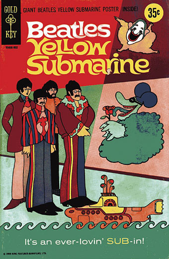
Yellow Submarine comic books

submarine1.jpg

By the time Yellow Submarine appeared on TV in the early Seventies I was already a keen viewer of anything showing the groovier side of the late Sixties. What I recall of that decade is resolutely unspectacular—I was only 7 in 1969, after all—but Swinging London as seen in the lighter films of the period, or via trace elements in TV series such as The Avengers, always looked like a fun place to be. Yellow Submarine was a concentrated dose of all the gaudiest elements of the era and immediately became one of my favourite films, probably the favourite psychedelic film until I finally got to see Performance in 1983.

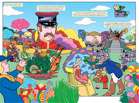
This comic strip adaptation of the film is a curious cash-in from 1968 which is nonetheless better, and longer, than I expected. The writer and artist go uncredited but whoever they were they manage to flesh out the admittedly sketchy storyline and still retain the atmosphere of the film. One significant change may be the result of the timidity of the time with John Lennon’s lysergic muse, Lucy in the Sky with Diamonds being downgraded to Paul McCartney’s rather more mundane Rita the Meter Maid.
submarine2.jpg

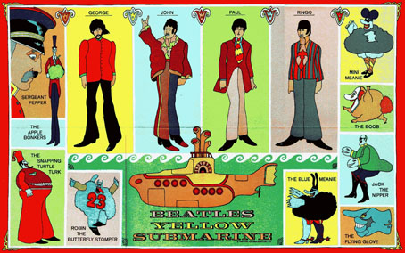
The comic came with this poster and the whole package is now highly-sought by Beatles collectors with near mint copies going for $300. Naturally there are various copies circulating in the digital world and I shouldn’t have to tell you how to find them.

submarine3.jpg

There were plans by Dark Horse in the 1990s to produce a more faithful adaptation of the film in comic form. Bill Morrison was the artist and this would have tied-in with the film’s release on DVD in 1999. He managed 26 pages before Apple Records pulled the plug on the project which seems a shame going by the completed work. The Beatles’ back catalogue is due to be reissued soon in CD editions which will replace the shoddy 1987 versions. Expect to hear more about Yellow Submarine before the year is out.

Previously on { feuilleton }
The Sonic Assassins
A splendid time is guaranteed for all
Heinz Edelmann
Please Mr. Postman
All you need is…

New things for April II

coc.jpg

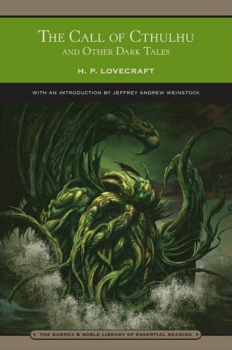
Another work-related update. This HP Lovecraft collection is published by Barnes & Noble next month and features my colour rendering of the rising monstrosity on its cover. Nice to have something decorating an actual Lovecraft book, the second time this has happened (first time was for a French volume). B&N also sell my own book, of course (with, er…the same cover pic).

And another shout-out, for a preview of Arik Roper‘s new book, Mushroom Magick: A Visionary Field Guide, at Abrams. Read an extract from Erik Davis’s introduction here.

Via Further.

Previously on { feuilleton }
The art of Arik Roper

New things for April

drive-in.jpg

I drew attention yesterday to the abraded look of the Taking Woodstock poster and mentioned a recent book design of mine which used a similar effect. This is that cover, created for a collection of Joe R Lansdale’s horror novels coming soon from Underland Press. Lansdale is known mainly for being the writer of the story which Don Coscarelli adapted for Bubba Ho-tep in 2002 (a great film, incidentally) but he’s done a lot more besides. Find out more at his website.

While on the subject of self-promotion, the invent-your-own-band website Figment posted an interview with me as a complement to their cover art competition which I’ve been judging. Results of that will be announced at the end of the week.

And speaking of interviews, I’ll mention again Jay Babcock’s exclusive interview/feature with comic artist Rick Veitch over at Arthur. Rick’s an artist I’ve always had a lot of time for and this piece includes a special intro/appreciation by collaborator Alan Moore. The interview examines the serious business of dreaming, with Rick’s advice on using your dreams for artistic breakthroughs, personal growth, problem solving, and time/space travel.

Previously on { feuilleton }
Sleeve craft
Finch

Taking Woodstock

taking_woodstock.jpg

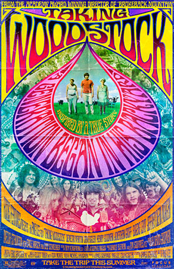
I mentioned Ang Lee’s forthcoming film, Taking Woodstock, last week and this poster by Mojo makes a decent fist of capturing some of the West Coast psychedelic style. I thought at first that the rainbow hues were garish in the wrong way, the San Francisco poster artists used bold colours but limited their palette since many of them were working for screenprinting. But since this film concerns the story of a gay man, Elliot Tiber, and his attempt to provide a home for the Woodstock festival in 1969—and since the rainbow flag is now a gay symbol—it makes sense even if the overall impression is of colour clash. I like the subtle touch of making the poster look worn, something I’ve done myself on a recent book cover design which is also styled as a cinema poster. I’ll be posting that here in due course.

woodstock.jpg

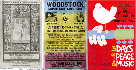
That’s the film promotion; the posters for the original event can be seen at Woodstock posters. The pencil sketch on the left is an elaborate Art Nouveau-styled design intended for the festival before the original choice of venue was refused. The sheet in the centre looks like a hasty promo piece for the new venue while the poster on the right is the final version with the famous dove graphic by Arnold Skolnick. That dove came to symbolise the whole event, hence its appearance on the Taking Woodstock one-sheet.

Taking Woodstock opens in the US on August 15th, 2009, the 40th anniversary of the festival.

Previously on { feuilleton }
Over the rainbow
Dutch psychedelia
Family Dog postcards