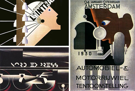
Poster art by Adolphe Mouron Cassandre.
• Gallery at the official site
• Cassandre at VTS: I | II
A journal by artist and designer John Coulthart.

‘Films are a way to kill my father’
| Bertolucci and The Conformist.
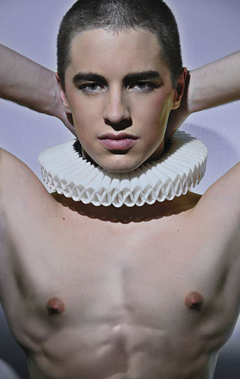
Jacob, a dancer with the Canadian National Ballet, photographed by Toxicboy.
Previously on { feuilleton }
• Chris Nash
• Peter Reed and Salomé After Dark
• Felix D’Eon
• Dancers by John Andresen
• Youssef Nabil
• Images of Nijinsky
• The art of Hubert Stowitts, 1892–1953
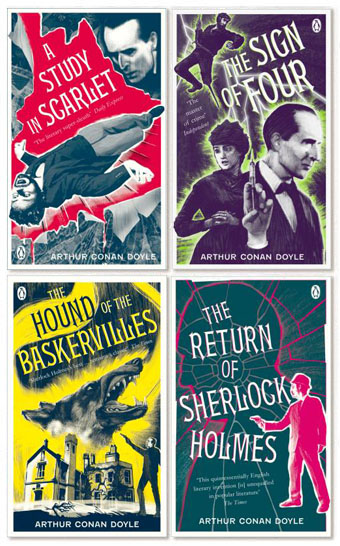
Coralie at Penguin Books sent through these cover designs today, a splendid “collect the set” republication of the Sherlock Holmes stories which should be on the shelves early next month. This follows last year’s collection of similarly repackaged Edwardian thrillers which included Conan Doyle’s dinosaur tale, The Lost World. Having recently watched the Granada TV adaptations of the Holmes stories now would be a good time to go back to the books, especially since I only recall ever having read The Sign of Four and a couple of the stories.
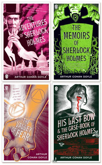
And on the technical side, I’ll note that my typeface mania identifies the font used for the titles of these books as Gable Antique Condensed, a contemporary design by Jim Spiece based on a Bauer typeface from around 1900. Unless it’s one of the variants mentioned by Identifont….
Elsewhere on { feuilleton }
• The book covers archive
Previously on { feuilleton }
• “The game is afoot!”
• Boys Own Books
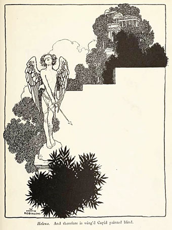
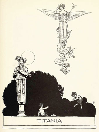
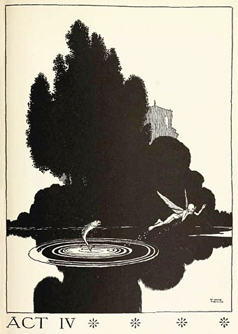
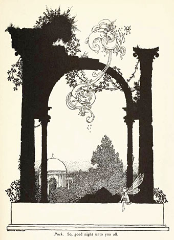
I wasn’t planning on featuring William Heath Robinson again so soon but I couldn’t resist posting some extracts from his 1914 edition of A Midsummer Night’s Dream, another great download from the scanned books at the Internet Archive. I have a few of these illustrations in a WHR monograph but I didn’t realise the book as a whole was so good. The Robinson brothers had a remarkable mastery of space in their work, no doubt derived from Beardsley but they found a way to make his expanses of black and white work for their own distinctive styles. This book, like many of those of the period, features colour plates but I much prefer Heath Robinson’s black-and-white work to his watercolours. His Poe book contains many fine drawings but his style is more suited to this Shakespeare play, especially in the depictions of clouds of fairy figures tumbling through the air.
Elsewhere on { feuilleton }
• The illustrators archive.
Previously on { feuilleton }
• William Heath Robinson’s illustrated Poe