Pablo Ferro on YouTube

ferro1.jpg

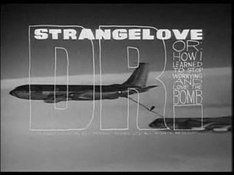
Dr. Strangelove titles (1964).

There’s less of his work around than there should be, unfortunately. Saul Bass is justly celebrated for his title sequences and poster designs yet Pablo Ferro—whose titles were equally innovative and memorable—is rarely heard of even though you’ll have seen a lot of his work.

ferro2.jpg

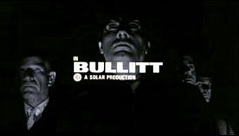
Bullitt titles (1968).

Ferro’s advertising films brought him to the attention of Stanley Kubrick for whom he created titles and trailers for Dr. Strangelove and A Clockwork Orange (1971). The hand-drawn quality of the Strangelove titles was revisited for Stop Making Sense (1984) and Men In Black (1997), while the frenetic pace of the Clockwork trailer still seems advanced over thirty years later. This collection lacks his titles for the original Thomas Crown Affair (1968) but you can see a mix of Ferro’s split-screen work (which includes parts of the titles) here.

By Pablo Ferro:
Dr. Strangelove trailer
Dr. Strangelove titles
Bullitt titles
A Clockwork Orange trailer
Stop Making Sense titles
To Die For titles
LA Confidential titles

This Is Pablo Ferro

About Pablo Ferro:
• Pablo Ferro documentary clips: I | II

Quick Cuts, Coarse Letters, Multiple Screens—an article by Steven Heller
• Free Ferro-derived fonts! Pablo Skinny | Major Kong

Previously on { feuilleton }
Juice from A Clockwork Orange
Clockwork Orange bubblegum cards
Alex in the Chelsea Drug Store

The art of Michael Goro

goro1.jpg

Voyage de Nuit (etching/engraving; no date).

Michael Goro’s etchings and engravings are rich with the kind of gritty urban verisimilitude I love. His site has several more examples and there’s a good interview with the artist here.

Michael Goro, a prominent intaglio printmaker, has lived and worked in Russia, Europe, Israel, and the U.S. His work has received a number of prestigious international awards including Special Prize at the 1998 International Print Triennial in Kanagawa, Japan and Excellent Prize at the 2006 14th Seoul Space International Print Biennial at the Seoul Museum of Art (Korea). He describes his art as a “continuous creative search for raw authenticity in urban environments and human forms that are constantly changing.” Utilizing the full spectrum of printmaking techniques, ranging from Renaissance engraving to digital photogravure, he shares his unique personal experiences through imaginative imagery.

Thanks to PK for the tip!

goro2.jpg

Reflections (etching; no date).

Previously on { feuilleton }
The etching and engraving archive

Lalique’s dragonflies

lalique1.jpg

Dragonfly woman corsage ornament (1897–1898).
Gold, enamel, chrysoprase, moonstones, and diamonds.

Seeing as dragonflies emerged as a theme this week I can’t resist mentioning my favourite of all, this bizarre confection by glass artist and jeweller René Lalique (1860–1945), a dragonfly with female torso and gryphon claws. This was owned by wealthy Armenian collector Calouste Gulbenkian (in whose museum it now resides) and was worn once by Sarah Bernhardt. You can barely tell from this picture but the delicate gold wings are hinged at several points so they wouldn’t be obtrusive for the wearer.

lalique2.jpg

The Lalique company made more glassware than they did jewellery and these included a range of unique automobile mascots whose pedestrian-puncturing potential saw them banished to museum cabinets as road safety laws evolved. The dragonfly design was an especially splendid example, being placed above a multicoloured disc lit from beneath which rotated in accordance with the speed of the car. The faster the car travelled, the faster the colours changed.

Previously on { feuilleton }
Lucien Gaillard
Wesley Fleming’s glass insects
The glass menagerie