The art of Maleonn Ma

ma1.jpg

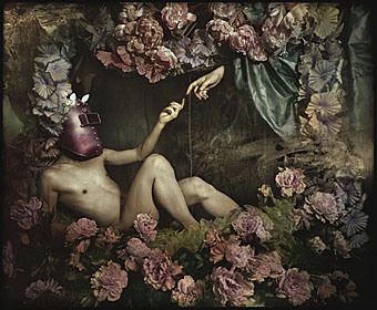
Portrait of Mephisto #1 (2006).

ma2.jpg

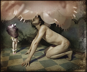
Portrait of Mephisto #5 (2006).

The carefully-constructed and coloured tableaux of Shanghai-based art Maleonn Ma remind me of Joel-Peter Witkin‘s grainier and nastier works only without the body parts or dead babies. The repeated use of Michelangelo’s Creation of Adam in contemporary culture is a whole subject in itself.

Via Phantasmaphile.

Previously on { feuilleton }
Behold the (naked) man
Sculptural collage: Eduardo Paolozzi
Michelangelo revisited

In the hands of FATE

fate.jpg

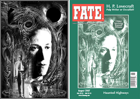
One of my works graces the cover of an American institution this month with the appearance of my HP Lovecraft portrait on the August issue of FATE magazine (volume 60, number 8, issue 688, if you must know). This is for an article about Lovecraft’s occult connections and I believe they’ve also used one of my views of R’lyeh for the article itself although I can’t confirm this just now.
predators.jpg

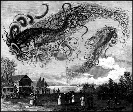
This is the third time my work has appeared in FATE (like TIME, the magazine prefers to see its name in caps). The first occasion was for another Lovecraft feature about Cthulhu in (I think) 1999. Then in 2000 I was commissioned to produce the illustration above for an article on “sky predators” which led me to plunder once again Ernst Haeckel’s Art Forms in Nature, a wonderful book I’ve frequently swiped from when in need of organic weirdness.

A couple of years later this picture was featured in a Fox TV documentary of all things, part of a post X-Files series called Conspiracy Theory. The subject was “flying rods”, one of the less convincing manifestations of cryptozoological phenomena, and the program needed some antique pictures to back up their thin veneer of evidence. They rather scurrilously used my picture to illustrate flying rod history as though this was a Victorian illustration, not a piece of Photoshop work. Fox documentaries, like their news channel, seem to have a flexible approach to the truth.

Previously on { feuilleton }
New things for June
Le horreur cosmique

Crossed destinies revisted

calvino.jpg

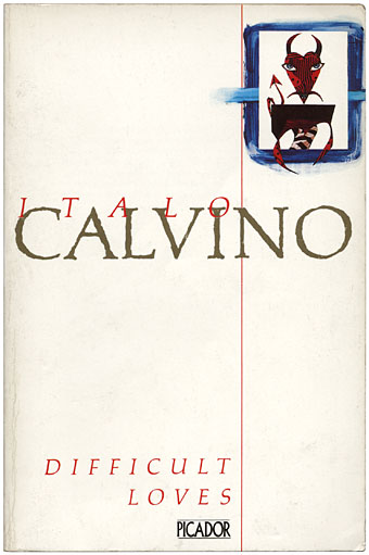
Difficult Loves (1985).

Today’s book purchase was another in the Picador run of Italo Calvino titles with covers by the Brothers Quay, this particular volume being a collection of the author’s early short stories. I wrote about the Quay’s contribution to book design back in February and their covers remain one of many reasons to keep haunting the local charity shops, especially when their designs are superior to those of more recent editions.

Elsewhere on { feuilleton }
The book covers archive
The Quay Brothers archive

Jack Kerouac book covers

ontheroad.jpg

left: Andre Deutsch (1958); right: Penguin (1972).

In a year filled with cultural anniversaries, here’s another. Jack Kerouac’s On the Road is fifty years old next month and to celebrate this Penguin is publishing the book in its original form for the first time. Although the cover of the first edition described the text as “complete and unexpurgated”, names were changed to protect the innocent and/or guilty and other aspects, such as some very mild gay sex references, were removed. The same site I linked to last year with a great selection of William Burroughs book covers has another section devoted to Kerouac’s magnum opus.

The challenge with this book is whether or not to feature a road as the main image; some designers rise to that challenge better than others. The Ukrainian cover crudely modelled on a Jack Daniel’s label is a particularly unfortunate choice considering that the author died prematurely from cirrhosis of the liver. As with William Burroughs, some translations of the title work better than others: Unterwegs (German) sounds clunky to English ears while Sulla Strada (Italian) has more poetry than the original.

The Observer on the book’s fiftieth anniversary
Beat Scene magazine
Kerouac’s bisexuality explored at GLBTQ

Elsewhere on { feuilleton }
The book covers archive

The Darjeeling Limited

darjeeling.jpg

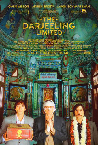
There aren’t many directors whose next films I await with impatience but Wes Anderson is one of them. I still haven’t seen his debut, Bottle Rocket (1996), but Rushmore (1998) was good, The Royal Tenenbaums (2001) was great and The Life Aquatic with Steve Zissou (2004) was a masterpiece. The Darjeeling Limited will be out later this year and stars Owen Wilson (who’s been in all of Anderson’s films apart from Rushmore but he did co-write that one) Adrien Brody, and Jason Schwartzman who made his debut in Rushmore and can be seen in another odd and inventive comedy, I Heart Huckabees. Schwartzman also co-writes this new opus. I have an unproven theory that Anderson is responsible for an annoying trend in recent American independent cinema—the “quirky comedy” which features multiple shots of charmingly flawed characters standing motionless centre-screen while staring at the camera. With groovy music playing on the soundtrack. Anderson does (or did) enough of this but he does a lot more besides. His films are better written and a lot more inventive than those of his imitators.

The most striking thing about the Darjeeling Limited trailers and poster (although it’s not something most people would notice) is the complete absence of Futura. Anderson is possibly unique among filmmakers in having what amounts to an obsession with a single typeface; Futura appears in different weights and styles throughout Rushmore, The Royal Tenenbaums and The Life Aquatic. I’m not quite sure which typeface is used on the poster (and neither are the people at Typophile); Proxima Sans is the closest match I can find but it may be a grotesk variant created specially for the film. I ask you: how many filmmakers are there that can get people talking about their work simply by changing a font?

Previously on { feuilleton }
Masonic fonts and the designer’s dark materials
Helvetica: the film