Art is magic. Magic is art.

millidge.jpg

Cover concept by Chip Kidd.

I noted the imminent arrival of Gary Spencer Millidge’s labour of love last month and the volume itself turned up this week, and what a book it is, a heavyweight hardback that’s far more lavish than I anticipated. The first surprise comes when removing the dust jacket to find Alan’s scowling visage embossed on the boards. Inside there’s a wealth of Moore ephemera from biographical material (lots of family photos) to insights into the scripting process behind the comics. I already knew Alan made little thumbnail sketches of his comic layouts before writing his scripts, having been fortunate enough to see one of the work-in-progress books for From Hell one time when I was chez Moore. Now everyone can have that opportunity. In addition there’s a thorough overview of Alan’s career, from the earliest juvenilia through to recent issues of Dodgem Logic. The comics career often overshadows his other work but in a later part of the book there’s considerable attention given to his collaborations with musicians, dancers and others for the Moon and Serpent performances. For my part it’s a pleasure to see some of the designs I created for the Moon and Serpent CDs printed large-size and in better quality than pressing plants manage with compact discs. None of those releases sold in great quantities and all are now out-of-print so the artwork often feels lost.

moore01.jpg

The front board.

What else? How about two sections of the book with fold-out pages? How about the first ever public appearance of Alan’s huge chart mapping the progress of every character through the unfinished Big Numbers? How about an introduction by Michael Moorcock where he calls Alan “a Robert Johnson of the Age of Doubt; questioning, confronting, mourning and yearning, representing his readers in profound ways, an intellectual autodidact, one of my few true peers for whom I have limitless respect.”? How about a compact disc featuring extracts from the Moon and Serpent CDs plus many other previously unreleased songs including pieces by the Emperors of Ice Cream? This is a gorgeous production designed by Simon Goggin and art directed by Julie Weir, and I haven’t even begun to read it yet. Is it necessary to state that it’s an essential purchase for anyone with more than a passing interest in Mr Moore and his many talented collaborators? Yours for twenty-five quid from Ilex Press. Some page samples follow.

moore02.jpg

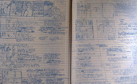
Front endpapers showing Alan’s working notes and sketches.

Continue reading “Art is magic. Magic is art.”

Nabokov book covers

nabokov1.jpg

Flowers are the sexual organs of plants, which may have been what designer David Pelham had in mind when he created this cover for the Penguin debut of Nabokov’s densely-written and erotic novel, Ada in 1970. (Butterfly orchids also feature in the text, of course.) The Russian maestro has been unavoidable lately on account of the publication this week of his final, unfinished work, The Original of Laura. The design of the new book by Chip Kidd is slightly more daring than I’d have expected from something which the publisher will be hoping to sell in large quantities, and I’d love to know how much argument was required to push the cover through the marketing department. The contrast between boards and dust jacket is very satisfying and adds value to the book as artefact, a feature impossible to replicate in ebook terms even if this was an ordinary novel rather than sketches on index cards. If people want books to stay physical then smart design needs to be applied a lot more often.

nabokov2.jpg

The ragged item above is my battered second edition of the original UK (Weidenfeld & Nicolson) printing of Lolita, now fifty years old and with a cover designed by Eric Ayers. There’s a more pristine copy on display at this comprehensive gallery of Lolita covers, fascinating viewing if you’re interested in seeing how the same book can be presented over 150 editions. From a drab beginning things quickly degenerate into outright salaciousness, a development which would no doubt have dismayed the author. That gallery link comes via Venus febriculosa who recently held a competition to redesign the cover; you can see the results here, many of which are a lot more inventive than the published editions.

Meanwhile, the advent of Nabokov’s final novel has meant that all of his works are being reissued by Vintage. Ace cover designer and art director John Gall was tasked with redesigning the corpus for which he assembled a team of designers and requested that they each fill a butterfly specimen box with material to suit their allotted title. You can see the gorgeous results here. And if that’s not enough Nabokov, you can read Martin Amis taking his favourite author to task over The Original of Laura here.

The inside story of Nabokov’s last work

Elsewhere on { feuilleton }
The book covers archive

Repackaging Cormac

blood_meridian.jpg

left: Vintage International (US), cover design by Susan Mitchell (1993).
right: Picador (UK) reprint (2008).

After the Oscars success of No Country for Old Men it’s understandable that Cormac McCarthy’s publishers would want to reprint all his works. His books still appear under the Picador imprint in the UK where they’ve been reissued recently in uniform editions with new cover designs. A couple of these are an improvement on their lacklustre predecessors, and they don’t look so bad when seen together on a shelf, but on the whole this McCarthy reader is disappointed by the overall blandness they present.

crossing.jpgMy earlier post about McCarthy’s UK covers was critical of the The Road which used a combination of a stock photo and Akzidenz-Grotesk Condensed for the typography. In the case of No Country for Old Men the photo from the American original by Chip Kidd was used but his carefully-judged type layout was dropped. Unfortunately it’s The Road approach which has been continued on the new covers, with variable degrees of success. The Chip Kidd designs that Picador repeated in the 1990s made similar use of suggestive photos but there was at least some attempt made to match form to content; a number of the new designs are vague in the extreme. I assume that the disparate group of objects on the cover of Blood Meridian relate to the character of the Judge when he reveals his intention to catalogue every new object that he comes across. But that’s an incidental detail in one scene of a baroque, ferocious and very violent historical novel. So the image isn’t exactly a misrepresentation but it puts the wrong emphasis on a book that could easily be described as a Western nightmare. And they’ve also dropped the book’s subtitle, an amendment I find especially egregious.

Even more bland is the picture of a shack on the cover of Child of God, McCarthy’s tale of a backwoods psychopath who moves into a cave and murders women so he can have sex with their corpses. Anyone buying the Picador book on the strength of the cover is in for a surprise. And since when did that novel have a definite article in its title? Best of the bunch is probably The Crossing (above) which shows the wolf that provides the impetus for the story. The type works better on this cover while the animal’s reflection in the water is a nice touch that can be read as relating to the various symmetries and reflections in The Border Trilogy, of which this book forms the second part.

Picador set a high standard for paperback design in the Seventies which makes the sight of uninspired and lazy work doubly-dismaying. Susan Mitchell’s covers for the Vintage paperbacks are still the best I’ve seen for McCarthy’s books—and they’re still available—but if these new editions pick up new readers on the strength of the author’s moment in the limelight then that’s no bad thing. It’s the words that count, after all.

Elsewhere on { feuilleton }
The book covers archive

Previously on { feuilleton }
Cormac McCarthy book covers

No Country for Old Men

no_country1.jpg

no_country2.jpgOne of the posters for the new Coen Brothers’ film has finally surfaced and the design is pretty similar to the original book jacket by Chip Kidd (later spoiled with poor type layout in the UK edition). The book cover looks better but we’ll probably see some variations on the poster design anyway. I’m reading the novel at the moment and loving it, so the prospect of a Coens adaptation is rather mouthwatering. This should see them back on form again after the calamity of The Ladykillers and they do the hardboiled thing really well. Cormac McCarthy’s dialogue is spare and witty; Ethan Coen’s characters are either excessively verbose or they hardly speak at all so it’s easy to see the appeal, especially when the plot isn’t so far removed from Blood Simple or Fargo. I’ll be waiting impatiently now for the trailer.

Previously on { feuilleton }
In praise of Cormac
The poster art of Bob Peak
A premonition of Premonition
Cormac McCarthy book covers
Perfume: the art of scent
Metropolis posters
Film noir posters

Cormac McCarthy book covers

cormac1.jpg

Still in pursuit of a Cormac McCarthy obsession I picked up a copy of the (American) Vintage International paperback of Blood Meridian this week, almost solely for the cover. As it turns out it’s also an easier book to read than the UK edition, less tightly bound although the body text in both looks as though it was printed from photocopied galley proofs. The cover design is by Susan Mitchell, with photography by Craig Arness, and forms part of a small series among the Vintage reprint editions. Mitchell resists the understandable temptation to put red on the cover, saving that for McCarthy’s tale of a murderer, Child of God.

Continue reading “Cormac McCarthy book covers”