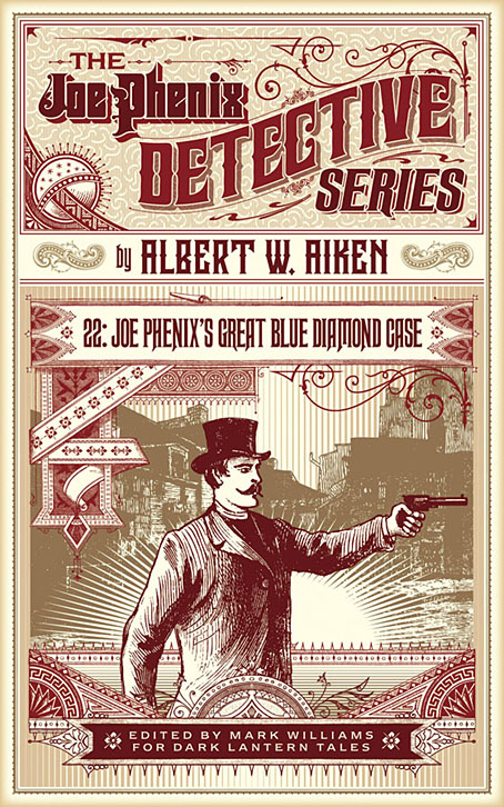
After six months of black-and-white drawing it’s been good to return to colour book covers of which this is the first of a new crop of designs. Albert W. Aiken (c.1846–1894) was a prolific American author of pulp fiction, whether writing under his own name or pseudonymously (and sometimes as a woman) for Dime Library, Banner Weekly, Saturday Journal and many other publications. Joe Phenix (also named Phoenix in later stories) was one of his more popular creations, a late-Victorian detective whose investigations ran to over 20 adventures. These tales are in the process of being made available by Mark Williams in ebook form so my task was to provide a single cover design that could function for all the titles.
In keeping with the new format, the style deployed here is mostly a pastiche of the dime novel idiom with a few contemporary touches. Many of the dime publications favoured a large box in the top third of the cover which would contain a typically florid title arrangement. The accompanying illustrations were often comparatively crude but the titles followed the style of the period with engraved drop shadows, gradients and lots of fine decoration. It’s fun to imitate this style although it can also be more time-consuming than contemporary design since everything has to be worked out one piece at a time. Several of the decorative elements on this cover are what printers used to refer to as “combination ornaments”, very small details which can be pieced together in a number of ways to form banners, borders and other motifs. Combination ornaments were a solution to the problem of working elaborate decoration into spaces of variable size and shape; instead of a pre-shaped design you’d shape the decoration to fit the space. They were also lucrative since printers charged for the use of each small element. In a digital composition such as this the joins between the pieces are invisible but in a period design you can often spot the combination pieces (especially in border designs) when the individual elements fail to line up properly. The figure with the gun, incidentally, is Mr Phenix himself, taken from the cover of Beadle’s Dime Library.
The first few Joe Phenix titles are available now at Amazon and other ebook outlets with further titles to follow.
Previously on { feuilleton }
• The man who wasn’t Tesla
• The George Dower Trilogy by KW Jeter
• Steampunk in the Tank
• More vapour trails
• Steampunk catalogued
• Steampunk: The Art of Victorian Futurism
• Steampunk Calendar
• Words and pictures
• Nathanial Krill at the Time Node
• Fiendish Schemes
• Ghosts in Gaslight, Monsters in Steam
• Steampunk Revolution
• The Bookman Histories
• Aether Cola
• Crafting steampunk illustrations
• SteamPunk Magazine
• Morlocks, airships and curious cabinets
• The Steampunk Bible
• Steampunk Reloaded
• Steampunk overloaded!
• More Steampunk and the Crawling Chaos
• Steampunk Redux
• Steampunk framed
• Steampunk Horror Shortcuts


Florid but not floral and not a lazy design–.
Missing a dead parrot tho’ ;)
Short article below related to the first for those interested: Something tells me that John’s workspace does not resemble the following. I know mine doesn’t. And I prefer Messr C’s covers for Jeff Vandermeer in their combination ornamentations.
>https://www.nytimes.com/2017/02/27/fashion/mens-style/rodrigo-corral-manhattan-workspace-tour-book-covers-graphic-design.html
That said, I’m going to read up on Corral to see what I can glean designwise. But usually there’s more Beyond The Fringe
From The Off Trend,
TjZ
btw
The Best Example of Design I know:
>http://www.johncoulthart.com/feuilleton/2010/05/06/into-the-media-web-by-michael-moorcock/
Thanks :)
I don’t earn enough to have a dedicated workspace like that. Work for the big publishers pays three/four/five times more what I earn from my work. I seldom get commissions from the big publishers despite having worked for several of them in the past, having won a world award etc, etc…