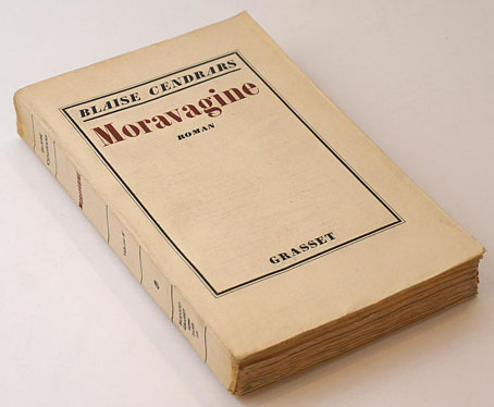
First publication, Grasset, 1926.
I should have liked to open all cages, all zoos, all prisons, all lunatic asylums, see the great wild ones liberated and study the development of an unheard-of kind of human life…
Recent reading was Moravagine (1926) by Blaise Cendrars, a novel that resists easy summary. It’s a Modernist work to some extent although the prose (a good translation from the French by Alan Brown) is never unorthodox in style; it’s also scabrous, amoral, misogynist and deeply misanthropic. The narrative is a picaresque affair narrated by a young doctor who frees the mysterious Moravagine from an asylum where he’s been imprisoned for many years. “Moravagine” is an adopted name whose origin and meaning is never addressed, although a French reader would find a rather unavoidable pun on “death by vagina”. Moravagine himself is an otherwise unnamed member of the Hungarian royal family, a dwarfish intellectual psychopath with a bad leg who goes on the run with the doctor, first to pre-revolutionary Russia, then to the United States and South America.
Reviewers have compared the book to Beckett, Céline and Burroughs although it’s much lighter reading than the first two, and the prose is more coherent than Burroughs in cut-up mode. Since we’ve been hearing a lot about the First World War this year it’s tempting to read the book as a kind of Dadaist reaction to Cendrars’ own experiences in the war, even though the entirety of the conflict is dispensed with in two pages. Cendrars appears as a character in the later chapters; he lost an arm in the war so he has his narrator lose a leg while Moravagine loses his reason altogether. At the end of the book he’s found imprisoned in another asylum where he believes he’s an inhabitant of the planet Mars, and where he spends his last months writing a huge, apocalyptic account of how the world will be in the year 2013.
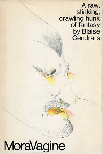
All this, of course, presents a challenge for a cover designer. I have two Penguin editions, both with very different covers, neither of them unsuitable. Curiosity impelled me to see how the book has been treated since 1926. There aren’t many editions but their difference shows the difficulty of trying to encapsulate the contents of this strange novel in a graphic form. The selection here has avoided text-only treatments in favours of those using some form of illustration.
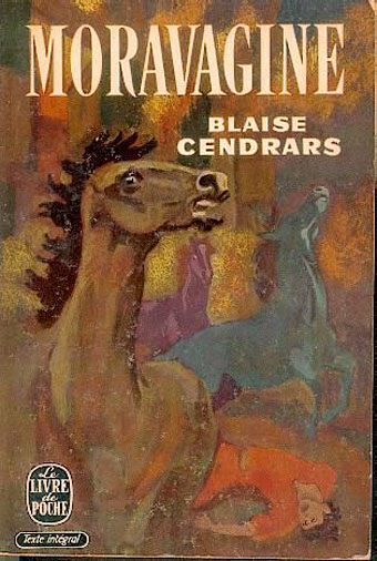
Le Livre de Poche, 1957.
In an early chapter Moravagine describes fleeing the imperial household by strapping himself to a horse. Without knowing this narrative detail the painting here seems bizarrely arbitrary.
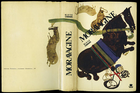
Editora Ulisseia, Portugal, 1966.
The horses again, with Moravagine strapped underneath one of them. I’d guess the illustrators of these two books didn’t read very far.
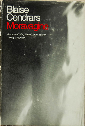
First UK edition, Peter Owen, 1968.
Peter Owen commissioned the first English translation which is still in use today.
Doubleday, 1970.
I’m not sure where the capitalised V comes from but this is a good design by Seymour Chwast. 50 Watts shows more of the cover and also boldly attempts a précis of the contents.
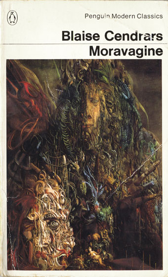
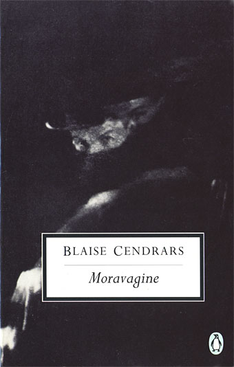
Penguin, 1979.
A favourite Penguin edition of mine for its use of Lucifer by Thomas Häfner. The painting was one of the highlights in David Larkin’s Fantastic Art (1973) which might explain its appearance here. Monster Brains has a larger copy together with more of Häfner’s detailed canvases.
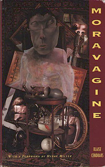
Blast Books, 1990.
The only example here that actually attempts to summarise the book via illustration, and a good attempt at that. If anyone has a credit please leave a comment.
Penguin, 1994.
The photograph is Figure Descending Stairs by Anton Giulio Bragaglia. Not a bad choice but it’s pretty vague, and could easily by used on many other novels.

NYRB Classics, 2004.
A detail from Death: I am the one who will make a serious woman of you; come, let us embrace (1896) by Odilon Redon. Difficult to go wrong with Redon although this was originally an illustration for Flaubert’s The Temptation of St. Anthony.
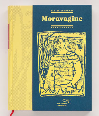
Die Andere Bibliothek, 2014.
A new German edition in a slipcase. Looks like a quality production but that illustration is more like something for a Genet novel.
There’s more Cendrars at the Paris Review where the author was profiled in their long-running Art of Fiction series.
Elsewhere on { feuilleton }
• The book covers archive
I have the Penguin edition — thanks for all the others.
the prose is more coherent than Burroughs in cut-up mode.
At the same time, the prose flips between narrative mode and expositional mode in a wholeheartedly Modernist way (e.g. the ‘Blue Indians’ section), with a sense that the expositional parts could have been copied from elsewhere, in the manner of Mann’s “Dr Faustus” (or by the same token, of Scholastic theological writing).
In an early chapter Moravagine describes fleeing the imperial household by strapping himself to a horse.
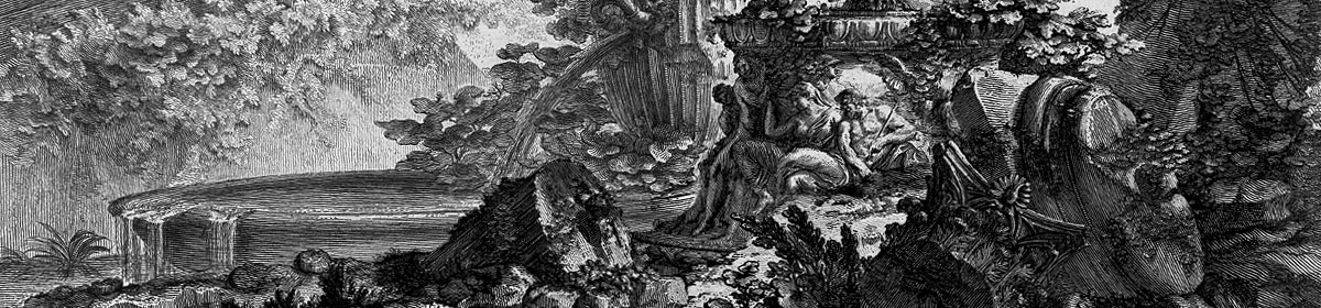
I would like to think that this was a reference to the ‘Mazeppa’ theme in Romantic painting.
I get the impression that the essayistic sections were Cendrars’ own since they feel consistent with the rest of the prose, unlike some of the descriptions of animals and things in Maldoror. The Art of Fiction piece refers to Cendrars’ travels in Africa and South America, and his writings on the subject.
I almost mentioned Mazeppa as well, although it’s a vague similarity at best. As I recall, Mazeppa was tied to the horse against his will. And that reminds me that I did a drawing of Mazeppa when he makes an appearance in the horse race in this volume:
http://www.johncoulthart.com/feuilleton/2010/04/23/engelbrecht-lives-to-fight-another-day/
I so want a copy of Engelbrecht, one day when I grow up and have money.
Just found out that the TLS has a piece about Cendrars in the latest issue. Odd coincidence.
http://www.the-tls.co.uk/tls/public/article1462845.ece
Please note that the cover was designed by Die Andere Bibliothek.