
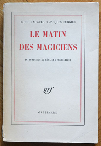
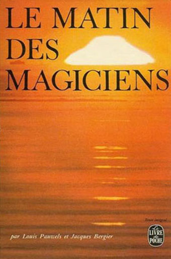
Éditions Gallimard, France, 1960.
Yesterday’s post proved popular so it seemed worthwhile taking another look at the book that birthed Planète magazine. The main problem The Morning of the Magicians presents for an art director is how to encapsulate such wildly diverse contents in a cover design. To judge from the examples here, most people seem to have either given up or gone for vaguely symbolic designs which at the most correspond to the contents in a minor way. The biggest surprise for me was seeing the cover of the first edition above, one of those typically sober French titles which gives away nothing of the intellectual fireworks within. Few of these designs have any credits, and this is nothing like a complete list (more editions may be seen at Goodreads). More recent editions have been avoided altogether since they’re pretty terrible.

Arnoldo Mondadori Editore, Italy, 1963. This edition, which runs to 476 pages, includes three translated stories inserted into the text: The Nine Billions Name of God by Arthur C. Clarke, A Canticle for Leibowitz by Walter M. Miller Jr, and The White People by Arthur Machen.
A hardback edition showing an alchemist at work.
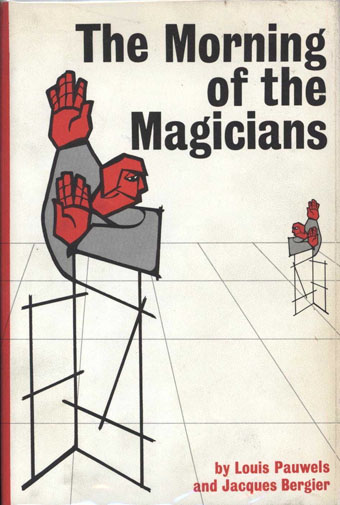
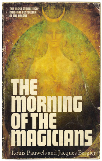
Stein and Day, USA, 1964.
You know a cover is failing when it could easily be applied to any number of other titles.

De Bezige Bij, Netherlands, 1964.
God knows what’s going on here. Bewilderingly random.

Plaza & Janés, Argentina, 1967.
I like this one, the design is blocked onto the boards, and that stripe is gold ink. Somebody was at least making an attempt even if it does come across more like a horror novel.
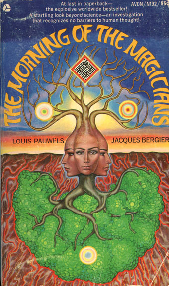
Avon, USA, 1968. Cover art by Mati Klarwein.
An Avon paperback so it’s cosmic time courtesy of the great Mati Klarwein. Not one of his best covers, and not even very suitable but it intrigues. The glowing square is stylised Arabic lettering similar to that used on his Live-Evil (1971) album cover.
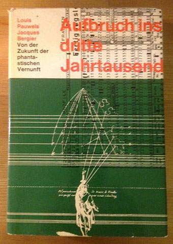
Scherz, Germany, 1970.

De Bezige Bij, Netherlands, 1971. Cover art by Philip Renard.
Another bizarre Dutch cover.
Éditions Gallimard, France, 1971.
UFO books were very popular in the early 1970s so this one was inevitable. That’s probably the sun, of course, but the resemblance to a flying saucer can hardly be accidental.

Éditions Gallimard, France, 1972.
A typically restrained Folio cover which works if you consider it in the light of the Planète designs.
Mayflower, UK, 1975.
My own well-thumbed paperback. The cover painting of Astarte would be more suited to an edition of The White Goddess.
Stein and Day, USA, 1977.

Arnoldo Mondadori Editore, Italy, 1979. Still with the additional stories from earlier editions. Illustration: Stars (1948) by MC Escher.
Escher is a good choice but also very over-used. I’ve seen this artwork on a book about world mysteries, and his tesselated patterns have appeared many times on science books.
Dorset Press, USA, 1988. Cover art based on The Therapeutist (1937) by René Magritte.
And so to the Surrealists. This still doesn’t really work since it’s a single, unusual image that conveys nothing of the book as a whole. I’m tempted to suggest the best approach would be to collage all the above examples into a single piece of art. Either that or abandon attempts to pictorialise and do what publishers tend to do with literary classics, use text alone. Which brings us back to the first edition; maybe Éditions Gallimard were right all along.
Elsewhere on { feuilleton }
• The book covers archive
Previously on { feuilleton }
• Planète magazine covers
Also published as “The Dawn of Magic”; https://covers.openlibrary.org/b/id/5541294-M.jpg
http://lh5.ggpht.com/_BsePKX0h59Q/SyxoDDvU2sI/AAAAAAAADfc/zCVn3bsfAn4/dawnofmagic_thumb%5B2%5D.jpg?imgmax=800
Yes, I almost went searching for those but it was taking long enough to put together as it was.
The A Canticle for Leibowitz included in the 1963 Italian edition must be a single chapter, since that’s a whole (very good) book.
I’d be glad to read P&B MotM in each of those covers. It was a revelation in its day and (while it spawned many feeble attempts at besting it) remains nearly unique in its sense of intelligent fun, adventure, and wonder. (If only I could lay my paws on the Eng. trans. of those magazines!)
It’s the short story version which later became the first section of the novel:
http://www.isfdb.org/cgi-bin/title.cgi?58868
John, I find these comparative posts very instructive and entertaining. Having never read this book, what composite image does emerge from all these covers? It must be a very slippery and undefinable book…
It’s impossible to easily describe which is why it remains so fascinating. The way they lurch from one wild subject to the next puts it closer to something like a Thomas Pynchon novel than a work of ostensible non-fiction. But then it was described originally as an introduction to “Fantastic Realism”. I wouldn’t be surprised to find it was one of Pynchon’s favourite books.
One day I’ll have to re-read it, I remember nothing from it besides being related to mysteries and magic. In my mind-space it’s a non-fiction book, stored right next to “Arthur C. Clarke’s Mysterious World” TV show.
In Portugal, the name is “O Despertar dos Mágicos” / “The Awakening of the Magicians”, by the way. You might appreciate checking some portugese covers…
The one I read almost 25 years ago: http://images02.olx.pt/ui/30/37/85/Fotos-de-Livro-o-despertar-dos-magicos-de-louis-pauwels-jacques-bergier_448533285_1.jpg
Sixties’ edition, by the same publisher: http://images03.olx.pt/ui/25/34/21/Oculto-O-Despertar-dos-Magicos-Lisboa_439443321_2.jpg
I like it how they evolved from a slightly “cave painting” style to a “computer graphics” style.