
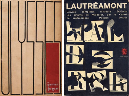
Ulysses (1934), designed by Ernst Reichl; Complete Works of Isidore Ducasse (1967), designed by Pierre Faucheux.
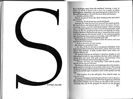
On the design front, that is, not the writing one. Ernst Reichl’s design for the 1934 Random House edition of James Joyce’s Ulysses (the first US edition) has a cover which isn’t so different to the many Art Deco-style bindings from around this time. Inside, however, there’s a significant innovation with his title spread, and the dramatic imposition of a huge capital letter. Random House was presenting Ulysses as a major artistic statement, a quality which Reichl’s design reinforces when the page-filling capitals recur at the openings of each of the novel’s three sections.
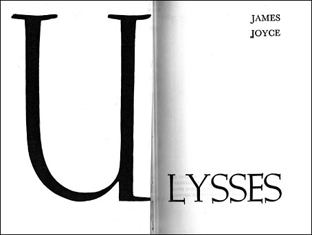
I encountered the huge S on the opening page in a book about Joyce shortly after I’d started reading the novel for the first time, and for years was under the impression that this had been a specific instruction of the author’s, a typographic flourish to add to the rest of the formal manipulations. I’d suggest—insist, even—that all editions of Ulysses should adopt Reichl’s design. Martha Scotford at Design Observer looks at the book in more detail.
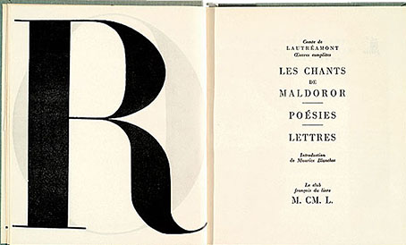
Les chants de Maldoror-Poésies-Lettres (1950) by Lautréamont. Le club français du livre.
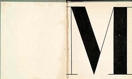
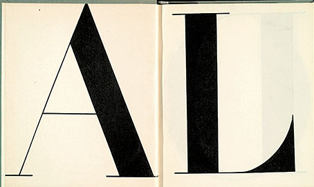
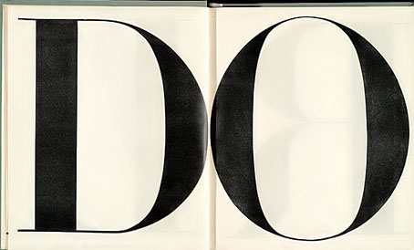
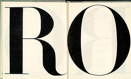
Pierre Faucheux went one further with his grandiose opening for Les chants de Maldoror-Poésies-Lettres by filling the opening of the book with Didot capitals which spell out M-A-L-D-O-R-O-R on each page before the title is reached. This is the design equivalent of shouting in the reader’s face when the book is opened; given the nature of the text I can imagine the author approving. I’ve no idea whether the idea was borrowed from Reichl but Faucheux was a very inventive designer who was quite capable of arriving at such a layout on his own. His cover for a 1967 reprint of the book (above) spells out the title by tearing up the earlier Didot capitals. Rick Poynor at Design Observer (again) looked at more of Faucheux’s covers for the Livre de Poche imprint, while at Eye magazine there’s an essay by Richard Hollis about Faucheux’s innovations.
Previously on { feuilleton }
• Maldoror
• Covering Joyce
• Books of blood
• Magritte’s Maldoror
• Frans De Geetere’s illustrated Maldoror
• Maldoror illustrated