
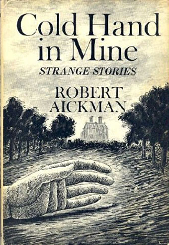
Scribner’s edition (USA, 1978).
I’m still working through the Robert Aickman stories so curiosity had me looking up the covers of his first editions. Edward Gorey was a fitting choice as artist for Aickman’s fifth story collection, Cold Hand in Mine, and it’s interesting seeing his work labelled on both these books as “strange stories”; paperbacks tended to brand his fiction as horror which isn’t always accurate. We’re back with that term “weird” again: reading Aickman today is like finding the quotidian Britishness of Alan Bennett darkening into the inexplicable nightmares of David Lynch. Gorey’s gloomy renderings suit these atmospheres a lot better than later attempts to package Aickman’s books so it’s a shame he wasn’t allowed to illustrate more of them. Cold Hand in Mine has recently been republished by Faber, together with two more collections of Aickman’s stories.
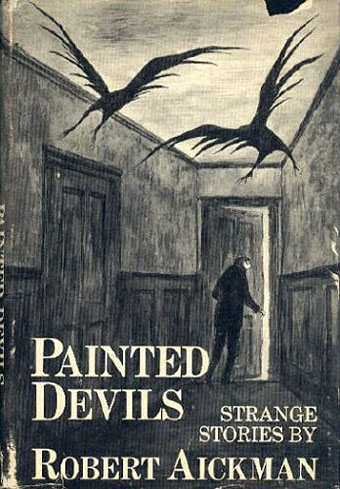
Scribner’s edition (USA, 1979).
Edward Gorey illustrated and designed many book covers, not all of them horror or ghost stories. This Flickr set has some of the more notable examples which includes Cold Hand in Mine. Also a flaming spider… There are more covers at Gorey Books where I was surprised to find he’d produced a cover for A Room in Chelsea Square, an early novel of gay life in London by Michael Nelson that was originally published anonymously to spare the author the attentions of intolerant authorities. Gorey’s drawing is like something Philippe Jullian might have done had he been a more careful draughtsman.
• See also: Edward Gorey’s Elephant House for more covers and Gorey ephemera.
Elsewhere on { feuilleton }
• The book covers archive
• The illustrators archive
Previously on { feuilleton }
• Weird Fiction Review
Thanks for those, John.
This book of correspondence between Gorey and Peter F. Neumeyer looks intriguing. : http://tinyurl.com/68wx5og
I love the idea of those illustrated envelopes and they’re inspiring me to revive an old habit of ‘snail mail’ …
Must admit I’m not a fan of Gorey’s Aickman covers. Far too cartoony for my liking, and at odds with the peculiar cold reserve of the author’s voice descending into nightmare. Although I’m not too impressed with the current crop of Tartarus reprint covers either (with the exception of Stephen J Clark’s Sub Rosa image), I feel the more classical deployment of a detail within a large border works better. Stephen Thrower’s minimalist efforts for the collected volumes were suitably mysterious, if lacking in substance, but I’m undecided what would truly complement those amazing stories. Andrzej Klimowski at his weirdest might be a good choice, or Veronique Meignaud’s line work. Ultimately I’m drawn (sorry about the pun) to Vania Zouravliov. The discipline of his stippling technique combined with a demonic imagination would suit Aickman down to the (charnel) ground.
Mr Kenneth: I’ve never done that with envelopes myself, despite having had enough opportunity. Some artists seem to like it, however. My colleague at Savoy Books, Kris Guidio, always embellishes his mail with drawings and elaborate lettering.
Dave C: If I was designing for Aickman I’d probably try an all-typographic approach although that may not help the books. Despite the history of all-type covers (Penguin, Faber, Gollancz et al) people respond to pictures. So the question then becomes one of what picture you’d use. Direct illustration is a bad idea for anything as ambiguous as Aickman’s work although I’d love to see what Klimowski could provide. Some of Alexei Titarenko’s photos would work really well if you omitted the ones with Russian signage.
“Gorey’s drawing is like something Philippe Jullian might have done had he been a more careful draughtsman” : I like that !