
Image-heavy post! Please be patient.
Four designs for three bands, all by the same designer, the versatile and brilliant Barney Bubbles. A recent reference over at Ace Jet 170 to the sleeve for In Search of Space by Hawkwind made me realise that Barney Bubbles receives little posthumous attention outside the histories of his former employers. Since he was a major influence on my career I thought it time to give him at least part of the appraisal he deserves. His work has grown in relevance to my own even though I stopped working for Hawkwind myself in 1985, not least because I’ve made a similar transition away from derivative space art towards pure design. Barney Bubbles was equally adept at design as he was at illustration, unlike contemporaries in the album cover field such as Roger Dean (mainly an illustrator although he did create lettering designs) and Hipgnosis (who were more designers and photographers who drafted in illustrators when required).
Colin Fulcher became Barney Bubbles sometime in the late sixties, probably when he was working either part-time or full-time with the underground magazines such as Oz and later Friends/Frendz. He enjoyed pseudonyms and was still using them in the 1980s; Barney Bubbles must have been one that stuck. The Friends documentary website mentions that he may have worked in San Francisco for a while with Stanley Mouse, something I can easily believe since his early artwork has the same direct, high-impact quality as the best of the American psychedelic posters. Barney brought that sensibility to album cover design. His first work for Hawkwind, In Search of Space, is a classic of inventive packaging.
Update: BB didn’t work with Mouse in SF, I’ve now been told.
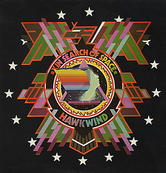
Hawkwind: In Search of Space (1971).
It’s fair to say that Hawkwind were very lucky to find Barney Bubbles, he immediately gave their music—which was often rambling and semi-improvised at the time—a compelling visual dimension that exaggerated their science fiction image while still presenting different aspects of the band’s persona. In Search of Space is an emblematic design that opens out to reveal a poster layout inside. One of the things that distinguishes Barney Bubbles’ designs from other illustrators of this period is a frequent use of hard graphical elements, something that’s here right at the outset of his work for Hawkwind.
This album also included a Bubbles-designed “Hawklog”, a booklet purporting to be the logbook of the crew of the Hawkwind spacecraft. I scanned my copy some time ago and converted it to a PDF; you can download it here.
The In Search of Space sleeve unfolded.
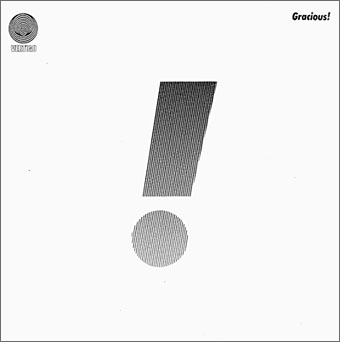
Gracious! by Gracious! (1970).
The shifting identity of Barney Bubbles means that many works such as this are omitted from listings. Gracious! was one of the first releases on the Vertigo label and the design was credited to “Teenburger”. The bold exclamation mark is printed on textured (bubbled?) card while the interior (below) featured a three-dimensional Richard Hamilton-style tableau. This band also connects Barney Bubbles and Roger Dean, another artist whose work was increasingly used by Vertigo. The second Gracious! album featured a Dean cover which kept the exclamation mark design.
Gracious! gatefold interior.
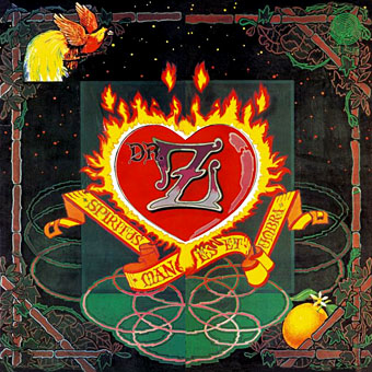
Dr Z: Three Parts to My Soul (1971).
In the 1970s even the most obscure bands could receive lavish cover treatment. This more typical design for the Vertigo label had two flaps that opened out from the centre with a heart-shaped hole cut in the middle.

Hawkwind: Doremi Fasol Latido (1972).
I hadn’t realised until I started assembling these images how much Barney’s work seemed to go through phases of influence. For the third Hawkwind album he must have been looking at the kind of superhero comic art exemplified by Jack Kirby. The Doremi cover is a black and white drawing (printed in silver ink on the original sleeve) done in the style of Kirby’s familiar reflective metal strips. The inner sleeve was even more Kirby-like although less successful, a squadron of barbarians on horseback with a sacked city burning in the distance and flying saucers drifting overhead. The fold-out poster below was free with initial pressings.
Hawkwind: Star Rats—poster with the Doremi album (1972).
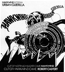
Hawkwind: Urban Guerilla single ad (1973).
This artwork in this ad design was part of a series of black and white posters all created around the time of the Doremi album that still exhibited the bold influence of Jack Kirby. This particular picture, however, is lifted directly from a Lone Sloan strip by French comic artist Philippe Druillet, Les Iles du Vent Sauvage (1970). (You can see part of the drawing on this page.) I later swiped from Druillet myself so I’m not one to criticise. In fairness, the comic strip figure only had the helmet and the shield, Barney adds an elaborate sword and a new background.
Update: thanks to comments from Rebecca and Mike below, I was reminded of the title of the picture above and so was able to find the poster version and its companions. You can see all five posters here.
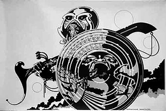
Fanon—Dragon Commando.
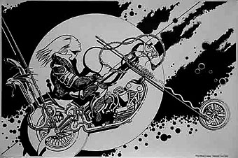
Prince Minksy’s chopper.
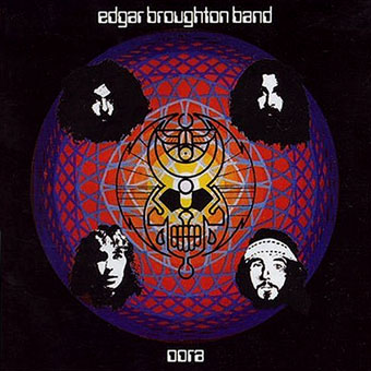
Edgar Broughton Band: Oora (1973).
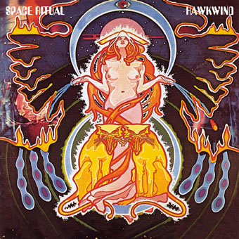
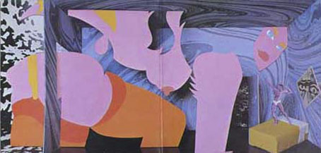
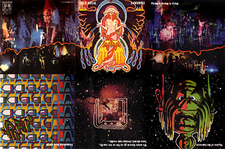
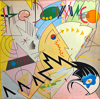
Hawkwind: Space Ritual (1973).
The definitive Hawkwind design and one of my favourite album covers. Barney’s work had now moved away from comic books into a kind of cosmic Art Nouveau with the band’s dancer, Stacia, here presented in the style of Alphonse Mucha. The lion heads were based on a head in Mucha’s L’Emeraude from 1900. Mucha also favoured a combination of illustration with hard graphics so it’s easy to see why Barney would respond to this. Much of the Hawkwind ad art of the time features Mucha-styled borders.
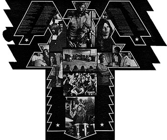
Space Ritual is justly celebrated for its poster sleeve which opens out to six panels. Barney’s graphics for the interior were developments of the work he created for the Hawkwind logbook, a blend of drawn or painted graphics with “significant” photos, in this case Edwardian erotica, atomic structures, a foetus floating among stars, etc. The example below is crudely composited from the CD reissue; it was too much effort to photograph the original sleeve and it doesn’t make much difference at this size anyway.
The Space Ritual tour programme also came as a fold-out poster, featuring a pulpy sf story and pictures of the band among the Mucha flourishes. Once again, I made my copy into a PDF which you can download here.
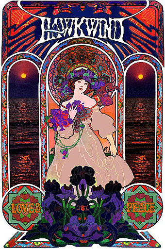
Hawkwind: Love & Peace poster (circa 1973).
The Mucha influence continued in this promotional poster whose figure and design is based on the Champagne White Star artwork for Moet & Chandon (1899).
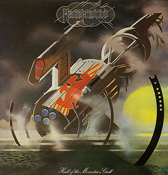
Hawkwind: Hall of the Mountain Grill (1974).
The most illustrational of all his Hawkwind sleeves and a picture that could easily have worked as one of his monochrome designs.
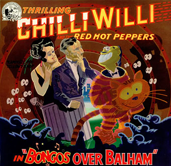
Chilli Willi and the Red Hot Peppers: Bongos Over Balham (1974).
The sleeve for Mike Moorcock’s Deep Fix album below was (according to Moorcock) a real wooden fairground booth that Barney constructed, painted then photographed.
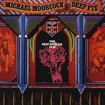
Michael Moorcock & the Deep Fix: New Worlds Fair (1975).
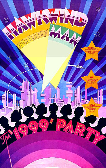
Hawkwind: The 1999 Party—tour poster (1975).
The shift of emphasis in the mid-Seventies was away from Art Nouveau towards Art Deco poster graphics, a style evident in all the 1999 Party tour artwork and the two sleeves that follow.
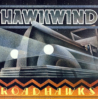
Hawkwind: Roadhawks (1976).
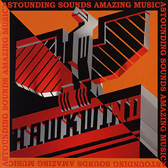
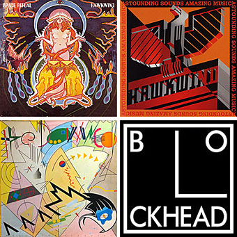
Hawkwind: Astounding Sounds, Amazing Music (1976).
The final Hawkwind design isn’t just Art Deco, it’s almost fascist, looking like a piece of Soviet propaganda art topped by a Nazi eagle. Hawkwind singer Bob Calvert spoke of the band being reorganised after this album along the lines of “a Stalinist purge” so maybe the design is appropriate.
1976 was the year of a Stalinist purge in British music as a whole. With the advent of punk Barney successfully made the transition from hippy designer to punk designer. If anything, punk gave him a new leash of life as his tremendous sleeve for the second Damned album demonstrates. His association with Stiff Records and Radar Records was the second major phase of his career after Hawkwind and gave him the opportunity to explore a range of influences from early 20th century design.
The Damned sleeve is a Kandinsky-esque portrait of the band with the group’s name spelled out using abstract shapes, an approach to album lettering he was to use for other artists as the decade progressed. I was especially taken with this album at the time and referred to it in an exam essay I had to write about album covers.
The Damned: Music For Pleasure (1977).
The very wide letter spacing used on the titles of these albums was a common feature of his Stiff designs, one of a number of habitual effects that became prevalent in work from subsequent designers.
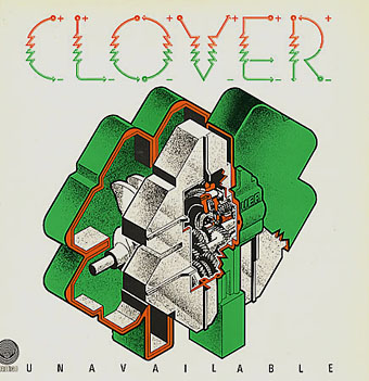
Clover: Unavailable (1977).
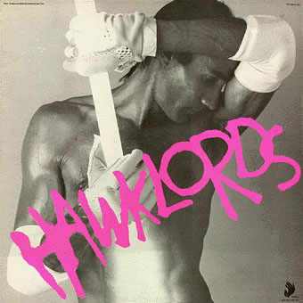
Hawklords: 25 Years On (1978).
Hawkwind became Hawklords for one album and a tour in 1978. Barney was commissioned to help create the stage show and develop the vague science fiction concept of Pan Transcendental Industries around which the album was based. The result was a very up-to-the-minute presentation which the band discarded immediately afterwards. This was Barney’s last work for Hawkwind. I’ve always found this cover distinctly erotic but I doubt you want to know about that here.
Nik Turner’s Sphinx: Xitintoday (1978).
Sax player Nik Turner was thrown out of Hawkwind in the 1976 band purge but he remained friends with Barney Bubbles. When Turner came to record his solo album, Xitintoday, Barney was asked to create the packaging. The album is a concept affair based around the Egyptian Book of the Dead but Barney’s design for the sleeve and accompanying booklet avoids hippy cliches with a use of abstract graphics or arrangements of lettering; the cover design, for example, features stars made up of the word “twinkle”. The pair continued to work together for Turner’s later band, Inner City Unit.
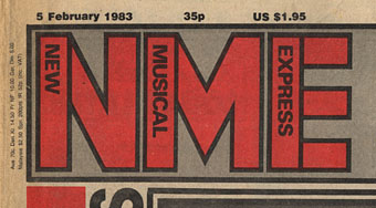
1978 was also the year Barney was asked to help with the redesign of the NME. His new logo remained in use up to the late 80s and forms the basis of the current (degraded) logo design.
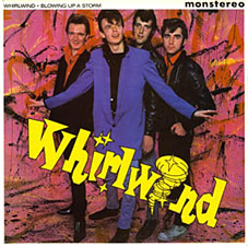
Whirlwind: Blowing Up A Storm (1978).

Ian Dury & the Blockheads: logo design (late 70s).
The association with Stiff Records led to one of Barney’s most famous works, the Blockhead logo. If he’s remembered for anything it should be for this simple, brilliant and witty graphic.
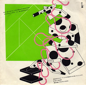
Ian Dury & the Blockheads: Hit Me With Your Rhythm Stick (1978).
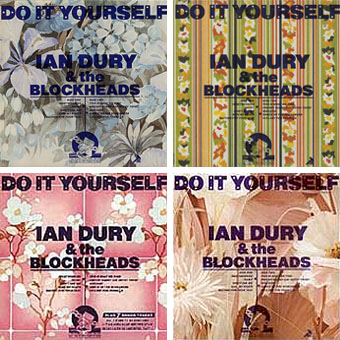
Ian Dury & the Blockheads: Do It Yourself (1979).
His inventiveness came to the fore again with his cover designs for Ian Dury. This sleeve was printed in twelve different versions onto real sheets of wallpaper. The design acts not only as a comment on the home improvement alluded to in the title but also a request for the purchaser to make a choice of their own among the different styles.
Radar Records logo (1978).
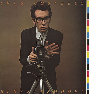
Elvis Costello & the Attractions: This Year’s Model (1978).
Initial pressings were made to look like deliberate misprints, showing CMYK colour bars and cutting off the letters of the artist name and title, a quirk abandoned on subsequent editions.
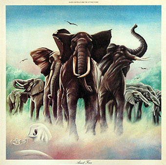
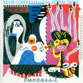
Elvis Costello & the Attractions: Armed Forces (1979).
The David Shepherd-style elephants on this cover do little to hint at the exceptional interior design, probably Barney’s most extravagant work since Space Ritual, and certainly its equal. The sleeve opens out to further extend the interpretation of the title and includes Mondrian and Jackson Pollock stylings among its animal-print abstractions. To save page-loading time there’s a page here where you can see the full effect for yourself. Thanks to LondonLee for the photos.
Update: Tim Niblock in the comments notes that this package was produced in association with Bazooka Graphics, France.
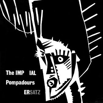
The Imperial Pompadours: Ersatz (1982).
Not many people know Barney Bubbles had a band. The Imperial Pompadours was Barney plus Nik Turner and other members borrowed from Inner City Unit. They recorded this one unhinged rock’n’roll album on a very restricted budget. Read The Seth Man’s review of it here.
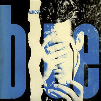
Elvis Costello & the Attractions: Almost Blue (1981).
Work at Radar continued with covers for all the early Elvis Costello albums. Almost Blue prefigures the look of many sleeve designs that came later in the decade while Imperial Bedroom featured a painting of Barney’s pastiching Picasso (“Snakecharmer & Reclining Octopus by Sal Forlenza, 1942”). Despite his increasing success and a growing reputation among younger designers these were to be his last works. Friends say he’d always been something of a depressive and late in 1983 he evidently reached some kind of crisis and took his own life. Roy Carr wrote an obituary for the NME.
Elvis Costello & the Attractions: Imperial Bedroom (1982).
Barney Bubbles’ work is continually featured in histories of album cover design but he was more than just a cover designer. We’re overdue a decent book-length examination of his work and his influence.
Update: The book is on its way. And David Wills’ new blog features his reminiscences about art school life with Barney. Good things come to those who wait.
Update 2: Reasons to be Cheerful: The Life and Work of Barney Bubbles by Paul Gorman was published by Adelita on December 4th, 2008. Paul Gorman writes about it here and I featured an extract here.
Elsewhere on { feuilleton }
• The album covers archive
“As a long-standing Bubbles fan I was overjoyed to find the new book. Strangely I already had tickets to see the Blockheads and of course bought a T-shirt with the famous square Blockheads logo.
But funnily enough, the book does not mention the logo’s obvious origin. You can see the Left Book Club logo here:
http://www.wcml.org.uk/culture/lbcbooks.htm”
As has been noted on EyE blog
Hi Paul G
No I’m not Yolanda’s Paul but Happy Xmas to you and all Bubblers. And enormous thanks for doing the book, it made my heart jump for joy to see it. It sits proudly with the Factory book, other album cover books and many records featured in ’em.
Hi Paul G (again)
Another observation from your fantastic book: relating to the mysterious ‘3’ logo on Get Happy. Although ‘none of those involved in its release know what it symbolises’ (p145), it actually says 3D, not just 3, if you look at the bit at the bottom of the logo too. This seems to connect with the spot colour scheme of opposites and ‘out of line’ printing, especially on the inner sleeve – it resembles something to view through (red and green) 3D glasses. This also fits the LP title, ‘worn old favourite’ sleeve and 50s retro image, an instruction to Get Happy imposing a forced happiness of gimmicky cheap 50s escapism, in retro contrast to an 80s recession. (The off centre circles may also echo the dart of Gerry Anderson’s Century 21 logo used in the titles of Captain Scarlet.)
Also a correction (p90) – Ian Dury died on 27 March 2000, not 2001.
Best wishes
I know I know…Thanks for your comments/corrs Paul. An event occurred in our business dealings over the weekend the final pages were going to the printers which completely blind-sided us and not only threatened to capsize the whole project but sent things into a spin.
No excuses, but maybe someday the story can be told (that’s if anybody is even interested). I will not go into this in a public forum – suffice to say that lawyers are working on it.
But your points do go to a major element in putting this book together and one which proved a major hurdle for anybody else sticking their heads above the parapet and doing it previously.
Apart from the fact that very little had been documented, BB’s working practices were so layered, and his references/quotes/sources/cryptography winging in from every which way that its is only now – that I have set out 600 images spanning his entire career – there is at least some clarity in attribution/meaning/etc.
As I say – no excuses and I am certainly not depicting your’s and other’s comments as pedantry. I got things wrong; over to you as to whether anybody else could have done a better job or whether it was worth doing in the first place.
Dear Paul G
Make no mistake, your book is fantastic. Rest assured, it was absolutely worth doing and warm thanks for putting it together. It filled in far more gaps in my knowledge than my one or two observations, and I can see that you have done a lot of work pulling together as much info as possible. I’m only adding my tuppence worth in the interests of (hopefully) accuracy and adding a few scraps to our knowledge of Barney. You got lots & lots right – a great, pioneering effort – well done!
On Sunday 8 March 2009, there will be a Sunday Implosion at The Roundhouse, Chalk Farm, London, as a memorial tribute to Barney Bubbles. Featuring the Hawklords (a band comprising former members of Hawkwind), this event is inspired by Barney’s creative art, design, cosmology and the stage presentation of his and Robert Calvert’s original Space Ritual 1973 space-rock-opera show, with a hefty nod to his concept for the Hawklords 25 Years On production of 1978.
The event will run from 3.00pm – 11.00 pm and will feature performers and performance all day, including Robert Calvert’s play ‘The Stars That Play With Laughing Sam’s Dice’ (for which Barney designed the stage set), performed by the Pentameters Theatre Group. It is also hoped to have an exhibition of Barney’s work and copies of the book for sale.
More information is avialable at http://www.roundhouse.org.uk/whats-on/productions/the-space-ritual-2009-2925
Tickets are available from http://www.roundhouse.org.uk or 0844 482 8008
The Clover cover reminded me somewhat of TenCC’s album cover of the phone and inner human ear, and the Edgar Broughton Band a little like an old Vertigo swirlie Cressida album I have.
Hi Jeni. The 10cc album you mention (How Dare You) was designed by Hipgnosis with illustrations by George Hardie. Hardie worked a lot for Hipgnosis and was very fond of the kind of isometric perspective seen on the Clover cover. Barney B was working for Vertigo at the same time as Hipgnosis in the early Seventies but I’ve not seen any mention that they knew each other. I’d be surprised if they didn’t but Barney isn’t mentioned in any of the books about Hipgnosis.
Report on an absolute rarity today:
http://www.barneybubbles.com/blog/archives/876
Not Barney Bubbles. Photography by Colin ‘Glans’ Glanfield, and design by David ‘Warfarin’ Wharin. Commonly known as..colin and david..
I checked on the website printed on the 1975 LP cover. Which I would have otherwise ignored.
Storm Thorgerson of Hipgnosis did know BB. Thorgerson does not particularly rate Barney as his cup of tea, but declared that he likes the Art on the Damned LP produced by Nick Mason
Hi
A post which may be of interest – record label Trensmat’s remake/remodelling of Barney Bubbles Hawkwind artwork for the sleeves/labels for it’s series of split 7″ cover versions of the band’s songs by contemporary groups.
Also posted the letterhead for Hawk Graphics.
See here: http://www.barneybubbles.com/blog/archives/1013
Best
PJG
Just thought you might like to know that Reasons To Be Cheerful is out in the US from August 9. We are planning a series of events in American cities to tie in with the launch.
See here for more details: http://www.barneybubbles.com/blog/archives/1332
tks for the effort you put in here I appreciate it!
You can see some rare footage of Barney Bubbles working at Friends, on YouTube: http://www.youtube.com/watch?v=cIgPCDAVTlM
The sequence of Barney appears from 2m01s to 2m05s (the guy in the sheepskin waistcoat who walks across the room and sits down at some artwork). Either side of that there’s some interesting footage in general.
There’s some more info about the context of this find on David Wills’ blog: http://davidwills.wordpress.com/2009/10/22/world-scoop-see-barney-move-make-your-own-barney-flip-book/
I agree…. I too have found the Hawklords cover distinctly erotic but I doubt you want me to talk about that here. LOL
I have always…. ALWAYS been into metaphysics and science fiction to the extent that it expresses the infinity of mind unfolding and futurism… so I find the Hawklords album (promotional copy) bought so many records in the used record stores in Hollywood over the years… more often are promos… but this odd discovery of your site comes from searches today which took me to Motorhead’s Ian Kilmister’s “Serial Killer” dialogue on YouTube and then subsequent searches which found my way to Hawkwind and Hawklords… to which my brain said… “Hey… I’ve got that record”…. don’t have the heavy metal stuff…. eeeeeeewwwwwwwwww. Did I say that? LOL I’ve got a large vinyl collection from 60’s… 70’s…. some 80’s… gets less and less as the years h a v e g o n e by.
Trying to find John Muggeridge
any help gratefully received
Lia
(formerly Sarah Seagull so named by Barney Bubbles)
in London for one week
has anyone got a contact number 4 caramel crunch………….?pauline williams…old friend tryin t contact from australia.