
Image-heavy post! Please be patient.
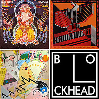
Four designs for three bands, all by the same designer, the versatile and brilliant Barney Bubbles. A recent reference over at Ace Jet 170 to the sleeve for In Search of Space by Hawkwind made me realise that Barney Bubbles receives little posthumous attention outside the histories of his former employers. Since he was a major influence on my career I thought it time to give him at least part of the appraisal he deserves. His work has grown in relevance to my own even though I stopped working for Hawkwind myself in 1985, not least because I’ve made a similar transition away from derivative space art towards pure design. Barney Bubbles was equally adept at design as he was at illustration, unlike contemporaries in the album cover field such as Roger Dean (mainly an illustrator although he did create lettering designs) and Hipgnosis (who were more designers and photographers who drafted in illustrators when required).
Colin Fulcher became Barney Bubbles sometime in the late sixties, probably when he was working either part-time or full-time with the underground magazines such as Oz and later Friends/Frendz. He enjoyed pseudonyms and was still using them in the 1980s; Barney Bubbles must have been one that stuck. The Friends documentary website mentions that he may have worked in San Francisco for a while with Stanley Mouse, something I can easily believe since his early artwork has the same direct, high-impact quality as the best of the American psychedelic posters. Barney brought that sensibility to album cover design. His first work for Hawkwind, In Search of Space, is a classic of inventive packaging.
Update: BB didn’t work with Mouse in SF, I’ve now been told.
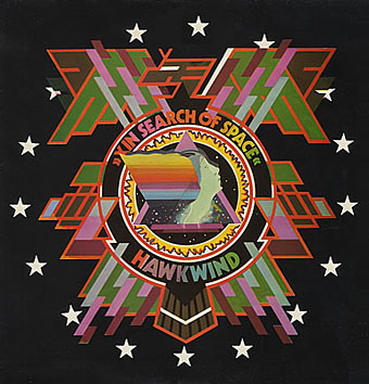
Hawkwind: In Search of Space (1971).
It’s fair to say that Hawkwind were very lucky to find Barney Bubbles, he immediately gave their music—which was often rambling and semi-improvised at the time—a compelling visual dimension that exaggerated their science fiction image while still presenting different aspects of the band’s persona. In Search of Space is an emblematic design that opens out to reveal a poster layout inside. One of the things that distinguishes Barney Bubbles’ designs from other illustrators of this period is a frequent use of hard graphical elements, something that’s here right at the outset of his work for Hawkwind.
This album also included a Bubbles-designed “Hawklog”, a booklet purporting to be the logbook of the crew of the Hawkwind spacecraft. I scanned my copy some time ago and converted it to a PDF; you can download it here.
The In Search of Space sleeve unfolded.
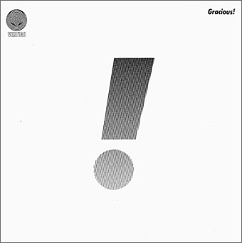
Gracious! by Gracious! (1970).
The shifting identity of Barney Bubbles means that many works such as this are omitted from listings. Gracious! was one of the first releases on the Vertigo label and the design was credited to “Teenburger”. The bold exclamation mark is printed on textured (bubbled?) card while the interior (below) featured a three-dimensional Richard Hamilton-style tableau. This band also connects Barney Bubbles and Roger Dean, another artist whose work was increasingly used by Vertigo. The second Gracious! album featured a Dean cover which kept the exclamation mark design.
Gracious! gatefold interior.
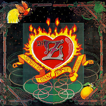
Dr Z: Three Parts to My Soul (1971).
In the 1970s even the most obscure bands could receive lavish cover treatment. This more typical design for the Vertigo label had two flaps that opened out from the centre with a heart-shaped hole cut in the middle.

Hawkwind: Doremi Fasol Latido (1972).
I hadn’t realised until I started assembling these images how much Barney’s work seemed to go through phases of influence. For the third Hawkwind album he must have been looking at the kind of superhero comic art exemplified by Jack Kirby. The Doremi cover is a black and white drawing (printed in silver ink on the original sleeve) done in the style of Kirby’s familiar reflective metal strips. The inner sleeve was even more Kirby-like although less successful, a squadron of barbarians on horseback with a sacked city burning in the distance and flying saucers drifting overhead. The fold-out poster below was free with initial pressings.
Hawkwind: Star Rats—poster with the Doremi album (1972).
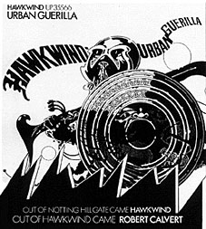
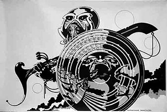
Hawkwind: Urban Guerilla single ad (1973).
This artwork in this ad design was part of a series of black and white posters all created around the time of the Doremi album that still exhibited the bold influence of Jack Kirby. This particular picture, however, is lifted directly from a Lone Sloan strip by French comic artist Philippe Druillet, Les Iles du Vent Sauvage (1970). (You can see part of the drawing on this page.) I later swiped from Druillet myself so I’m not one to criticise. In fairness, the comic strip figure only had the helmet and the shield, Barney adds an elaborate sword and a new background.
Update: thanks to comments from Rebecca and Mike below, I was reminded of the title of the picture above and so was able to find the poster version and its companions. You can see all five posters here.
Fanon—Dragon Commando.
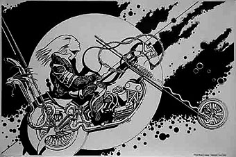
Prince Minksy’s chopper.
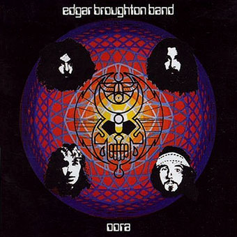
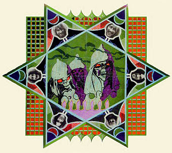
Edgar Broughton Band: Oora (1973).
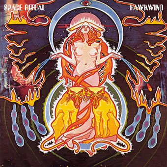
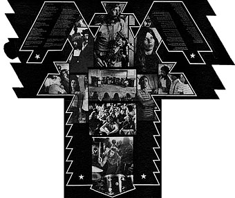
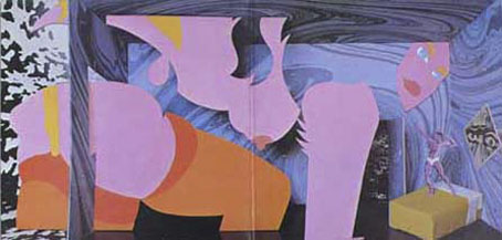
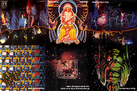
Hawkwind: Space Ritual (1973).
The definitive Hawkwind design and one of my favourite album covers. Barney’s work had now moved away from comic books into a kind of cosmic Art Nouveau with the band’s dancer, Stacia, here presented in the style of Alphonse Mucha. The lion heads were based on a head in Mucha’s L’Emeraude from 1900. Mucha also favoured a combination of illustration with hard graphics so it’s easy to see why Barney would respond to this. Much of the Hawkwind ad art of the time features Mucha-styled borders.
Space Ritual is justly celebrated for its poster sleeve which opens out to six panels. Barney’s graphics for the interior were developments of the work he created for the Hawkwind logbook, a blend of drawn or painted graphics with “significant” photos, in this case Edwardian erotica, atomic structures, a foetus floating among stars, etc. The example below is crudely composited from the CD reissue; it was too much effort to photograph the original sleeve and it doesn’t make much difference at this size anyway.
The Space Ritual tour programme also came as a fold-out poster, featuring a pulpy sf story and pictures of the band among the Mucha flourishes. Once again, I made my copy into a PDF which you can download here.
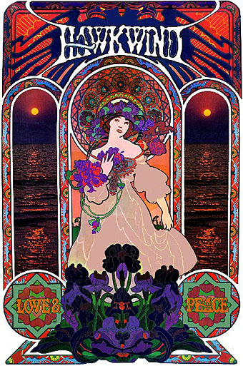
Hawkwind: Love & Peace poster (circa 1973).
The Mucha influence continued in this promotional poster whose figure and design is based on the Champagne White Star artwork for Moet & Chandon (1899).
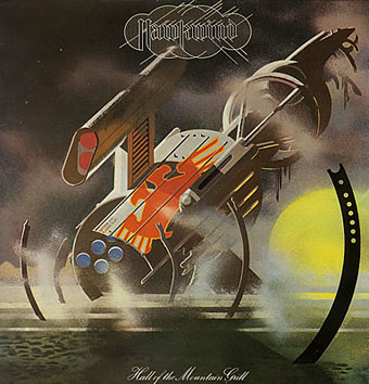
Hawkwind: Hall of the Mountain Grill (1974).
The most illustrational of all his Hawkwind sleeves and a picture that could easily have worked as one of his monochrome designs.
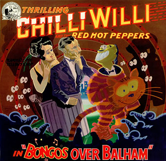
Chilli Willi and the Red Hot Peppers: Bongos Over Balham (1974).
The sleeve for Mike Moorcock’s Deep Fix album below was (according to Moorcock) a real wooden fairground booth that Barney constructed, painted then photographed.
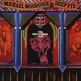
Michael Moorcock & the Deep Fix: New Worlds Fair (1975).
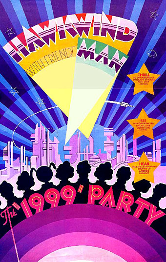
Hawkwind: The 1999 Party—tour poster (1975).
The shift of emphasis in the mid-Seventies was away from Art Nouveau towards Art Deco poster graphics, a style evident in all the 1999 Party tour artwork and the two sleeves that follow.
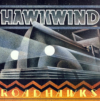
Hawkwind: Roadhawks (1976).
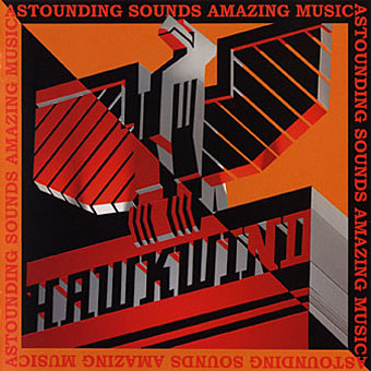
Hawkwind: Astounding Sounds, Amazing Music (1976).
The final Hawkwind design isn’t just Art Deco, it’s almost fascist, looking like a piece of Soviet propaganda art topped by a Nazi eagle. Hawkwind singer Bob Calvert spoke of the band being reorganised after this album along the lines of “a Stalinist purge” so maybe the design is appropriate.
1976 was the year of a Stalinist purge in British music as a whole. With the advent of punk Barney successfully made the transition from hippy designer to punk designer. If anything, punk gave him a new leash of life as his tremendous sleeve for the second Damned album demonstrates. His association with Stiff Records and Radar Records was the second major phase of his career after Hawkwind and gave him the opportunity to explore a range of influences from early 20th century design.
The Damned sleeve is a Kandinsky-esque portrait of the band with the group’s name spelled out using abstract shapes, an approach to album lettering he was to use for other artists as the decade progressed. I was especially taken with this album at the time and referred to it in an exam essay I had to write about album covers.
The Damned: Music For Pleasure (1977).
The very wide letter spacing used on the titles of these albums was a common feature of his Stiff designs, one of a number of habitual effects that became prevalent in work from subsequent designers.
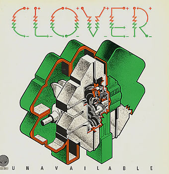
Clover: Unavailable (1977).
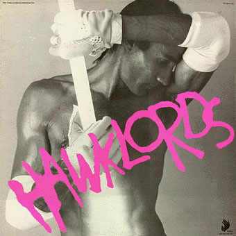
Hawklords: 25 Years On (1978).
Hawkwind became Hawklords for one album and a tour in 1978. Barney was commissioned to help create the stage show and develop the vague science fiction concept of Pan Transcendental Industries around which the album was based. The result was a very up-to-the-minute presentation which the band discarded immediately afterwards. This was Barney’s last work for Hawkwind. I’ve always found this cover distinctly erotic but I doubt you want to know about that here.
Nik Turner’s Sphinx: Xitintoday (1978).
Sax player Nik Turner was thrown out of Hawkwind in the 1976 band purge but he remained friends with Barney Bubbles. When Turner came to record his solo album, Xitintoday, Barney was asked to create the packaging. The album is a concept affair based around the Egyptian Book of the Dead but Barney’s design for the sleeve and accompanying booklet avoids hippy cliches with a use of abstract graphics or arrangements of lettering; the cover design, for example, features stars made up of the word “twinkle”. The pair continued to work together for Turner’s later band, Inner City Unit.
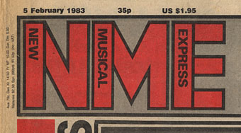
1978 was also the year Barney was asked to help with the redesign of the NME. His new logo remained in use up to the late 80s and forms the basis of the current (degraded) logo design.
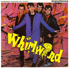
Whirlwind: Blowing Up A Storm (1978).

Ian Dury & the Blockheads: logo design (late 70s).
The association with Stiff Records led to one of Barney’s most famous works, the Blockhead logo. If he’s remembered for anything it should be for this simple, brilliant and witty graphic.
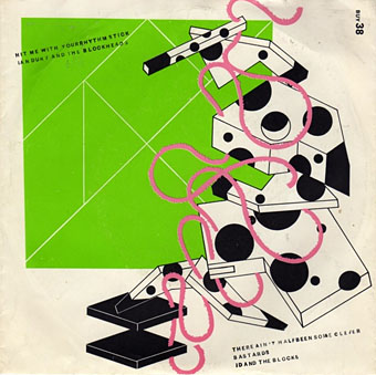
Ian Dury & the Blockheads: Hit Me With Your Rhythm Stick (1978).
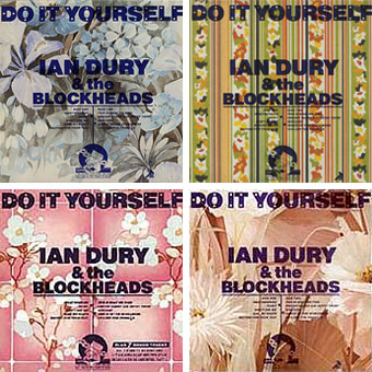
Ian Dury & the Blockheads: Do It Yourself (1979).
His inventiveness came to the fore again with his cover designs for Ian Dury. This sleeve was printed in twelve different versions onto real sheets of wallpaper. The design acts not only as a comment on the home improvement alluded to in the title but also a request for the purchaser to make a choice of their own among the different styles.
Radar Records logo (1978).
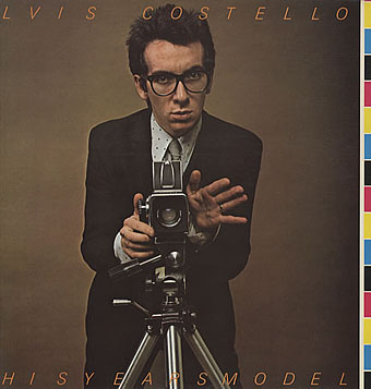
Elvis Costello & the Attractions: This Year’s Model (1978).
Initial pressings were made to look like deliberate misprints, showing CMYK colour bars and cutting off the letters of the artist name and title, a quirk abandoned on subsequent editions.
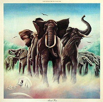
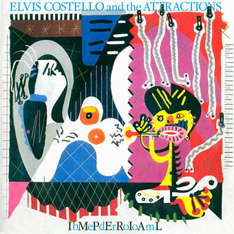
Elvis Costello & the Attractions: Armed Forces (1979).
The David Shepherd-style elephants on this cover do little to hint at the exceptional interior design, probably Barney’s most extravagant work since Space Ritual, and certainly its equal. The sleeve opens out to further extend the interpretation of the title and includes Mondrian and Jackson Pollock stylings among its animal-print abstractions. To save page-loading time there’s a page here where you can see the full effect for yourself. Thanks to LondonLee for the photos.
Update: Tim Niblock in the comments notes that this package was produced in association with Bazooka Graphics, France.
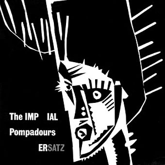
The Imperial Pompadours: Ersatz (1982).
Not many people know Barney Bubbles had a band. The Imperial Pompadours was Barney plus Nik Turner and other members borrowed from Inner City Unit. They recorded this one unhinged rock’n’roll album on a very restricted budget. Read The Seth Man’s review of it here.
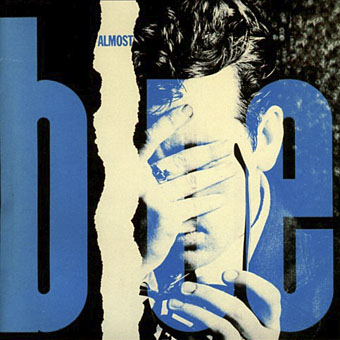
Elvis Costello & the Attractions: Almost Blue (1981).
Work at Radar continued with covers for all the early Elvis Costello albums. Almost Blue prefigures the look of many sleeve designs that came later in the decade while Imperial Bedroom featured a painting of Barney’s pastiching Picasso (“Snakecharmer & Reclining Octopus by Sal Forlenza, 1942”). Despite his increasing success and a growing reputation among younger designers these were to be his last works. Friends say he’d always been something of a depressive and late in 1983 he evidently reached some kind of crisis and took his own life. Roy Carr wrote an obituary for the NME.
Elvis Costello & the Attractions: Imperial Bedroom (1982).
Barney Bubbles’ work is continually featured in histories of album cover design but he was more than just a cover designer. We’re overdue a decent book-length examination of his work and his influence.
Update: The book is on its way. And David Wills’ new blog features his reminiscences about art school life with Barney. Good things come to those who wait.
Update 2: Reasons to be Cheerful: The Life and Work of Barney Bubbles by Paul Gorman was published by Adelita on December 4th, 2008. Paul Gorman writes about it here and I featured an extract here.
Elsewhere on { feuilleton }
• The album covers archive
Please, more by people who worked with Barney, that sounded really true Liam. “Mike and I talk Barney for hours” – tell all!
Hi Rian, thanks for dropping by, I’ve been following your work since the Eighties thanks to my skirmishes with the comics world.
I’ve also wondered how BB would have got on in the digital age. Some people made the transition very easily (I have a 1992 book called Designers on Mac featuring Neville Brody, April Greiman and the Emigre people talking about the new world of computer-oriented design); others, such as (IIRC) Peter Saville, have assistants to push the mouse around for them.
Hi, its been nice chatting with you folks, but I’m off to http://www.davidwills.wordpress.com
where I’ll be continuing to post away to my heart’s content, without having to take up valuable space here in John’s good log. Please pop in to visit, lots to see and do.
David: I’ve added a link to your page above. Welcome to the blog world!
A Genius think what he would have went onto.
He has influenced my career so much, I feel I owe him.
Never reached your peaks and it’s terrible you’ve gone.
James
Barney’s work touch us all as units of popular culture I had and still have some of these great Albums and know of some of the clips he produced. I am sure the artists he worked for benifited from his creative and unusal design quility’s. Such a short life but some times great work comes out under these situations. Great tribute to a great designer keep up the great work. Will view in more detail in the future.
Looking at your great collection of Bubbling art I have a feeling that the Hawkwind, Fanon Dragon Commando, cover was drawn by, or in the style of, the mysterious Chris Higson, whose inking skills I see at work here, he was a good buddy of Barney – he put him in touch with Stiff. He’s also another often anonymous artist – he drew inked and colored the Eagle comics, Churchill, and Marco Polo, both of which are credited to Frank Bellamy (because of illness, and contracts).
Gate keeper John, please correct # 154, should be, “I’ll be continuing to post away to my heart’s content,”
Your wish is my command!
Where is Barney’s graphic-enabler Andrew Lauder now? Tell him he deserves Knighthood. Any relation of Harry?
Andrew is alive and well. If you would like to get in touch with him – please drop me a line
A comment on another blog has prompted us to revisit Malcolm Garrett’s comment (#44) which goes:
[quote]…Barney knew well the technical parameters he was working within and maximised the use of this size of board for the ‘Glastonbury Fayre’ album, which as a triple album would require that amount of card in any event, and thus suggested one large folding sleeve with no gluing required.
The practical success of that sleeve, gave him the leeway to utilise the same format for the live Hawkwind album shortly afterwards…
Without this design intelligence which allowed him to make smart use of ’standard’ size boards, that he realised would have been hard to argue with on an economic standpoint, it is doubtful that such radical designs would have been signed off so readily by cost conscious record executives…
I can’t think of any ‘real’ graphic designers working in the field of record sleeve design in this way before Barney… [/quote]
Yep, Barney was certainly exploiting things to the max by using a 6 panel fold-out sleeve on releases like ‘Glastonbury Fayre’ (Revelations 1972) and ‘Hawkwind: Space Ritual’ (UA 1973), but it would be remiss of us not to point out that other designers were doing this before Barney. Some examples that spring to mind are Nigel Thomas’ 6 panel fold-out ‘Juicy Lucy: Lie Back and Enjoy It’ (Vertigo 1970) and Roger Dean’s 6 panel fold-out ‘Ramases: Space Hymns’ (Vertigo 1971). These earlier examples had probably already started to make the economical case for such formats, and may have even provided the impetus for Barney to use the same format; who knows? Given Barney’s relationship with Vertigo in 1970/71, it is difficult to believe he wouldn’t have been aware of what they were doing.
And… thinking about the conversations we’ve had with Revelations erm… ‘executives’, it’s doubtful that any economic case had to be made anyway on the ‘Glastonbury Fayre’ release!
Now… if anyone knows a 6 panel fold-out sleeve designed by Barney that pre-dates 1970, we’d love to know about it!
Here’s a couple links to those earlier 6 panel fold-out sleeves:
http://www.popsike.com/php/detaildata.php?itemnr=230205953316
http://www.vintageprog.com/sh_cover.jpg
Don’t you think In Search of Space counts as six panels as well? Looks that way to me.
Vertigo certainly seems to be the key for this kind of experimentation: there was also Barney’s Doctor Z sleeve and Heavy Petting by Dr Strangely Strange, another cut-out panelled sleeve by Roger Dean. And I’ve got the Ramases album; great to look at, less enjoyable to listen to!
Hullo,
Yep, ‘Hawkwind: In Seach of Space’ (UA 1971) and ‘Dr Z: Three Parts To My Soul’ (Vertigo 1971) certainly do count as 6 panels; but both of these are similarly pre-dated by Nigel Thomas’ 6 panel ‘Juicy Lucy: Lie Back and Enjoy It’ (Vertigo 1970) and the 6 panel die-cut Roger Dean design you mentioned; ‘Dr Strangely Strange: Heavy Petting’ (Vertigo 1970) whose folding and die-cut complexity can be seen here http://www.popsike.com/php/detaildata.php?itemnr=120218368426
Wonder what else lurks out there?
For anyone who missed the exhibition of Barney’s work we staged in 2001, you can see some pics of it here (we’ve also written a few words about it in the ‘comments’ section of that page too): http://davidwills.wordpress.com/2008/09/26/rebecca-and-mikes-great-barney-bubbles-exhibition-of-ad2001/
(part of David Wills’ blog).
Hi again John / David and Co
not been here for a bit – and just seen Davids confirmation to my comments 8 months back ( Mr D Rider ) of BBs love for Paolozzi – I knew it – its in the work – especially the inner sleeves for Ritual and the Oz posters. – I wonder if they met ?
Paolozzi was a huge influence to many of us -of course – and the 1956 show at the ICA was the big one – with his Light Show of found images – with an epidioscope – pretty far out then – hot from paris no doubt – but that mid 50s ‘Independent group’ shook things up for the year. ( Theo Crosby set that up i think ? )
Did any of you folks out there work with Ambit ? when Paolozzi was there – I have some old issues late 60s with his work in under the Pseudonym ‘Arturo Laskus’ – great drawings
– EP was great teacher and i will never his presence around the RCA – especially in the LIFT
thanks for all this John – the site just gets better and better – come to Manchester and talk to us and the students please whenever suits
With reference to Ambit, the review published by Martin Bax, I’m pretty sure he still has an airing cupboard full of back issues. I obtained some from his son who liberated them for me in 1986 when I stayed at their house back in the ’80s. I recall Robert calvert of hawkwind fame contributed some of his superb poetry within Ambit during those times
Yes Ambits right through to the 90s were rich with that Ballard Paolozzi surrealist vein – Martin and Michael ran /run a great ship there. I have some brilliant copies from early 70s an unusual bold cover stock and size format and front covers were always top Draw !
David: link business sorted!
There is a double page spread in this month’s The Word magazine (datelined November) on Reasons To Be Cheerful. Enjoy.
A good friend of ours, Brian Griffin, is having an exhibition in London soon which will feature some of the projects he did with Barney. We thought that maybe the folk who read JCs growing Barney bible here might like to know about it.
On show will be the newspaper ‘Y’, the books ‘Copyright 1978’ and ‘Power’, and associated posters, including the ‘coat hanger and scarf’ poster for Brian’s photo show in 1980. All of these (apart from ‘Power’) will be available to buy too (we think)… so, if you want to, you can bag yourself an early Christmas present (and help put some turkey on Brian’s table!)
Here’s the details: Brian Griffin, 15 November – 8 December 2008 , Monday – Saturday 11 – 6, at ‘England & Co.’, 216 Westbourne Grove, London W11 2RH.
The ‘Y’ newspaper’s got a real chunky red button on the cover (in a little plastic bag); symbolic of the nuclear button we-thinks, and there’s a great concentric circle graphic on the cover too, which is reminiscent of a few things, like the back of the not-used Dury ‘4000 Weeks Holiday’ LP sleeve design and also the front of the never released ‘Station BPR’ LP sleeve (which was due to be the second release on Billy Bragg’s ‘Utility’ label). There’s also an illustration in ‘Y’ by Nazar Ali Khan of ICU fame.
The ‘Copyright 1978’ booklet is cool too; with nearly every one of Brian’s photos in it being accompanied by thumbnail graphics by Barney, which contain cryptically encoded comments. The one that always sticks in our mind is the one that questions whether it is good or bad to receive awards for your work.
– – – – – – – – – – –
And whilst we’re tappety-typing away here: Barney paid homage to Brian in the Hawklord’s tour booklet (check out the first words of the first paragraph) and here are some of our favourite Barney Bubbles / Brian Griffin music sleeves:
Johnny Moped: Little Queenie 7″, The Rumour: Frozen Years 7″, Devo: Be Stiff 12″ EP, The Rumour: Frogs, Sprouts, Clogs and Krauts LP (cover shows Barney’s studio), The Attractions: Mad About the Wrong Boy LP, Inner City Unit: The Maximum Effect LP, Paul Carrack: Suburban Voodoo LP, Blanket of Secrecy: Walls Have Ears LP.
:-)
just found a nice record collector website, it shows each item more or less completely.
have pulled a few Barney Bubbles pieces out.
most of these are quite early simply because that’s what’s on the site:
http://www.collectable-records.ru/groups2/quintessence/blissful.htm
http://www.collectable-records.ru/groups2/quiver/morning.htm
http://www.collectable-records.ru/groups2/cressida/same.htm (note that the issue that is queried as a counterfeit/re-issue is exactly that!)
http://www.collectable-records.ru/groups2/sutherland_bros/dream.htm
http://www.collectable-records.ru/groups2/costello_elvis/armed.htm
http://www.collectable-records.ru/groups/hammill/future.htm
http://www.collectable-records.ru/groups/hawkwind/search.htm
http://www.collectable-records.ru/groups2/sutherland_bros/same.htm
http://www.collectable-records.ru/groups/samplers/stiff.htm
hello again (groan!)
just to avoid confusion we should probably mention that the paintings used on the front and back of the Quintessence LP linked above are by Gopala (Maha Dev’s brother-in-law), the rest is Barney working with J. Moonman (John Muggeridge; Barney’s former Conran co-worker). actually, taking a look at the LP book pages on that weblink it looks like this copy is missing the centrefold sheet, which is messing with the some of the spreads a bit. oh well.
over ‘n’ out
We just got shown a copy of the Barney Bubbles book hot-off-the-press (it’ll be appearing on shelves in December).
Haven’t had chance to read it yet (which admittedly is a very important aspect of the book!), but we have had a look all the way through, and judging by the pictures, there are lots of nice things in there for everyone’s delight, amplified by interesting original art, sketches, photos and such like; even a magic Lohengrin banner!
It’s not a completist collection of material (but then again, what ever could be a complete Barney tome). Neverthelss, it will make a very nice shape in your stocking at Christmas. So, get writing your letter to Santa now, and if you don’t believe in Santa, well…
shame on you!
Reading the last few comments I see Devo: Be Stiff 12″ EP gets a mention. Here’s what it looks like http://en.wikipedia.org/wiki/Be_Stiff_EP
There was also a 7″ Devo single called Be Stiff featuring the Chi Chi Rodriguez golf-ball-head from the album campaign. Now, I’m not sure if the 7″ design was by Barney Bubbles (I’m guessing it’s not), but I did notice the phrase ‘actual size’ typeset over the image – see it here http://eil.com/shop/moreinfo.asp?catalogid=449822
That phrase also features on the cover of Nick Lowe: Little Hitler which was released the same year and definitely designed by Barney http://www.musicstack.com/item/19891569/nick+lowe/little+hitler
Does anyone know who designed the Be Stiff 7″ and whether the “actual size” thing has any wider significance than mere coincidence?
–
John, I’ve been following this post for over a year and a half now, finally got around to posting (!) and wanted to congratulate you on creating a fantastic source of info and inspiration. Hope it continues to draw more Barney-related stories out of the woodwork.
If PG is watching, can you put in a word with your publisher so any followers of Barney, especially ones watching this blog can attend the book launch.
Martin Stone will be in London next week, so it may be possible to drag the benign ‘devils whisper’ along if Paris does not beckon too quickly. I have just found some International Times (it) published in london from 1976 – 1979 under the watch of Heathcote Williams methinks, which has a 2 part spread on Stiff, theres an Ad for New Rose which may have been directed by Barney
Hi David
Devo supplied their own artwork for the singles released on Stiff (Gerald Casale and Bob Lewis formed the group while studying art at Kent State so had a handle on that side of things).
As recorded in the BBC4 Stiff documentary, the relationship between group and label was short-lived and unhappy; they jumped ship to Virgin/Warners pretty quickly. Dave Robinson’s quote was along the lines of: “All they were interested in was the readies.”
The Be Stiff EP collected together the singles which had been licensed from the band up to that point; the cover is a collaboration between BB and Brian Griffin. Another image from the same shoot appears in the book they produced together, Copyright 1978 (see above).
Can’t account for the “actual size” I’m afraid, apart from noting that the “actual size” on Little Hitler is, er, a different (type)size.
Many thanks Paul, interesting to hear. Yes, the handling of the typography is quite different between the two releases – worth a shot though…
‘Copyright 1978’ is sitting on my desk right now after taking another look through it following Rebecca and Mike’s comment (#172). I’d looked through it many a time before trying to decipher the line illustrations but never worked out the ‘receiving awards’ graphic they mention. ‘Seeing’ the meaning for the first time really blew me away, and in fact, put a smile on my fact for most of the day – no mean feat!
That also goes some way to explaining why I savour his work so much. He lived his life creating work in such a way as to make me dig for meaning in every dot and line he put down. I’m not driven to understand absolutely everything in Barney’s work (I don’t think it’s possible anyway), what interests me is that he’s created a legacy whereby his work can’t really be viewed passively, he’s changed the mindset – total audience participation is required! I think that’s very rare.
The photograph that you refer to in my “Copyright 1978” book is of Chris Law accountant and world champion yachtman. Last year his body was found beside Lake Con-stance in Germany. Not unlike Barney, at the age of 55 he had taken his own life.
The photograph of the two men with the three pieces of paper is titled “The end of Jensen Motors”. One day Car Magazine presented three drawings to the executives of Jensen, suggesting if they adopted these ideas, Jensen could be saved. The executives showed little interest.
Barney put a lot of himself into his work, so enevitably their is a lot of self portrayal in this book.
In 1977 I asked Barney to design a book for me and to illustrate the meanings behind my photographs, just by using lines and circles. I had savoured his small Johnny Moped drawings in the NME. By the way, the title was also Barney’s idea. In 1978 I published the book and it went on sale for around £1. I don’t think a single person bought one, but they must have, for you have one David!
It’s great to hear what you briefed Barney whilst compiling the book Brian. I’ve not seen the Johnny Moped drawings you speak of but the reverse of the ‘Little Queenie’ single looks, at first glance, like it shares similar concerns to your book.
For everyone interested, the Jensen Motors photograph that Brian Griffin refers to can be seen here http://tinyurl.com/6phcad alongside all the info on his show which opens this Saturday (15.11.2008). I guess you’ll just have to go there and buy ‘Copyright 1978’ if you want to see Barney’s accompanying annotations!
There’s a copy of issue 4 of my old ‘zine Cheesecake for sale on eBay. Barney did a set of four ICU illustrations specially for this issue, published in 1981, to accompany an interview with Nik Turner. He also contributed illustrations for issues 5 and 6.
Spotted over here by Rebecca and Mike –
http://tinyurl.com/5m3rnr
here’s some pictures of barney’s issue 4 contribution (for the interested):
http://davidwills.wordpress.com/2008/11/18/inner-city-unit-illustrations-by-barney-bubbles/
we recently came across a beautiful photo of one of Barney’s sleeves on flickr.
there is a real magic to this photo, incredibly rich in information; what a great way to present his work.
http://www.flickr.com/photos/jacobwhittaker/2357038229
Would be nice to see a Flickr pool devoted to Barney’s work, wouldn’t it?
That title “There ain’t half been some clever bastards” could apply to the sleeve designer as much as any of the people ID and the Blocks sing about.
yes, a very clever *chap* indeed!
that sleeve was an overnight job. originally barney did have plans for photographer brian griffin to have some involvement in it, but there was no time for that to happen.
one thing with that record – as with many barney bubbles records – is that to fully appreciate the package barney put together you really need to see not only the front and back of the sleeve, but also the bespoke disc label designs that are an integral part of the whole thing. without them, it’s kind of like seeing the mona lisa with the bottom 15cm missing, or to put it another way, it’s like seeing an extra 15cm of the mona lisa that’s always been hidden from view! (likewise with LPs that have inners and inserts and stickers and so on). whilst there’s currently no flickr pool, and whilst it’s no substitute for pictures, here at least is a description of those labels from rhythm stick:
side a disc label: two different sized pink polka dots with a mathematical type equation that says 6 tricks, points % .
side b disc label: regular grid of large pink polka dots, with ‘late start high on fence’ and ‘segovia rules’.
Et voila!
Is it my imagination or did he use a John Bull printing set on that sleeve?
yes!
Re: Hit me with your rhythm stick,
I wonder if the dog in the ‘Woodentops’ was an articulated dalmation (for our younger viewers)
Hi John! Got my copy of the new book today – looks fantastic. Both you and this post get a mention in the postscript. Nice one.
Thanks Richard. I’ve been hoping Waterstone’s here or (more likely) Magma will be stocking it. Should find out this week.
Also: Paul Gorman has sent me some fabulous Stiff-era material for a new post. Stay tuned…
Hi John
Thought you had your copy by now…
Will chase in the morning and make sure you get it asap.
Best
Paul
Thanks Paul. And as promised, more goodies for BB obsessives with an extract from Paul’s book including a couple of graphics which didn’t make the final edit.
well praise should go to you Mr Coulthart for starting the ball rolling with what I’m sure you thought was a nice interesting little blog feature and now there is a very super sexy coffee table book at the end of it.
I hope you did get a free copy you deserve it!
I still think his work and his involvement in so many different scenes and movements would make brilliant documentary. He is fairly unique in that he remained so grass roots level with the music and design and crucially from 60’s hippies to punk. If you consider his contemporaries stayed within their scenes looking dated or moved out and started making big bucks advocated a very right wing ethos….Felix Oz et al
Not read the book yet but it might be interesting to find out about why he took his own life, not in a voyeristic way, but from the little I know he seemed at odds with so much of the true ideology of his hippy contemporaries.
Anyway I await his posthumous Knighthood in the new years honours list
cheers
The book arrived. It’s fantastic. Tommy the Talking Tool Box says “Buy a copy!”
As a long-standing Bubbles fan I was overjoyed to find the new book. Strangely I already had tickets to see the Blockheads and of course bought a T-shirt with the famous square Blockheads logo.
But funnily enough, the book does not mention the logo’s obvious origin. You can see the Left Book Club logo here:
http://www.wcml.org.uk/culture/lbcbooks.htm
Hi Paul
What a fantastic spot – and so obvious to be staring me in the face and making me feel a bit of a fool. Ah well, as BB said: Better Mugs Than Being Smug.
I shall certainly correct (and attribute) in the new edition.
Are you Yolanda’s Paul (as in Catfunt)? If so (and even if not) Happy Holidays!