
Image-heavy post! Please be patient.
Four designs for three bands, all by the same designer, the versatile and brilliant Barney Bubbles. A recent reference over at Ace Jet 170 to the sleeve for In Search of Space by Hawkwind made me realise that Barney Bubbles receives little posthumous attention outside the histories of his former employers. Since he was a major influence on my career I thought it time to give him at least part of the appraisal he deserves. His work has grown in relevance to my own even though I stopped working for Hawkwind myself in 1985, not least because I’ve made a similar transition away from derivative space art towards pure design. Barney Bubbles was equally adept at design as he was at illustration, unlike contemporaries in the album cover field such as Roger Dean (mainly an illustrator although he did create lettering designs) and Hipgnosis (who were more designers and photographers who drafted in illustrators when required).
Colin Fulcher became Barney Bubbles sometime in the late sixties, probably when he was working either part-time or full-time with the underground magazines such as Oz and later Friends/Frendz. He enjoyed pseudonyms and was still using them in the 1980s; Barney Bubbles must have been one that stuck. The Friends documentary website mentions that he may have worked in San Francisco for a while with Stanley Mouse, something I can easily believe since his early artwork has the same direct, high-impact quality as the best of the American psychedelic posters. Barney brought that sensibility to album cover design. His first work for Hawkwind, In Search of Space, is a classic of inventive packaging.
Update: BB didn’t work with Mouse in SF, I’ve now been told.
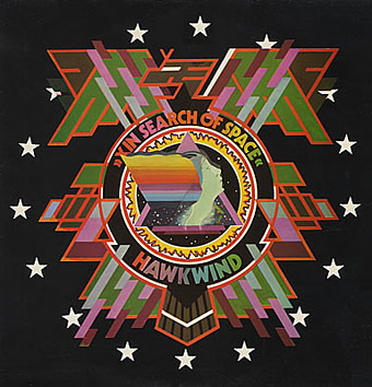
Hawkwind: In Search of Space (1971).
It’s fair to say that Hawkwind were very lucky to find Barney Bubbles, he immediately gave their music—which was often rambling and semi-improvised at the time—a compelling visual dimension that exaggerated their science fiction image while still presenting different aspects of the band’s persona. In Search of Space is an emblematic design that opens out to reveal a poster layout inside. One of the things that distinguishes Barney Bubbles’ designs from other illustrators of this period is a frequent use of hard graphical elements, something that’s here right at the outset of his work for Hawkwind.
This album also included a Bubbles-designed “Hawklog”, a booklet purporting to be the logbook of the crew of the Hawkwind spacecraft. I scanned my copy some time ago and converted it to a PDF; you can download it here.
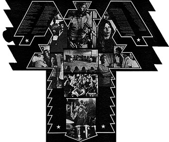
The In Search of Space sleeve unfolded.
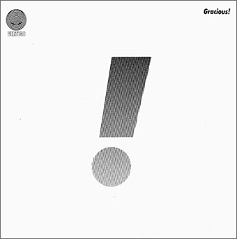
Gracious! by Gracious! (1970).
The shifting identity of Barney Bubbles means that many works such as this are omitted from listings. Gracious! was one of the first releases on the Vertigo label and the design was credited to “Teenburger”. The bold exclamation mark is printed on textured (bubbled?) card while the interior (below) featured a three-dimensional Richard Hamilton-style tableau. This band also connects Barney Bubbles and Roger Dean, another artist whose work was increasingly used by Vertigo. The second Gracious! album featured a Dean cover which kept the exclamation mark design.
Gracious! gatefold interior.
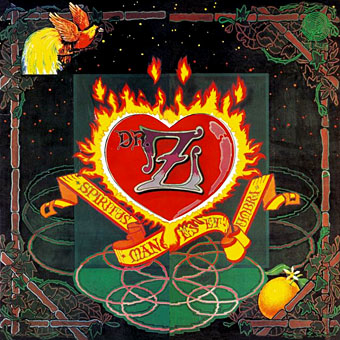
Dr Z: Three Parts to My Soul (1971).
In the 1970s even the most obscure bands could receive lavish cover treatment. This more typical design for the Vertigo label had two flaps that opened out from the centre with a heart-shaped hole cut in the middle.

Hawkwind: Doremi Fasol Latido (1972).
I hadn’t realised until I started assembling these images how much Barney’s work seemed to go through phases of influence. For the third Hawkwind album he must have been looking at the kind of superhero comic art exemplified by Jack Kirby. The Doremi cover is a black and white drawing (printed in silver ink on the original sleeve) done in the style of Kirby’s familiar reflective metal strips. The inner sleeve was even more Kirby-like although less successful, a squadron of barbarians on horseback with a sacked city burning in the distance and flying saucers drifting overhead. The fold-out poster below was free with initial pressings.
Hawkwind: Star Rats—poster with the Doremi album (1972).
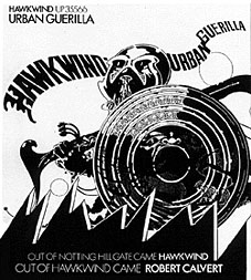
Hawkwind: Urban Guerilla single ad (1973).
This artwork in this ad design was part of a series of black and white posters all created around the time of the Doremi album that still exhibited the bold influence of Jack Kirby. This particular picture, however, is lifted directly from a Lone Sloan strip by French comic artist Philippe Druillet, Les Iles du Vent Sauvage (1970). (You can see part of the drawing on this page.) I later swiped from Druillet myself so I’m not one to criticise. In fairness, the comic strip figure only had the helmet and the shield, Barney adds an elaborate sword and a new background.
Update: thanks to comments from Rebecca and Mike below, I was reminded of the title of the picture above and so was able to find the poster version and its companions. You can see all five posters here.
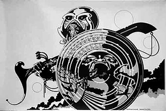
Fanon—Dragon Commando.
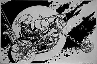
Prince Minksy’s chopper.
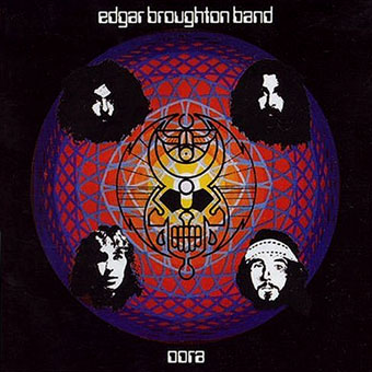
Edgar Broughton Band: Oora (1973).
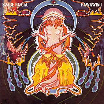
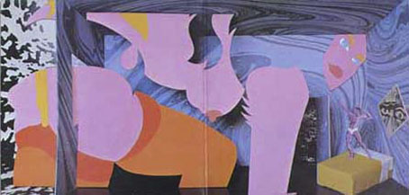
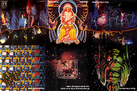
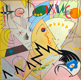
Hawkwind: Space Ritual (1973).
The definitive Hawkwind design and one of my favourite album covers. Barney’s work had now moved away from comic books into a kind of cosmic Art Nouveau with the band’s dancer, Stacia, here presented in the style of Alphonse Mucha. The lion heads were based on a head in Mucha’s L’Emeraude from 1900. Mucha also favoured a combination of illustration with hard graphics so it’s easy to see why Barney would respond to this. Much of the Hawkwind ad art of the time features Mucha-styled borders.
Space Ritual is justly celebrated for its poster sleeve which opens out to six panels. Barney’s graphics for the interior were developments of the work he created for the Hawkwind logbook, a blend of drawn or painted graphics with “significant” photos, in this case Edwardian erotica, atomic structures, a foetus floating among stars, etc. The example below is crudely composited from the CD reissue; it was too much effort to photograph the original sleeve and it doesn’t make much difference at this size anyway.
The Space Ritual tour programme also came as a fold-out poster, featuring a pulpy sf story and pictures of the band among the Mucha flourishes. Once again, I made my copy into a PDF which you can download here.
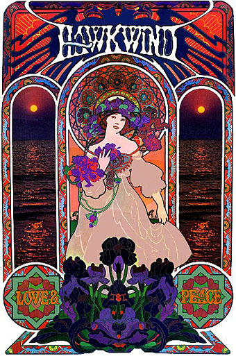
Hawkwind: Love & Peace poster (circa 1973).
The Mucha influence continued in this promotional poster whose figure and design is based on the Champagne White Star artwork for Moet & Chandon (1899).
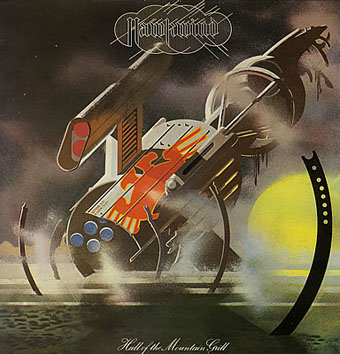
Hawkwind: Hall of the Mountain Grill (1974).
The most illustrational of all his Hawkwind sleeves and a picture that could easily have worked as one of his monochrome designs.
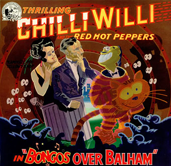
Chilli Willi and the Red Hot Peppers: Bongos Over Balham (1974).
The sleeve for Mike Moorcock’s Deep Fix album below was (according to Moorcock) a real wooden fairground booth that Barney constructed, painted then photographed.
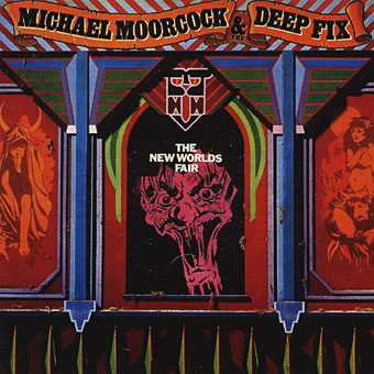
Michael Moorcock & the Deep Fix: New Worlds Fair (1975).
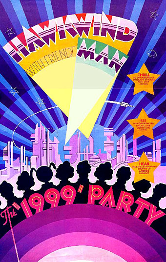
Hawkwind: The 1999 Party—tour poster (1975).
The shift of emphasis in the mid-Seventies was away from Art Nouveau towards Art Deco poster graphics, a style evident in all the 1999 Party tour artwork and the two sleeves that follow.
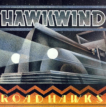
Hawkwind: Roadhawks (1976).
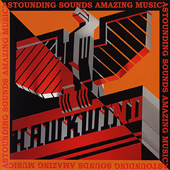
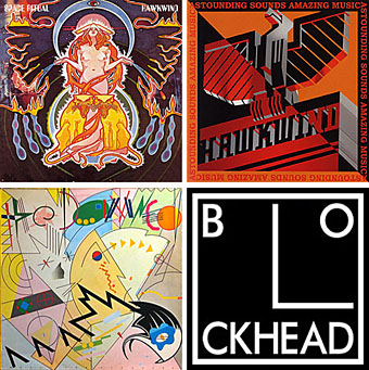
Hawkwind: Astounding Sounds, Amazing Music (1976).
The final Hawkwind design isn’t just Art Deco, it’s almost fascist, looking like a piece of Soviet propaganda art topped by a Nazi eagle. Hawkwind singer Bob Calvert spoke of the band being reorganised after this album along the lines of “a Stalinist purge” so maybe the design is appropriate.
1976 was the year of a Stalinist purge in British music as a whole. With the advent of punk Barney successfully made the transition from hippy designer to punk designer. If anything, punk gave him a new leash of life as his tremendous sleeve for the second Damned album demonstrates. His association with Stiff Records and Radar Records was the second major phase of his career after Hawkwind and gave him the opportunity to explore a range of influences from early 20th century design.
The Damned sleeve is a Kandinsky-esque portrait of the band with the group’s name spelled out using abstract shapes, an approach to album lettering he was to use for other artists as the decade progressed. I was especially taken with this album at the time and referred to it in an exam essay I had to write about album covers.
The Damned: Music For Pleasure (1977).
The very wide letter spacing used on the titles of these albums was a common feature of his Stiff designs, one of a number of habitual effects that became prevalent in work from subsequent designers.
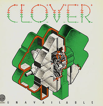
Clover: Unavailable (1977).
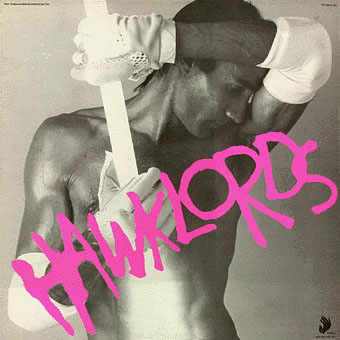
Hawklords: 25 Years On (1978).
Hawkwind became Hawklords for one album and a tour in 1978. Barney was commissioned to help create the stage show and develop the vague science fiction concept of Pan Transcendental Industries around which the album was based. The result was a very up-to-the-minute presentation which the band discarded immediately afterwards. This was Barney’s last work for Hawkwind. I’ve always found this cover distinctly erotic but I doubt you want to know about that here.
Nik Turner’s Sphinx: Xitintoday (1978).
Sax player Nik Turner was thrown out of Hawkwind in the 1976 band purge but he remained friends with Barney Bubbles. When Turner came to record his solo album, Xitintoday, Barney was asked to create the packaging. The album is a concept affair based around the Egyptian Book of the Dead but Barney’s design for the sleeve and accompanying booklet avoids hippy cliches with a use of abstract graphics or arrangements of lettering; the cover design, for example, features stars made up of the word “twinkle”. The pair continued to work together for Turner’s later band, Inner City Unit.
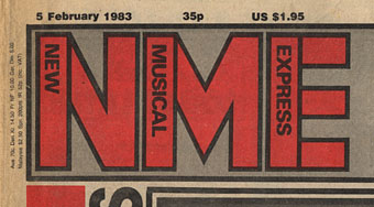
1978 was also the year Barney was asked to help with the redesign of the NME. His new logo remained in use up to the late 80s and forms the basis of the current (degraded) logo design.
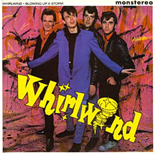
Whirlwind: Blowing Up A Storm (1978).

Ian Dury & the Blockheads: logo design (late 70s).
The association with Stiff Records led to one of Barney’s most famous works, the Blockhead logo. If he’s remembered for anything it should be for this simple, brilliant and witty graphic.
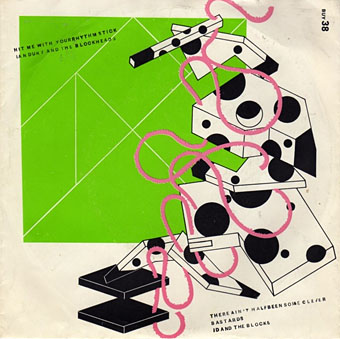
Ian Dury & the Blockheads: Hit Me With Your Rhythm Stick (1978).
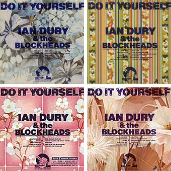
Ian Dury & the Blockheads: Do It Yourself (1979).
His inventiveness came to the fore again with his cover designs for Ian Dury. This sleeve was printed in twelve different versions onto real sheets of wallpaper. The design acts not only as a comment on the home improvement alluded to in the title but also a request for the purchaser to make a choice of their own among the different styles.
Radar Records logo (1978).
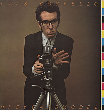
Elvis Costello & the Attractions: This Year’s Model (1978).
Initial pressings were made to look like deliberate misprints, showing CMYK colour bars and cutting off the letters of the artist name and title, a quirk abandoned on subsequent editions.
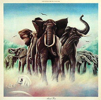
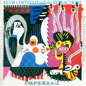
Elvis Costello & the Attractions: Armed Forces (1979).
The David Shepherd-style elephants on this cover do little to hint at the exceptional interior design, probably Barney’s most extravagant work since Space Ritual, and certainly its equal. The sleeve opens out to further extend the interpretation of the title and includes Mondrian and Jackson Pollock stylings among its animal-print abstractions. To save page-loading time there’s a page here where you can see the full effect for yourself. Thanks to LondonLee for the photos.
Update: Tim Niblock in the comments notes that this package was produced in association with Bazooka Graphics, France.
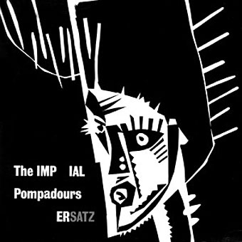
The Imperial Pompadours: Ersatz (1982).
Not many people know Barney Bubbles had a band. The Imperial Pompadours was Barney plus Nik Turner and other members borrowed from Inner City Unit. They recorded this one unhinged rock’n’roll album on a very restricted budget. Read The Seth Man’s review of it here.
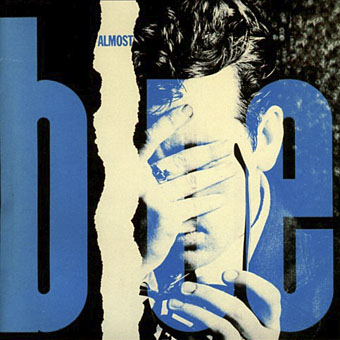
Elvis Costello & the Attractions: Almost Blue (1981).
Work at Radar continued with covers for all the early Elvis Costello albums. Almost Blue prefigures the look of many sleeve designs that came later in the decade while Imperial Bedroom featured a painting of Barney’s pastiching Picasso (“Snakecharmer & Reclining Octopus by Sal Forlenza, 1942”). Despite his increasing success and a growing reputation among younger designers these were to be his last works. Friends say he’d always been something of a depressive and late in 1983 he evidently reached some kind of crisis and took his own life. Roy Carr wrote an obituary for the NME.
Elvis Costello & the Attractions: Imperial Bedroom (1982).
Barney Bubbles’ work is continually featured in histories of album cover design but he was more than just a cover designer. We’re overdue a decent book-length examination of his work and his influence.
Update: The book is on its way. And David Wills’ new blog features his reminiscences about art school life with Barney. Good things come to those who wait.
Update 2: Reasons to be Cheerful: The Life and Work of Barney Bubbles by Paul Gorman was published by Adelita on December 4th, 2008. Paul Gorman writes about it here and I featured an extract here.
Elsewhere on { feuilleton }
• The album covers archive
It’s a joy to find this page. Barney is the most underrated, influential designer of our times. He has been referenced countless times yet few know his name. As a working designer he stands tall amongst my greatest influences. I hope this talk of a book comes to fruition, it’s high time the man had some form of solidly documented recognition.
I curse myself for missing that exhibition back in 2001, heart trouble laid me low and I was unable to attend. Hopefully another retrospective will one day appear.
Ian
Great page really enjoyed seeing so much of Barneys work. An exhibition/book would be wonderful. He also designed some amazing furniture for Jake Riviera which was featured in The Face magazine.
A great designer whose work looks as fresh as ever!
Mike
Just to echo the comments above. Magnificent work and up to now criminally neglected. I would happily help support a book / website dedicated to his work. Thanks so much for putting all this together, it’s fantastic.
Congratulations, a great collection of Barney’s work.
It should be mentioned that he did a lot of work for Hamburg’s Line Records label (some stunning designs for various Roger Chapman albums, for example). Like Mr. Garrett I have my own collection of Barney Bubbles stuff – so if that book project gets underway I can offer an almost complete run of the designs he did for the NME’s Single Of The Week page, his crazy design & layout for the NME’s “Modern Music” booklet, and other stuff like the “ashtray” painting for “The Art Of Roger Bechirian” promo album…
And I have the magnificent BB article from The Face somewhere that not only had photos of Barney’s furniture designs, but also reproduced his “Self Portrait” painting!
Dear John
Belated congratulations on a bang up job on BB.
I first became aware of his work as a teenage head frequenting the Roundhouse on Sunday afternoons 74-6. He did the great posters for those gigs which featured everybody from the Pink Fairies to Lady June to Tim Hardin to Lol Coxhill to Hawkwind, who I followed around because they played lots of free gigs, had Stacia and BB’s great artwork, which overshadowed the music imho.
Then when punk hit to find he was the same person behind the best work at Stiff and Radar and F-Beat etc was an absolute pleasure. He really worked from “street level” up and as others have said the breath of his imagination, his playfulness and unerring eye placed him far above the likes of Peter Saville (again imho).
He’s covered well in Ian McLagan’s My Back Pages (they went to college together and BB designed the fantastic text-glorifing posters for Mac’s first band The Muleskinners.
The clothes designer John Dove told me only this week that at one time in the 60s BB used to dress as Rupert The Bear and drive around in a painted-up ice cream van blaring out children’s ditties.
Do you know, since this dialogue was opened by your piece, has a book approached fruition? It’s about time. I was commissioned a piece on the 2001 exhibition for Mojo but the ratbags decommissioned it (doubtless when something beatles-related and less interesting came in) so it’s about time he got his props with a damn proper book and a higher profile show. In my experience (seven books down the line) I wouldn’t say it is anything to do with chariness over his earlier “hippie” output, but more to do with the fact that most agents and publishers just don’t know (or “get”) Barney Bubbles at all.
Very best
Paul
Thanks Paul (and to other recent commenters), this was the least I could do since the web was so lacking in a good display of his work. And shame on Mojo for spiking an article about him. I?m continually surprised when people say ?do you know he did?.??; just shows how productive he was and how a decent appraisal of his work is long overdue.
No idea whether that book is going ahead or not but considering this post only went up in January I?d say we?re a long way off seeing anything. Book production is notoriously slow, art and design production even more so. Someone has to source all the material, get rights and credits, write the damned thing (!) then find a publisher. All that would take two years (including publication scheduling) before anything appeared. Keep your fingers crossed. If anyone deserves a lavish Thames and Hudson monograph, it?s Barney B.
Take your point on the book production but it need not be so.
Both editions of my book The Look ran to well over 100,000 words with hundreds of images; the second has something like 250-plus illustrations and a CD but because I had an excellent and independnent publisher, designer and editing team we managed to get it done, out and extremely well received in nine months (and that period included a major family bereavement).
But it was because they were supportive, accurate, paid attention to detail and actually cared about the subject matter.
This is the crucial thing; as your correspondence here shows, anybody with half an idea could knock together a BB book – the images lined up alone would carry it – but to do the job he deserves it needs exactly the right publisher AND the full collaboration and participation of those who have treasured his work and memory. I get the sense that there is some resistance to that; else why hasn’t it happened so far?
best
Paul
Well done this is great.
when I first went on line, beginning of 2006 I searched in vain for stuff on Barney, there was a small wikipedia entry and some stuff on Hawkwind and Brian Griffiths site.
For me hitting my teens 79 onwards his stuff was the best, and its sad that Neville Brody, Malcolm Garrett, Peter Saville all have such large profiles and books and websites etc and this is the best there is on Mr Bubbles.
what about that cover for Spasticus Autisticus by Ian Dury, amazing.
It was a revelation when doing an evening class in etching, my teacher Denis Masi(i think..its a long time ago) told me he knew Malcolm G and Barney and that Barney was a manic depressive and would retreat to a monastery for months. I was young and naive and imagined someone called Barney Bubbles and all that exploding dynamic colourful radical work he produced would be a solid perfectly balanced colourful partying London superstar.
It was a further revelation and one that sat uncomfortably with my youthful prejudices that the man who made all that great post punk early 80’s stuff was the man who made all that fiddly hippy commune stuff ha ha But I’m over that now (though an aversion to Roger Dean still proudly exists)
Maybe you could do something with this page and turn it in to a small site, his work was immensely popular and influential and I remember that face article about the furniture and thinking wow, I could definitely have that in my bedroom.
Maybe yourself and messrs Garrett, Brody, Saville et all should combine your design weight and get that big book of Barney started.
Thanks once again for putting lots of his work up and the link to Armed Forces, how good is that work eh? Long live Barney Bubbles!
cheers
David
dear John
Sadly for me Barneys silkscreens and Star Rats are now on ebay if any one is interested as I would like them to go to an appreciative home – I have no space !
I’m an academic and used to search for info on Barney for my design students a coiuple of years ago with little available You have done a real service to all here well done
There are 4 of the set of Barneys silkscreens on ebay uk at the moment selling at 70 quid each – they have to go ( not framed and they should be
appreciated – only the dinosaurs mssing – breaking them up which is a shame ( sorry )
Star Rats is up for sale too – ive enclosed a link to this page for educational – I hope thats ok with you.
I WONDER IF BARNEY EVER MET / WORKED WITH PAOLOZZI – HE WOULD OBVIOUSLY HAVE KNOWN Ps WORK AND SEEN THE BREAKTHROUGH SHOW
‘THIS IS TOMMORROW’ by PAOLOZZI, SMITHSON HENDERSON SCI FI EXHIBITION AT THE ICA , I CAN SEE LINKS AND INFLUENCE – SAME INFLUENCE ED PAOLOZZI HAD ON
RCA ILLUSTRATORS LIKE TERRY DOWLING, Malcolm too ? AND STUART MCKINNON WAS IT ?
I WILL BE SENDING ALL MY degree STUDENTS HERE NEXT WEEK AND THIS PAGE WILL BE ON THEIR READING LIST !
best wishes
Fine by me using this page for eBay reference, if I wasn’t so skint just now I’d probably bid on some of those myself.
It wouldn’t surprise me if Barney at least met Paolozzi seeing as Paolozzi knew Mike Moorcock via New Worlds and JG Ballard and Moorcock was mates with BB. Not sure how much Paolozzi used to hang around with the freaks in those days but Moorcock told me that he used to visit the New Worlds office (and was on the masthead of the mag as “Aeronautics Advisor”).
Thanks Dave for that – I’m sure your site will bring BB to a new audience and put him ‘academically’ in his correct place. the Paolozzi link is interesting and
would like to hear of any material available where Moorcock and Paolozzi had a dialogue – his huge quite recent book prior to his demise called ‘Paolozzi’s writings’ – has hundreds of his letters – may be some references to collaboration there – i will look.
in circa 1983 there was a chap in a wee portable record store opposite the now flattened Haymarket arcade in Newcastle who had some nice BARNEY artwork – he had been filming Calvert on his uk tour with DAVE ANDERSON & ex inner city unit steve pond and nick i think ? bit hazy
anyway point is he was selling hi quality Videos of the live gigs and their rehearsals -Calvert was on good form – they were excellent. I saw two of them but they have since dissapeared into the ether and not many people know about these films – but some one has them – as for the chap who filmed them and ran the music shop in Newc – lord only knows
May show up one day soon – youtube maybe. As the recent bbc doc proved there is so little film footage of Bob Calvert these would be so valuable historically, so if anyone knows what Im on about or where that chap who made all the calvert tapes is please get in touch.
Calvert was such a unique performer that it is criminal that there is no Hawklords era footage except the quark track from bolans show.
I think it was referenced somewhere that Lydon had seen Calvert ?- it shows – may be an urban myth -havent read JLs biography
If any news from anyone about those videos let everyone know.
Re BB / Calvert
Apologies for typo John that should read ‘Thanks John’ ( not dave ! )
That’s okay. :)
If you want to know more about the Moorcock/NW/Paolozzi nexus you could always try asking a question on the MM forums:
http://www.multiverse.org/
Mike often answers questions himself when he’s not too busy.
Never say never where video footage is concerned, there may well be something recorded on a European tour that’s yet to come to light. Some French and German TV shows used to film a lot of bands throughout the Seventies so who knows what’s out there?
Great to see so much Barney material in one place and to read the recollections of those who knew and worked with Barney. Also fabulous image reproduction on this site.
For anyone who is interested there is a little bit of information about Barney’s life and work in the late 60s thru mid 70s in my book ‘No Sleep Till Canvey Island – The Great Pub Rock Revolution’ (please excuse plug).
I had the pleasure of meeting Barney when he did some artwork for my group, Kursaal Flyers. I am also fortunate to own a bass drum head Barney painted and gave to me as a gift, designed for an imaginary group, The Blue Genes!
When is someone going to put it all in a book (with lavish illustration)?
Thank you for putting this together. So now I know who designed that greatest of album covers, Armed Forces. There was an exhibition at the Modern Art Museum in Stockholm showing the greatest album covers of all time. Of course it included Warhol’s famous banana cover, but I fully expected it to incorporate Armed Forces as well. Great to finally find out who’d designed it and many of the other great covers from Riviera’s labels.
John,
I often find myself returning to this excellent post with its colourful exhibition of Barney’s work, both a fitting tribute and a wonderful recognition.
JOHN – Strange thing happened today. I’m researching a piece on a 60s car magazine called Motor Racing. It was around for ages but then in early 1968 was given a re-design. Brutal sans serif typography, better quality photography, the introduction of scantilly clad women and a sense of humour. Looking at the flanel panel for leads on people I should talk to, I came across the design consultants credit, which read David Wills and Colin Fulcher. This last one rang a bell. Barney Bubbles was christened Colin Fulcher – could it possibly be the same person?
I’d love to think it was, particularly given that he was such a hero and mentor of mine whilst at college. Neville (Brody) and I would often go and see him in his studio on the top floor at 60 Parker Street, where he would be more than generous with his time. Later whilst working at Stiff as a junior I would often have to do ads based on his sleeve artwork – not an enviable responsibility. I used to just sit and stare at his skinny ticket card artwork in bewilderment.
Some designers (myself included) struggle for years to make a half descent fist of it – Barney was just instinctively brilliant. One sleeve I remember in particular was Save the Wail by Lew Lewis. The main picture was a blow up from Lew’s debut single Boogie on the Street taken to line, exposing the dot screen and backed by a blue wash. Barney re-designed the Stiff logo for the sleeve, simply because none of the current logos fitted it’s retro feel. It was a throw away detail that we adored it and of course applied to every other sleeve afterwards…
Like many of your contributors, I too have a big old wad of Barney’s work and did actually approach a publisher about producing a book back in the late 80s. Despite a more than favourable response, much to my shame, I never got it together. Just as well really as at the time, being of that punk mindset, I was only really into the work that had effected me and had barely scratched the surface where his pre-Stiff days were concerned. I know through friends that Rebecca and Mike have done an amazing job collating info on him and they should be thoroughly encouraged to realise their endeavours and publish it. Which brings me back to my original point – do they or anyone else know if that WAS Barney who was invloved in the re-design of Motor Racing magazine?
Hi Jules and thanks for the lengthy response, it’s great that people are still coming here to fill in the gaps. Good as well to have some detail about Neville B’s interest since his first Graphic Language book says little about his early inspirations.
I know next to nothing about BB’s history pre-Friends, Hawkwind, etc. but regarding the motoring mag business I’d propose the following:
a) He obviously had enough training and knowledge to be a “regular” (as opposed to underground) designer.
b) I think Rebecca & Mike have established that he *did* work outside the music business now and then, even while doing the album sleeves he’s famous for. Given how little he probably got paid by bands or record companies I don’t blame him.
c) How many print designers named Colin Fulcher could there have been in London in 1968?
That last point seems the most significant to me but until we get a decent monograph, it’s impossible to know for certain.
Dear Jules et John
The CF credited will definitely be BB.
He and pal and fellow design fiend David Wills shared a mansion flat behind Olympia in 1968 from where they carried out all manner of commissions, from OZ layouts to commercial work for the likes of Justin De Blank, the pound-note grocery provisions company set up by one of BB’s colleagues at Conran Design.
That summer BB visited his friend Paul Olsen in San Francisco and, having absorbed at first-hand the work and influences of the likes of Stanley Mouse, returned to a new abode in Portobello Road from where his design career as we know it really took off towards the end of 68.
FYI: These days David Wills lives in Haight Ashbury.
Oh, good one, Paul! Nice that you know something about the journey to SF as well, since the info I’d seen on that wasn’t confirmed elsewhere. Given how costly air travel was in those days, he’d have needed some decently paying commissions to fund the flight so the “straight” work makes sense. Thanks.
Nick Lowe’s Burning/Zulu kiss 7″ sleeve,
surely must be Barney’s?
Deliver us that book, please.
john,
thanks so much for putting this all together. barney and i were best friends for much of the 70’s. i miss him more than i can say. barney had a huge influence on my life. many memories of working on hawkwind covers with him. as talented as he was, he would run things by me (as if i could draw a straight line!).
i have lots of letters and little drawings from barney. he also did work for the bands ace and amazorblades, among others.
there has been book talk for a long time now. personally, i think he deserves it. there’s just so much work out there to put together.
it’s great to see all the postings and to know that barney’s work is so appreciated.
thanks again.
Why don’t you make it a BB ‘movie’ project – this would require a different approach than a book, but hey, isn’t it 2007 – I have a lot of respect for Melvyn Bragg’s kind of thing, but let’s move on, BB pioneered (certainly with Stiff) an icon-style of graphics which now pokes everybody in the eye on mobile phones, games consoles, TV, PDAs, packaging, advertising, etc., isn’t it implicit in Barney’s work (particularly the later work) that he was perfectly attuned to the flow of popular visual culture, shame he didn’t get to do web-sites or have opportunities like the Gorillaz.
Anyway, hearty yo to an enterprise which celebrates and perpetuates BB’s thing.
Best wishes
Dave
Thank you for creating this page. Barney was a brilliant designer and I very much hope a book and a new exhibition of his work happen in the near future. I think he may have designed office furniture for Jake Riviera?
I should have read all the posts first! He did design furniture and it was in The Face that I remember reading about it. Sorry about that.
Hi John
I thought it may interest your subscribers/visitors to know that my book about Barney’s work will be published this autumn by British publisher Adelita. A US publisher will be announced soon.
I am currently compiling and writing it and am pleased to say there are already many illuminating contributors and interviewees and some revelations about the work Barney achieved.
The book will be a visual document and the publisher and I aim for it to be a definitive account.
An exhibition will be held in conjunction with Paul Smith New York and London. More details to follow.
I want to thank you and your blog for being partly responsible for kicking the whole project into action.
Check out the link here for more info:
http://www.adelita.co.uk/reasons/index.php
Very best – I’d be delighted to hear from any potential contributors who I haven’t already contacted,
PJG
At last. This is outstanding news!
Interesting reading all the above as in my record collecting days I had SO many of the records mentioned. However I think you will find that the Armed Forces/Costello cover was done in collaboration with BAZOOKA GRAPHIQUES from France, who even got to design a cover of the NME in the punk days…looking forward to the book and hope it gets to Australia!
Hi Tim,
Yes, you’re right to flag up the Bazookas on Armed Forces. They were involved in some of the image-making; Kiki and Loulou Picasso. In addition, the cover painting of the elephants on Armed Forces was neither Barney or the Bazookas, but was a guy called Tom Pogson (briefed by Barney).
So now I know who did the elephant as I knew it was neither Bazooka or BB, there was an interesting daily blog which was a graphic representation of the news run by loulou picasso but it apparently ran into trouble because of copyright issues of images used. They were just brilliant even if just for the use of the picasso names.
A truly fascinating account of Barney’s work . . . I was first astounded by those Hawkwind album covers back in the day . . . They were something to cherish and lo they still survive as I can’t bear to part with them – much to the annoyance of the other arf.
Barney’s work inspired me to take art and design further giving me a thoroughly enjoyable and diverse career – Thanks BB
Just to add to Bubbleania that seems to be forging ahead here, try and find a copy of ‘Kings of the robot rhythm’ by Chilli Willi on !972 Revelations. The lyric sheet has a typical BB joke.
Having skimmed through the responses here, I cannot see references to EyE no 6 (1992) and the Red Dirt diecut LP on UK Fontana.
I found a japanese pressing of Bongo’s Over Balham c.1978. I have always been amused this may have just been an extended joke that BB and Jake Riveira may have carried out just to guffaw on the rascist kamikazie elements of Nips in barrels. I wonder if the japanese got the Joke.
Hi Deepinder. I did search for the Chilli Willi albums at the time but old cover art isn’t always so easy to find. It might be worth having another look.
Rick Poyner who edited Eye magazine mentions the BB feature near the top of the comments.
Wow so the book is really happening! yay!!
cover looks good. Surely pink was a fave of his, its all over his work.
So now I officially start the campaign for the BBC 4 documentary on Mr Bubbles.
I dont see why not.
cheers
i can only repeat all the wow thanks so much for this page being here and so look forward to the publication of the book and have noticed in todays trawl across the intranet that an iialian reissue label-akarma-have released the glastonbury fayre set on 180 gm
vinyl with all the original posters inserts pvc cover etc
Great post! I found this post googling for The Damned’s Music For Pleasure. I always wondered if the cover was meant to be portraits of the band or not. You said you wrote about the album cover. what was your take on the characters on the album art? Which part of the design being which member of The Damned? I can only guess that the blue and black rounded thingy on on the right bottom corner being Dave Vanian. and the left bottom one is probably Captain. But the rest is unsure.
This album art is one of my favorites.
Hi Vanian. The piece I wrote about the Damned sleeve was for a school exam where we had to compare two very different album covers. I chose that one and Close to the Edge by Yes. I can’t possibly remember what I wrote apart from making some vague point about abstraction versus representation and so on.
I’ve never figured out who was who among the band members aside from DV. I suppose the best bet would be to compare the sleeve with a photo of the band from that period.
Just been thinking about the Armed Forces sleeve, and how there are significant contributions by other graphic artists on that sleeve. There are a couple other sleeves pictured above that are not solely a Barney Bubbles credit:
Edgar Broughton Band’s ‘Oora’ is one. The ‘sleeve concept’ was by Chris Smith, the ‘sleeve design’ was by Chris Smith and Steve Broughton. Barney gets an ‘artwork’ credit.
Similarly Space Ritual. Curiously, Barney gets a ‘packaging’ credit, and Pierre gets an ‘art direction’ credit.
!
Hi, you might not know of me, but I am Sid Squeek, the Sqeek half of Bubbles and Squeek.
I was a brother of Barney’s from 1957 to ’82 in work and play. In life, love and ballistics.
I’ve been out of touch here in San Francisco with you all for a while, so its droll to see how our jolly fun at Leigh Court so long ago has morphed into intense web log nattering and the like.
I’m working on a biography of Barnstable with the so called Gorman, and in doing so am becoming more aware of how our jolly droll saga of adventures, with its multiple layers of intrigue, art and stolen Adam fireplaces has entered the consciousness of this age.
I look forward to many entertaining chats.
Rebbecca says it would have been cool to have read something about Barney. Fair do. OK here goes.
How about:
•••
Lorry was Colin’s girl friend from about 61 to 64 and an on going figure in his life. She survived, by choice, on dry bread and tea. Lorry was a very thin person. Head shaved in a slash and burn style, sub-crew cut. She was a very shy seeming, retiring girl with hesitant quick jerky movements that would suddenly burst out with a fiery animated exclamation. With her bright blue eyes glancing to the side, she was very funny, a nervous adventuress. In the late sixties she was a scene painter at the Natural History museum, she got really good at putting big expanses of blue sky in dioramas, and grass. Her darting, cockney accented questions searched for the light side of things, “Well they do, don’t they?”
•••
While Fulcher was still living with his parents at 76 Tranmere Rd in Whitton in 1962 and I lived in the apartment on Marylebone High Street over MacFisheries, we continued the idea of communal work, like our on-going (1959 – 62), GPO posted, Gas Works themed mail, and the organized occasional ‘Do Its.’ Where we’d have an idea and get our friends to do stuff, “Go to Woolworths and spend 2s 6d,” or ‘Make a noise maker.”
These were cognate with random bigger events, like a memorable visit to Fulham gasworks one Saturday in 1962 with my Yashica. (2.8mm, twin lens reflex, with two and a quarter inch square negatives.) I wore a harris tweed jacket, Barney in his sailors P coat and skinny jeans. We walked in the front gates of the vast building site, by a row of shovels, a ladder, buckets, and a big pair of red, acid resistant industrial gloves hanging on a peg. With the gas ovens, the coke piles, and the srorage tanks beckoning, we waltzes up tho the foreman and I boldly ask, “Is it okey doke to look around a bit and photograph?”
The friendly overalls and herring bone suited gent in a flannel shirt and no tie offers to show us around. “You scared of heights?” he asks. We ascend these dark stairs, going round and up. For ever. We come out at the top of the six story coke ovens, a long, sixty foot by twenty space, A dark place open to the wind, just as well. Furnace mouths opening over the burning coals below belching flames up every now and then; while soot black, black faced West Indian stokers, with vivid white teeth grinning in the dark, shoveled coal into the well named Hell-holes.
I made a book of the photographs I had beautifully printed at Bert Hardy’s(?) by Waterloo station. (Now lost like everything else.)
***
In, maybe, February of 68, we occupy the London School of Economics. (I never told my dad who took a London University engineering course at night school while in the Boys Service of the fledgling RAF at Martlesham heath in the early 20’s). Inside with the cream and green walls, with a tan stripe between at chest height, it looks very much like the institutional walls of Twickenham Art school, so it felt familiar. We futively join the throng of people milling. Walking through the unguarded entrance on a Sunday down a corridor, we look at a chalk board with a list of choices and wander off to join the print shop. We work during the day, leave at night for Leigh Court by bus. We clean screens for the print workshop, with the French Situationists, and the Maoists who don’t agree with each other. Colin (just beginning to be ‘Barney’ now) and I and I are both skilled squeegee bashers. While they argue, we assiduously scrub, with the sweet noxious gas off the methylated spirits in our breath. Us hard-working chaps deserve a break: So we figure we can just grasp a clean screen and cut a stencil. I walk over and pull one we’ve just cleaned. We spend about 2 hours cutting the ‘Black Mickey Mouse’ that I draw from Colin’s idea, he had already painted on the Vespa body (later lost after the enormous Jumble sale in the attic over in the Mansions in ’68), Next day as we are taping up our precious work, an officious Frenchy comes up rips it off, yelling, “you have no authority to have this screen!” We leave. Barney is not pleased, in fact he is really pizzed off.
•••
(’71 or 2?) I wander over to meet Barney at Tenburger, although he’s now living huddled in the cellar stables up the street. Because I don’t like Jonothan Green’s snide wit and don’t want to meet upstairs, Barney says to meet me behind the curtain as you walk in on the right at the back in the shop under Friends. “My hiding place.” I sit there and he appears, gnome like, peeking round the flap of the curtain, “Townley Woll!” and we do a hug, discuss the times.
He says he’s got a couple of things for us to work on, one is a painting he wanted destroyed, “but artfully.” He shows it me, but I couldn’t bring myself to “Hit it wiv’ an ‘ammer.” And the other job which he offered afterwards, which was painting a witch…
•••
There, that little dab’ll do y’.
Rebecca & Mike: seeing as I still have a vinyl copy of Space Ritual I might have noted that myself, had I been more diligent.
There is one mystery about that design which remains unresolved (for me, at least), namely the source of the vintage erotica. You’ll probably know that Victor Moscoso used the same photo for one of his Neon Rose psychedelic posters in the Sixties. Was the Space Ritual use a deliberate borrowing (and reference back) or coincidence?
David Wills: many thanks for the lengthy reminiscence, I think we’re all eagerly waiting to see Paul’s book.
John
Hmm, “lengthy reminiscence”? sounds bad.
Is that too lengthy for youse?
I do like to go on.
sorry john, can’t help there… don’t know too much about vintage erotica… but that’s another very interesting link you gave. one thing’s for sure, there are loads of codes and symbols in BBs work, and the fun bit is unravelling them all.
David: no need to apologise for length, the most valuable comments here have tended to be the longer ones and this post is an epic anyway, with more comments than anything else.
Rebecca & Mike: sounds like more than one book is required!
Great idea John
I believe Rebecca & Mike are perfectly placed to publish a fantastic book on Barney Bubbles and hope that my own humble effort opens the floodgates for continuing and everlasting assessment and celebration of his brilliance.
Meantime my money’s on Mr Wills being the ace provider of the A1 Good Guy 60s/70s memoir.