Vintage magazine art I

HarpersBazar1915-12.jpg

Magazineart.org has a great selection of covers from the golden age of illustrated American magazines. Not complete by any means but there’s some great art and design there, and the covers of Science and Invention are especially fun. Interesting to see that the technique of having a figure or object partly obscure the magazine title isn’t a recent invention at all.

Continue reading “Vintage magazine art I”

The Picture of Dorian Gray II

dorian_film.jpg

Oscar Wilde’s novel was filmed by Albert Lewin in 1945, a great adaptation with Hurd Hatfield playing Dorian, George Sanders as the aphoristic Lord Henry and Angela Lansbury as Sybil Vane. Lewin made a number of respectably arty films during the Forties and Fifties but Dorian Gray has always seemed the best to me, even if I am biased towards the story.

dorianbefore.jpg

The film was shot in black and white but views of the painting were shown in colour. For the final view of Dorian’s decayed portrait he commissioned the hyper-real artist Ivan Albright (1897–1983) whose shockingly grotesque picture (below) provides a memorable climax to the film. That painting now resides in the Art Institute of Chicago.

albright.jpg

Update: added a “before” view of the painting.

Update 2: added a link to a recent Wikipedia copy of the “after” picture that’s larger than previously available versions.

Elsewhere on { feuilleton }
The Oscar Wilde archive

Great British design

underground_map.jpg

The BBC’s Great British Design Quest has reached a shortlist of ten:

1) Catseyes. Hmm, more of an invention to me but the brief here seems to be pretty broad.

2) Concorde. Can’t imagine this winning seeing as it’s generally regarded as a costly failure. In design terms though, it was a great-looking plane.

3) Grand Theft Auto. Er…a computer game? And one that merely imitates Hollywood at that.

4) The K2 phone kiosk. Some of these choices seem to be determined by nostalgia more than anything else. The cast-iron urinal phone booths are distinctive but I’m not sure they could be called “great”.

5) The Mini. This is a design classic, and, like the VW Beetle, still in use today.

6) The Routemaster bus. More nostalgia.

7) The Supermarine Spitfire. And again… I wonder what people would think if Germany voted in a similar competition for the Stukka divebomber?

8) Tomb Raider. Another computer game… Yes, it was surprising at the time but it was another game aping Hollywood. In game terms, something like the Rubik’s Cube was far more “classic” and original. But then that’s not British, is it?

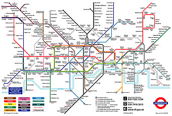
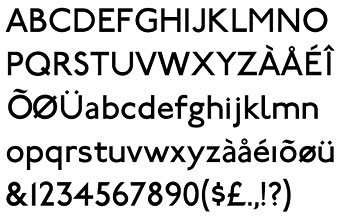
9) The London Underground map. This is the one I’d vote for. Harry Beck’s solution to mapping the first underground rail network was brilliant and elegant. Not only that but it’s stood the test of time and been imitated (and parodied) in similar transport maps all over the world. While we’re at it, let’s also remember Edward Johnston and Richard Kegler’s 1916 type design for the Underground system, the world’s first widely-used sans serif lettering.

underground_type.jpg

10) The World Wide Web. Respect to Tim Berners-Lee and all, but, again, is this a design or an invention? And how British is the web? Do they mean the web or HTML?

Charles Méryon’s Paris

meryon.jpg

Charles Méryon (1821–1868) made his name producing etchings of the city of Paris, and became as accomplished at rendering the solidity of architecture as Piranesi. Méryon manages to do for the City of Light what Piranesi did for the Eternal City with his famous Vedute di Roma, celebrating the buildings whilst paying careful attention to the glamour of deterioration. I looked at the work of Méryon and Piranesi a great deal when embarking on my Lovecraft adaptations and still regret not buying an expensive (for the time) book of Méryon’s work in the late 1980s. Happily there are plenty of museum websites with his etchings in their collections.

Elsewhere on { feuilleton }
The etching and engraving archive