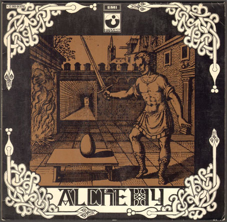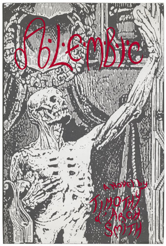
Current reading is Alembic (1992), a curious novel by Timothy d’Arch Smith whose publishings prior to this were all non-fiction, among them a study of the Uranian poets, a bibliography of Montague Summers, and The Books of the Beast, one of the many books about Aleister Crowley. Alembic reflects some of these interests and blends them with others, notably alchemy and rock music, delivering the result in a digressive, comma-strewn prose style which I imagine many readers would find off-putting. From the jacket description:
Alembic is an unsettling novel about madness and alchemy, epistemology and rock and roll, magic and perversion. Thomas Graves, a young antiquarian, works for ALEMBIC, a British government office investigating the contemporary applications of the secrets of alchemy. The strange world of alchemy, however, is as eerie as the rock and roll world of Thomas’s friend Nicholas Spark, leader of a Led Zeppelin-like band called Celestial Praylin. Moving between these worlds, colourfully conveyed in d’Arch Smith’s sonorous prose – at times elegant, at times comic – Thomas Graves feels his grip on reality constantly imperilled; his attraction to the fourteen-year-old daughter of one of his colleagues complicates his existence further. A dramatic turn of events brings all of his fears and fancies out in the open, suggesting finally that the world is as mad as Thomas thought himself to be. Alembic is itself an alembic, a vessel that allows things to disintegrate and be transformed into new, refined substances. Set largely in the early 1980s, Alembic ends in the early years of the twenty-first century as alchemy engineers a new world order of darkness and perfection, destruction and eternal life, concluding a novel of great originality and ill-boding.
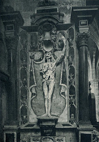
I don’t mind the style, it’s preferrable to the rudimentary bestsellerese that passes for much genre writing today. D’Arch Smith’s writing is witty, and there’s enough going on to sustain the interest. I thought at first the uncredited cover design would have had little to do with the contents but Ligier Richier’s celebrated sculpture of René de Chalon is referred to early on:
Nicholas had done himself to death. That was unequivocally stated in the garish red and black drawing depicted above the lyrics. In a grotesque parody of Ligier Richier’s funerary monument at Bar-le-Duc of the skeletal knight holding out his heart to God—possibly viewed by Ma during her historical tour of Alsace-Lorraine—Nicholas had been delineated in the same mortified yet exultant posture. The original figure was macabre enough, in the flaying of the naked body and the exposure of leg and arm muscles not yet rotted from the bones, to command attention, but the figure was imbued by Richier’s art with an enduring majesty that, though his design had been closely followed, was utterly overturned by the specious caricature of Nicholas Spark emblazoned down the waitress’s white cotton vest.
Given this, it’s a safe bet that the author would have asked for the capital “A” in the title to be given the same phallic connotations as it has in Aleister Crowley’s signature.
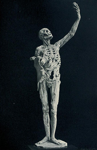
The web has plenty of photos of Le Transi de René de Chalon (c. 1545) but this view of Richier’s sculpture shows it to better effect than those where the background reduces the impact of the figure. The photos are from Ligier Richier, l’Artiste et Son Uvre (1911) by Paul Denis. As for Alembic, that’s currently out-of-print but copies are easy enough to find online.
Elsewhere on { feuilleton }
• The book covers archive
Previously on { feuilleton }
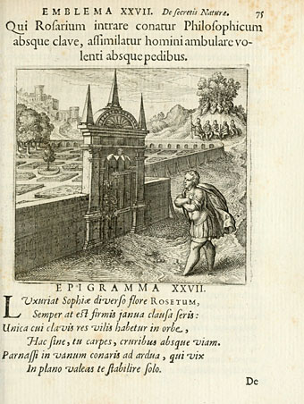
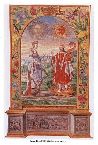
• Atalanta Fugiens
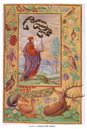
• Splendor Solis revisited
• Laurie Lipton’s Splendor Solis
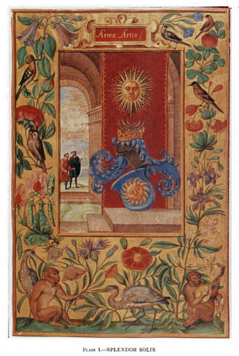
• The Arms of the Art
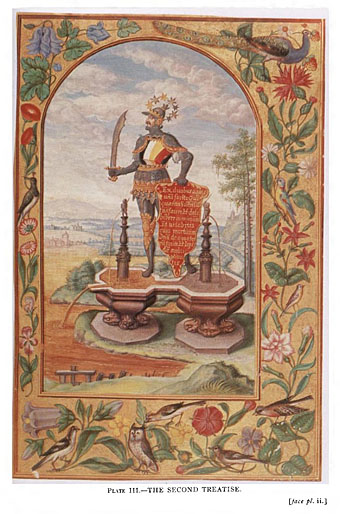
• Splendor Solis
• Amphitheatrum Sapientiae Aeternae
• Cabala, Speculum Artis Et Naturae In Alchymia
• Digital alchemy