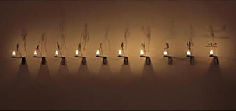
The Candles by Christian Boltanski.
The Shadow is an exhibition at Compton Verney from Saturday 30 June–Sunday 9 September, 2007. I’d been considering a post about shadows in art for a while so this has forced my hand. There’ll be some follow-ups in the coming week, work permitting. I’m busy with a big new piece of Lovecraft-related art at the moment, among other things. More about that later.
Shadows carry with them a range of associations. Whilst the shadow exists as a scientific phenomenon, its presence, from the Greek philosopher Plato through to JM Barrie’s children’s story Peter Pan, reflects the values and beliefs of society as well as an expression of psychological states.
The Shadow is the first extensive group show of its kind to look at an ancient theme that continues to emerge particularly in the work of contemporary artists. The exhibition will provide the viewer with a series of atmospheric encounters where sometimes the source is revealed but frequently the shadow exists independently, often revealing a presence outside the space represented.
The exhibition includes painting, sculpture and video by international contemporary artists such as Doug Aitken, Laurie Anderson, Christian Boltanski, Ceal Floyer, Mona Hatoum, Gary Hill, Tracey Moffatt, Anri Sala, Fiona Tan, Andy Warhol, William Wegman and Francesca Woodman.
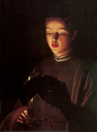
The Choirboy (A Young Singer) by Georges de La Tour (1640s).
To compliment The Shadow exhibition, Compton Verney will present a number of key candlelight works by the French artist Georges de La Tour (1593–1652).
La Tour was born in the Duchy of Lorraine and influenced by the work of Caravaggio. His works have been attributed to a number of artists and it is only since 1915 that a group of his signed paintings were linked and attributed conclusively to La Tour.
It was not until 1972 when all his surviving works were brought together in a major retrospective exhibition at The Orangerie, Paris that he came to the attention of a wider public. This exhibition will represent a rare opportunity for British audiences to view La Tour’s paintings and will focus on a number of powerful works, mainly from La Tour’s late period, which concentrate on the effect of light on the human figure.