One of Derek Jarman’s many unfilmed projects was PPP in the Garden of Earthly Delights, a study of the last days in the life of director Pier Paolo Pasolini seen through a prism of references to the director’s cinematic work, and also the paintings of Hieronymus Bosch. Jarman’s proposal exists as a synopsis rather than a screenplay, presenting a series of isolated scenes: the film set for the final scene from Salò, or the 120 Days of Sodom (1975); an expensive restaurant; a street at night where Pasolini is cruising for sex; a cheap restaurant; a petrol station; an area of waste ground where Pasolini is killed by the rent boy he’s picked up. The foreground events parallel moments from Pasolini’s life and death, while the background would have featured characters from his earlier films, and various Boschian figures or motifs. The synopsis was printed in the Derek Jarman issue of Afterimage in autumn 1985, and it’s likely that the outline contributed to Julian Cole’s film, Ostia, which was made as a final-year student project a year later.
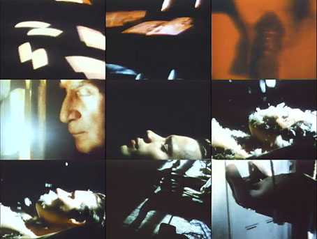
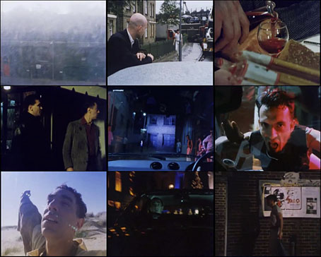
Ostia is unusual for being a film in which Derek Jarman is the lead actor, although when you see his acting it’s not so surprising that he kept himself out of his own films; Cole says on a commentary track for Ostia that some of Jarman’s performance was so bad it had to be cut. There is the curiosity value of seeing him playing the part of Pasolini, something that Jarman suggested when they were discussing the film.
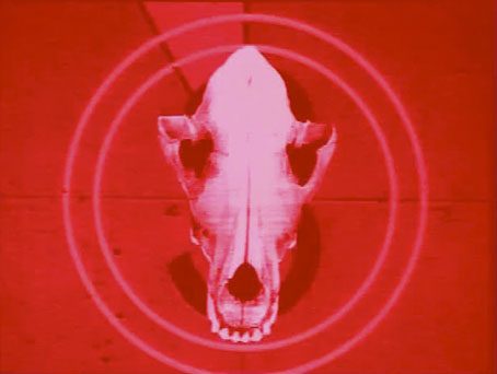
The title refers to the name of the Tyrrhenian resort near Rome where Pasolini was murdered in November 1975, and the narrative favours the theory that Pasolini wasn’t so much murdered as assassinated by an establishment for whom he was a continual thorn in the side. The unforgettable Salò uses De Sade as a frame to explore the worst period of Italian Fascist brutality at the end of the Second World War. Many of those who were complicit in wartime atrocities were still active in Italian society in 1975, and even without the film’s other excesses they wouldn’t have been impressed by Pasolini’s dwelling on the crimes committed during the period of the Salò Republic, or his allusion to the Marzabotto massacre. Pasolini was also a vocal Marxist, of course (Jarman’s synopsis throws some barbs at this), and heavily critical of the deleterious effects of consumerism on post-war Italian society. The assassination theory carries some weight, in other words, even if the face-value explanation—a rough-trade assignation gone awry—seems just as likely. Philo Bregstein’s documentary, Whoever Says the Truth Shall Die (1981) explores the theory in a roundabout fashion, while Ostia (The Death of Pasolini) (1986) by Coil looks at the tragedy through a symbolic lens. “Kill to keep the world turning.”
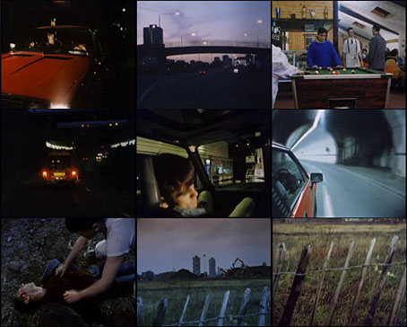
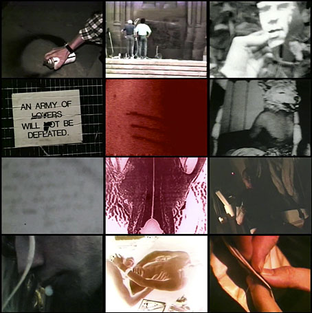
Julian Cole was working with a micro-budget so beyond the token presence of an Alfa Romeo like the one Pasolini drove (and which was driven over him on the beach) there’s no attempt at verisimilitude. All the scenes are shot in London locations circa 1986, and the dour skies of the metropolis are no match for the perfect blue of Italy. Cole’s film can’t help but be less ambitious than Jarman’s project but at least it got made. Viewed today Ostia has an unavoidable melancholy quality; Cole says that Jarman had just been diagnosed with HIV when they were making the film, and he refused to kiss actor David Dipnall because of this; at the time little was known about the infectiousness of the illness. Dipnall himself, in an unrelated chain of circumstances, died of AIDS a few years later. Ostia is also a reminder of how Pasolini’s death has gained a martyr-like quality among a certain group of gay men, making it a kind of cinematic equivalent to the martyrdom of Oscar Wilde 70 years earlier. It can be seen as an extra on the BFI’s Derek DVD or watched here.
Previously on { feuilleton }
• Derek Jarman In The Key Of Blue
• The Dream Machine
• Jarman (all this maddening beauty)
• Sebastiane by Derek Jarman
• A Journey to Avebury by Derek Jarman
• Derek Jarman’s music videos
• Derek Jarman’s Neutron
• Mister Jarman, Mister Moore and Doctor Dee
• The Tempest illustrated
• In the Shadow of the Sun by Derek Jarman
• Derek Jarman at the Serpentine
• The Angelic Conversation
• The life and work of Derek Jarman