More Russians…

A journal by artist and designer John Coulthart.

Gay
More Russians…
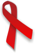
This month marks the 25th anniversary of the beginning of the AIDS epidemic, generally estimated to be responsible for the deaths of 25 million people worldwide. Today, with dismally ignorant timing, George Bush reconfirmed his intention to write minority discrimination into the American Constitution:
THE PRESIDENT: Good morning. Next week, the United States Senate will begin debate on a constitutional amendment that defines marriage in the United States as the union of a man and woman. On Monday, I will meet with a coalition of community leaders, constitutional scholars, family and civic organizations, and religious leaders. They’re Republicans, Democrats, and independents who’ve come together to support this amendment. Today, I want to explain why I support the Marriage Protection Amendment, and why I’m urging Congress to pass it and send it to the states for ratification.
Marriage cannot be cut off from its cultural, religious, and natural roots without weakening this good influence on society. Government, by recognizing and protecting marriage, serves the interests of all.
The conjunction of these two events is as depressing as it is inevitable given the current occupants of the White House. Following the President’s logic, Great Britain and other countries that now recognise unions for gay couples should be collapsing into sinks of anarchy and moral squalor. America’s claims to be the “home of freedom” collapse in the face of this kind of drivel. This is only gesture politics, of course, intended to throw a bone to bigots in the Republican heartlands, but it’s a despicable gesture all the same, made to appease the home-grown Taliban while Bush’s popularity continues to fall. Intolerance of this kind is deeply-ingrained in the Republican Party and previous Republican administrations. During this AIDS anniversary it’s worth remembering how criminally the Reagan administration responded to a national crisis:
Reagan’s AIDS Legacy
Silence equals death
Allen White
Tuesday, June 8, 2004As America remembers the life of Ronald Reagan, it must never forget his shameful abdication of leadership in the fight against AIDS. History may ultimately judge his presidency by the thousands who have and will die of AIDS.
Following discovery of the first cases in 1981, it soon became clear a national health crisis was developing. But President Reagan’s response was “halting and ineffective,” according to his biographer Lou Cannon. Those infected initially with this mysterious disease—all gay men—found themselves targeted with an unprecedented level of mean-spirited hostility.
A significant source of Reagan’s support came from the newly identified religious right and the Moral Majority, a political-action group founded by the Rev. Jerry Falwell. AIDS became the tool, and gay men the target, for the politics of fear, hate and discrimination. Falwell said “AIDS is the wrath of God upon homosexuals.” Reagan’s communications director Pat Buchanan argued that AIDS is “nature’s revenge on gay men.”
With each passing month, death and suffering increased at a frightening rate. Scientists, researchers and health care professionals at every level expressed the need for funding. The response of the Reagan administration was indifference.
By Feb. 1, 1983, 1,025 AIDS cases were reported, and at least 394 had died in the United States. Reagan said nothing. On April 23, 1984, the Centers for Disease Control and Prevention announced 4,177 reported cases in America and 1,807 deaths. In San Francisco, the health department reported more than 500 cases. Again, Reagan said nothing. That same year, 1984, the Democratic National Convention convened in San Francisco. Hoping to focus attention on the need for AIDS research, education and treatment, more than 100,000 sympathizers marched from the Castro to Moscone Center.
With each diagnosis, the pain and suffering spread across America. Everyone seemed to now know someone infected with AIDS. At a White House state dinner, first lady Nancy Reagan expressed concern for a guest showing signs of significant weight loss. On July 25, 1985, the American Hospital in Paris announced that Rock Hudson had AIDS.
With AIDS finally out of the closet, activists such as Paul Boneberg, who in 1984 started Mobilization Against AIDS in San Francisco, begged President Reagan to say something now that he, like thousands of Americans, knew a person with AIDS. Writing in the Washington Post in late 1985, Rep. Henry Waxman, D-Los Angeles, stated: “It is surprising that the president could remain silent as 6,000 Americans died, that he could fail to acknowledge the epidemic’s existence. Perhaps his staff felt he had to, since many of his New Right supporters have raised money by campaigning against homosexuals.”
Reagan would ultimately address the issue of AIDS while president. His remarks came May 31, 1987 (near the end of his second term), at the Third International Conference on AIDS in Washington. When he spoke, 36,058 Americans had been diagnosed with AIDS and 20,849 had died. The disease had spread to 113 countries, with more than 50,000 cases.
As millions eulogize Reagan this week, the tragedy lies in what he might have done. Today, the World Health Organization estimates that more than 40 million people are living with HIV worldwide. An estimated 5 million people were newly infected and 3 million people died of AIDS in 2003 alone.
Reagan could have chosen to end the homophobic rhetoric that flowed from so many in his administration. Dr. C. Everett Koop, Reagan’s surgeon general, has said that because of “intradepartmental politics” he was cut out of all AIDS discussions for the first five years of the Reagan administration. The reason, he explained, was “because transmission of AIDS was understood to be primarily in the homosexual population and in those who abused intravenous drugs.” The president’s advisers, Koop said, “took the stand, ‘They are only getting what they justly deserve.’ ”
How profoundly different might have been the outcome if his leadership had generated compassion rather than hostility. “In the history of the AIDS epidemic, President Reagan’s legacy is one of silence,” Michael Cover, former associate executive director for public affairs at Whitman-Walker Clinic, the groundbreaking AIDS health-care organization in Washington. in 2003. “It is the silence of tens of thousands who died alone and unacknowledged, stigmatized by our government under his administration.”
Revisionist history about Reagan must be rejected. Researchers, historians and AIDS experts who know the truth must not remain silent. Too many have died for that.
San Francisco Chronicle. Allen White is a San Francisco writer.
Given the equally criminal and incompetent actions of the Bush administration elsewhere, there’s no evidence that Bush junior or Bush senior would have behaved any differently. My contempt for these wretches knows no bounds. I’ll leave the final words to Dr Hunter S Thompson (RIP):
We have become a Nazi monster in the eyes of the whole world, a nation of bullies and bastards who would rather kill than live peacefully. We are not just Whores for power and oil, but killer whores with hate and fear in our hearts. We are human scum, and that is how history will judge us.
No redeeming social value. Just whores. Get out of our way, or we’ll kill you. Who does vote for these dishonest shitheads? Who among us can be happy and proud of having all this innocent blood on our hands? Who are these swine? These flag-sucking half-wits who get fleeced and fooled by stupid little rich kids like George Bush?
They are the same ones who wanted to have Muhammad Ali locked up for refusing to kill gooks. They speak for all that is cruel and stupid and vicious in the American character. They are the racists and hate mongers among us; they are the Ku Klux Klan. I piss down the throats of these Nazis.
And I am too old to worry about whether they like it or not. Fuck them.

Photography by Howard Roffman.
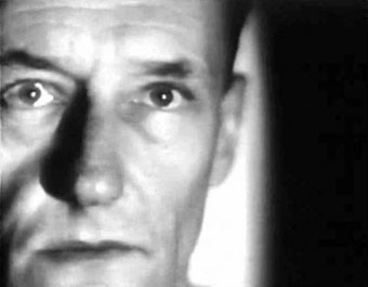
Towers Open Fire
58.8 mb (AVI)
1963, UK, 9’29”, Black and White
Cinematography: Antony Balch
Screenplay: William S. Burroughs
Cast: Antony Balch, William S. Burroughs, David Jacobs, Bachoo Sen, Alexander Trocchi
Elsewhere on { feuilleton }
• The William Burroughs archive

From Homo Sum by Konrad Helbig.
For once, a decent and restrained use of Flash. The books of erotic photography for sale from www.6×6.com can be browsed via simple animations that turn the pages of the book. A gimmick but it makes a change from clicking through another load of gallery thumbnails. Their site is divided into Blue, for pictures of men, and Pink for pictures of women. Some nice desktop downloads as well.