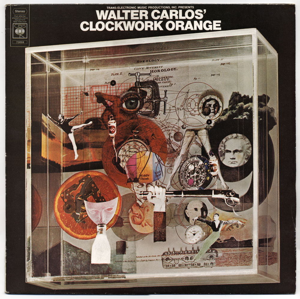
Pablo Ferro on YouTube

ferro1.jpg

Dr. Strangelove titles (1964).

There’s less of his work around than there should be, unfortunately. Saul Bass is justly celebrated for his title sequences and poster designs yet Pablo Ferro—whose titles were equally innovative and memorable—is rarely heard of even though you’ll have seen a lot of his work.

ferro2.jpg

Bullitt titles (1968).

Ferro’s advertising films brought him to the attention of Stanley Kubrick for whom he created titles and trailers for Dr. Strangelove and A Clockwork Orange (1971). The hand-drawn quality of the Strangelove titles was revisited for Stop Making Sense (1984) and Men In Black (1997), while the frenetic pace of the Clockwork trailer still seems advanced over thirty years later. This collection lacks his titles for the original Thomas Crown Affair (1968) but you can see a mix of Ferro’s split-screen work (which includes parts of the titles) here.

By Pablo Ferro:
Dr. Strangelove trailer
Dr. Strangelove titles
Bullitt titles
A Clockwork Orange trailer
Stop Making Sense titles
To Die For titles
LA Confidential titles

This Is Pablo Ferro

About Pablo Ferro:
• Pablo Ferro documentary clips: I | II

Quick Cuts, Coarse Letters, Multiple Screens—an article by Steven Heller
• Free Ferro-derived fonts! Pablo Skinny | Major Kong

Previously on { feuilleton }
Juice from A Clockwork Orange
Clockwork Orange bubblegum cards
Alex in the Chelsea Drug Store

The poster art of Richard Amsel

amsel.jpg

Hello Dolly (1969); The Sting (1973).
Murder on the Orient Express (1974); Barry Lyndon (1975).

Thanks are due for today’s post to Sebastiane who reminded me of the poster art that Richard Amsel produced through the Seventies up to the mid-Eighties. Together with Bob Peak, Amsel was a major exponent of the illustrated poster, a form that’s now completely vanished from cinema promotion in a sea of floating Photoshop heads and persistently lazy design. Amsel’s most famous piece in terms of success and visibility is probably his Raiders of the Lost Ark poster (and its variants) but I tend to prefer his work from the previous decade.

I collected film posters for a while and have one of Amsel’s Chinatown designs packed away somewhere. The Hello Dolly poster above was his first commission and must count as the first and only time a Spirograph was used (for the flowers) to create a design for a major Hollywood production. The Amsel page at American Art Archives notes that the poster for The Sting is a pastiche of the very popular (and gay) JC Leyendecker whose magazine and advertising art was contemporary with the film’s setting. This is exactly the kind of thing that can’t be done with ease today when the art is predominantly a product of digital techniques.

Amsel died in 1985, an early victim of the AIDS pandemic which possibly explains why there isn’t a site dedicated to his work as there is for Bob Peak. This page features a few examples of Amsel’s other work, however, including his instantly recognisable Divine Miss M album cover for Bette Midler. And there’s a small gallery of his posters at IMP.

Update: A retrospective article and marvellous gallery of Amsel’s work by Adam McDaniel

Elsewhere on { feuilleton }
The illustrators archive

Previously on { feuilleton }
Bollywood posters
Lussuria, Invidia, Superbia
The poster art of Bob Peak
A premonition of Premonition
Perfume: the art of scent
Metropolis posters
Film noir posters

Michelangelo Antonioni, 1912–2007

passenger.jpg

Another one bites the dust… What are the odds against two of the last surviving big names of cinema expiring in the same week? I could never get fully behind Antonioni the way I could with Bergman, I didn’t think much of the Neo-Realist school that Antonioni began as a member of while later films such as L’Avventura seemed like empty stylistic exercises. He divided opinion even among his peers—Orson Welles couldn’t bear his work whereas Stanley Kubrick put La Notte in a “ten best” list in 1963. I always enjoyed Blow-up (1966) even though it seems fatuous next to Performance while Zabriskie Point (1970) is a joke. But I like The Passenger (aka Professione: Reporter, 1975) very much.

A simple story—reporter in the Sahara swaps identities with a dead arms dealer then goes on the run—featured Jack Nicholson giving one of his last good performances before his descent into gurning self-parody. Also Ian Hendry, Steven Berkoff (between Kubrick films) and Jenny Runacre shortly before she was in Jubilee for Derek Jarman. The film works as an extended travelogue, ranging from Africa to England then into Spain as Nicholson’s character picks up student Maria Schneider on his travels and is pursued by his wife (who doesn’t believe he’s dead) and men intent on killing him. Events are resolved during a celebrated seven-minute single take where the camera passes miraculously through the iron bars of a hotel window. One of Antonioni’s finest qualities was his appreciation of architectural and cinematic space and the final shot of the film is a perfect example of this. The Passenger was out of circulation for years but is now available on DVD.

Guardian obituary | David Thomson appreciation

Previously on { feuilleton }
Further Back and Faster