My long and rambling post about the work of Barney Bubbles in January 2007 generated a considerable flurry of renewed interest in the great designer and ended by saying “We’re overdue a decent book-length examination of his work and his influence.” Just over a year later, here we are…. Paul Gorman was one of the contributors to the lengthy comments thread and I’m really pleased to see him take up the challenge to bring Barney’s work to a wider and, one hopes, new audience. Reasons To Be Cheerful (title borrowed from an Ian Dury song) is scheduled to be published by Adelita in November 2008.

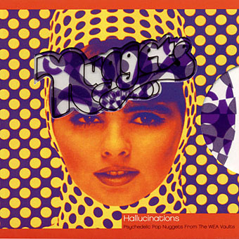
left: Doremi Fasol Latido by Hawkwind (1972).
right: Ian Dury & the Blockheads logo design (late 70s).
“He was so good I couldn’t have really competed with him.”
Sir Peter Blake
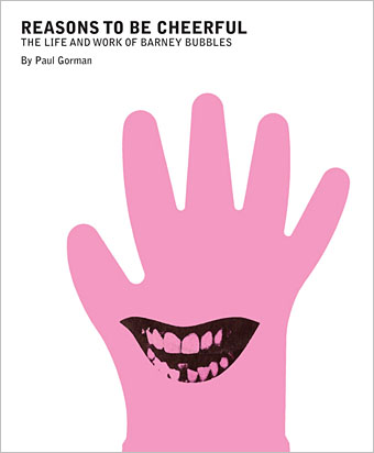
Reasons To Be Cheerful is a celebration of the life and work of one of the greatest designers of recent times: Barney Bubbles.
Bubbles—real name Colin Fulcher—was a giant of graphic design whose prodigious output is revered by musicians, artists, fellow designers and music and pop culture fans.
Reasons To Be Cheerful is published November 2008 to coincide with the 25th anniversary of the artist’s death. Author Paul Gorman is also curating a companion exhibition with Sir Paul Smith.
Barney Bubbles’ body of work included early posters for the Rolling Stones, brand and product design for Sir Terence Conran, psychedelic art with poster maestro Stanley Mouse, layouts for underground magazines OZ and Friends and collaborations with many bands and performers, from counter-culture collective Hawkwind to new wave stars Elvis Costello, Ian Dury, Nick Lowe, Graham Parker, The Damned and Billy Bragg.
Bubbles links the colourful underground optimism of the 60s to the sardonic and manipulative art which accompanied punk’s explosion from 1976 onwards, and influenced a generation of design talent including Neville Brody, Malcolm Garrett and Peter Saville.
The lavishly illustrated Reasons To Be Cheerful will contain hundreds of images and many full-colour plates.
About the Author
Paul Gorman is a popular culture historian and author of The Look: Adventures in Rock & Pop Fashion, and the top ten bestselling Straight with Boy George.
• Paul Gorman’s The Look: Adventures in Rock and Pop Fashion
Previously on { feuilleton }
• Barney Bubbles: artist and designer