Fungal observations

shriek.jpg

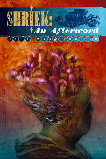
Seeing as Jeff VanderMeer and his publisher have made the cover for the new edition of Shriek: An Afterword public, I may as well do the same. The design is mine, the cover painting is by comic artist Ben Templesmith. The design and its integration with the book contents are more evident when you see the complete dust jacket, and the rest of the book, of course. Since these are still being proofed I’ll probably post them after publication. Meanwhile, the book has a reduction of 25% if you order a copy now.

Limited Edition: 500 signed numbered hardcovers
Expected Publication Date: Second quarter 2008

“Like some delicious mashup of H.P. Lovecraft, Mervyn Peake, and L. Frank Baum, but with his own verbal dexterity and perverse ingenuity…An affecting narrative about love, art, sibling rivalry, commerce, history, and some really nasty ’shrooms.” The Washington Post Book World

A year’s best selection of The San Francisco Chronicle, The Austin Chronicle, and SF Site, World Fantasy Award winner Jeff VanderMeer’s Shriek: An Afterword is a triumphant return to the author’s imaginary city of Ambergris—the setting of his critically acclaimed, best-selling City of Saints & Madmen.

Shriek: An Afterword relates the scandalous, heartbreaking, and horrifying secret history of two squabbling siblings and their confidantes, protectors, and enemies. Narrated with flamboyant intensity and under increasingly urgent conditions by ex-society figure Janice Shriek, this afterword presents a vivid gallery of characters and events, emphasizing the adventures of Janice’s brother Duncan, a historian obsessed with a doomed love affair and a secret that may kill or transform him; a war between rival publishing houses that will change Ambergris forever; and the gray caps, a marginalized people armed with advanced fungal technologies who have been waiting underground for their chance to mold the future of the city.

Experience the beautifully strange novel that received a starred review in Publishers Weekly and was praised by, among others, Elizabeth Hand, Gene Wolfe, Zoran Zivkovic, Hal Duncan, and Jeffrey Ford.

Shriek: An Afterword further established Jeff VanderMeer as the finest fantasist of his generation.” The Austin Chronicle

“Five stars! A stunning and very different fantasy novel.” BBC Focus Magazine

“In the telling, Shriek: An Afterword is an exceptional novel, a tapestry of fine writing, deep psychological insight, and acute narrative excitement…. a dark fantasy of tremendous distinction.” Locus

Previously on { feuilleton }
Shriek: The Movie
New things for April II
Jeff on Bldgblog
An announcement redux
City of Saints and Madmen

The art of Sascha Schneider, 1870–1927

schneider1.jpg

I first came across Sascha Schneider’s art some years ago when reading about German writer Karl May (1842–1912), and it was as May’s illustrator that Schneider initially gained recognition. May was one of Germany’s most popular novelists, his Western adventures about Old Shatterhand and Winnetou the Warrior sold millions of copies and numbered Albert Einstein and Adolf Hitler among their enthusiasts. Schneider’s work struck me as unusual compared to other illustrators of the period; there was a curious quality which seemed to owe more to Symbolist painting than book illustration and the few examples I saw were distinctly homoerotic at a time when homosexuality was regarded with suspicion or downright hostility. Sure enough it turns out that Schneider was openly gay and that May had no problem with this. It also transpires that the Symbolist tone which seemed so unsuited to a writer of Western pulp fiction complemented the content of some of May’s later works which weren’t Westerns at all but were Orientalist fantasies with a metaphysical inclination. The publisher wasn’t too happy with the ambivalent nature of these pictures, however, and they were replaced in later editions.

schneider14.jpg

For once I don’t have to complain about a lack of website examples, Schneider’s connections with May have at least ensured his work is still being written about even if it seems overlooked by gay art histories. This latter circumstance is unusual since he was a contributor to Der Eigene, the world’s first gay periodical, founded by Adolf Brand in 1896.

I’ve taken the liberty of posting more samples than usual here and you’ll have to forgive the lack of information about titles and dates. Many of the pictures are quite bizarre for the way they’re continually juxtaposing naked figures with angels, demons or monsters. Even the Winnetou illustrations, which should be depicting Native Americans, look more suited to the wall of a salon in fin de siècle Paris than stories of the Wild West. Links to various galleries follow.

Schneider’s Karl May frontispieces
An extensive Russian gallery
A smaller Schneider gallery

Continue reading “The art of Sascha Schneider, 1870–1927”

Engelbrecht again

engelbrecht.jpg

I’m surfacing this week from a busy couple of months having finished (more or less) two substantial book designs. I mentioned the redesign of The Exploits of Engelbrecht a couple of weeks ago and it’s been a pleasure to have another bash at this. The original design wasn’t bad as such, especially compared to the rudimentary first edition from 1950, it’s more that the production standards were raised so much by the Savoy titles which followed that I frequently felt dissatisfied with it. You can see the new cover above and I’ll post some additional examples nearer publication (ETA for that is still vague).

Maurice Richardson’s tales of the dwarf surrealist sportsman are classics of eccentric comedy and it’s been a privilege having the opportunity to reintroduce them to a new audience. I intended the new dust jacket to be reminiscent of an old theatre or boxing poster and the brown and red design will be printed on uncoated textured paper to augment that effect. In addition to this volume I’ve also designed an edition of Jeff VanderMeer‘s Ambergris novel Shriek: An Afterword for Wyrm Publishing. Once again, I’ll post more details of that closer to release.

So now I take a deep breath and see what’s next. There’s another book project imminent but I’ve been asked not to say anything about that for the time being (don’t you love a mystery?). In spare moments such as these I’ve been trying to keep working on the collected edition of the Reverbstorm comics I created with Dave Britton for Savoy. That series has always been an important part of my work, more important in many ways than The Haunter of the Dark, and it’s frustrating to have over 250 pages of some of my best artwork sitting around virtually unseen. I was supposed to have the book finished off last year but other projects kept intervening. One of the resolutions for this year has been to at least complete the scanning and re-lettering, then we’ll see where it fits into Savoy’s schedule. Watch this space.

Dorian Gray revisited

dg1.jpg

Today’s book purchase was an edition of The Picture of Dorian Gray published in 1945 by the Unicorn Press, London. It’s rather battered and the spine is stained by some unknown brown fluid that may be blood (which would suit a sanguinary tale such as this) but which is most likely something less dramatic.

The cover is a cropped version of the design drawn by the wonderful Charles Ricketts (1866–1931) for the original Ward, Lock & Co edition of 1891. More about his work below. Ricketts designed and illustrated a number of Wilde’s books and was far closer to Wilde than Aubrey Beardsley, despite the latter’s permanent association with the writer via Salomé. Ricketts’ title design for Dorian Gray was originally lettered in full and the pattern beneath it extended further down the board. The reversed “y” is a unique touch, something I don’t think I’ve seen anywhere else.

dg2.jpg

Continue reading “Dorian Gray revisited”

1st Ballardian Festival of Home Movies

ballardian_films.jpg

Via Ballardian:

In 1984 J.G. Ballard called for a ‘Festival of Home Movies’ and 24 years on we’re happy to oblige: announcing our latest competition, to promote JGB’s forthcoming autobiography, Miracles of Life. Presented by ballardian.com and HarperCollins UK, the competition will utilise ‘modern electronics’ as specified above, of an especial type that Ballard with his prodigious clairvoyant powers came close to envisaging: the mobile phone (or cell phone, for our North American cousins).

The requirement is that you shoot a one-minute film on a Ballardian theme using your mobile phone’s video camera only, no post-production allowed. That’s too much for my Motorola (above) which has never proved itself able to record more than a few seconds of continuous video for reasons unknown. The competition prize is a copy of Miracles of Life along with the forthcoming HarperCollins reissues of Ballard’s Millennium People, The Drought, The Crystal World, The Drowned World and The Unlimited Dream Company.

The constraints for this are pretty tough if all the editing has to be done in camera. I anticipate a lot of entries showing static shots of motorway traffic, windswept concrete vistas or imitations of CCTV. Anyone wishing for some offbeat inspiration can go and watch the One Minute Movies made by The Residents to accompany their Commercial Album in 1980.

Previously on { feuilleton }
JG Ballard book covers