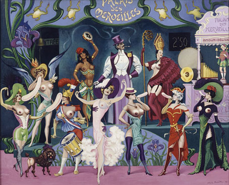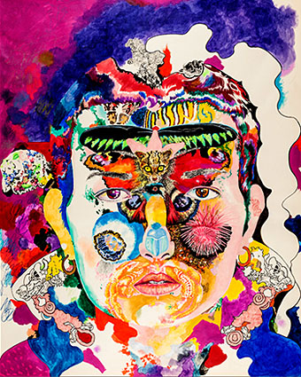
Untitled artwork by Melinda Gebbie.
• “Johnny Rocket is like a Chaucerian epic retold by David Peace with music by Bruce Haack and The Focus Group for a music hall located in Hell.” John Doran talks to Maxine Peake and the Eccentronic Research Council about their “psychedelic ouija pop”.
• Allison Meier looks at a new exhibition of Victor Moscoso’s psychedelic drawings. Related: Julia Bigham writing in Eye magazine in 2001 about London’s psychedelic poster scene.
• “Oh to eye the very enfilade through which that orchidaceous entity would make his stately progress…” Strange Flowers on the eccentric Count Stenbock.
• Melinda Gebbie: What Is The Female Gaze? The artist is in conversation next month with Mark Pilkington and Tai Shani at the Horse Hospital, London.
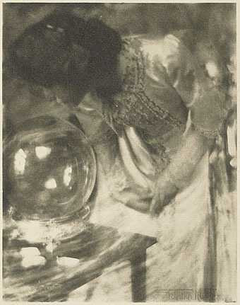
• Pamela Colman Smith: She Believes in Fairies. The Tarot artist and illustrator in a rare interview from 1912.
• Minimalist posters: “a lack of nuance disguised as insight,” says John Brownlee.
• Saturday night in the City of the Dead: Richard Metzger on the John Foxx-era Ultravox.
• The Will Gregory Moog Ensemble plays the Brandenberg Concerto No. 3.
• “In a weird way”: a brief history of a phrase by Ivan Kreilkamp.
• Die Hexe: An installation by Alex Da Corte.
• RIP Daevid Allen
• You Can’t Kill Me (1971) by Gong | Master Builder (1974) by Gong | When (1982) by Daevid Allen