
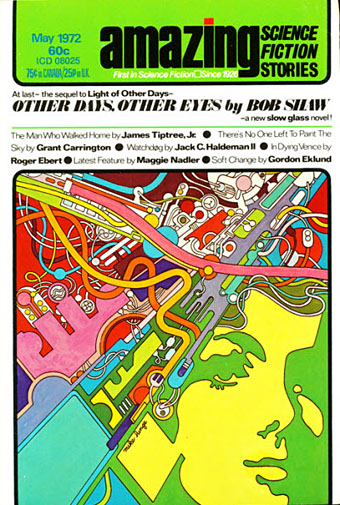
Amazing Science Fiction, May 1972.
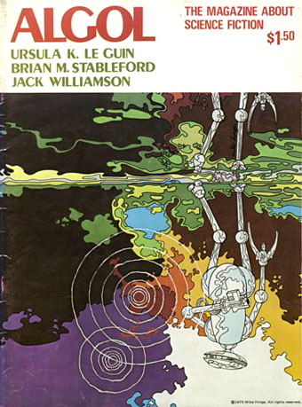
Back in March I ended my post on the psychedelia-derived art style that I think of as “the groovy look” with the words “there’s a lot more to be found.” There is indeed, and I’d neglected to include anything in the post by Mike Hinge, a New Zealand-born illustrator whose covers for American SF magazines in the 1970s brought a splash of vivid colour to the groove-deprived world of science fiction. This was a rather belated development for staid titles like Amazing and Analog whose covers in the previous decade wouldn’t have looked out of place in the Gernsback era. Opening the door to someone like Mike Hinge, a graphic designer as well as a general illustrator, was probably a result of both magazines having undergone recent changes of editorship. Hinge approached SF art in the same way that Jim Steranko approached comic-book art in the late 1960s, importing trends that had been flourishing outside the medium. (And Steranko liked Hinge’s art enough to publish a portfolio of black-and-white drawings, The Mike Hinge Experience, in 1973.) This kind of graphic style was increasingly outmoded by the mid-70s but some of Hinge’s compositions are audacious in context: the Algol cover with one of his robots seen in a water reflection (and those ripples that defy perspective), the Analog cover that works both vertically and horizontally.
For this post I’ve favoured Hinge’s groovy look over other covers, especially those from the late 70s when his cover art shifted to a painted style which is less distinctive, and less interesting as a result. It’s the distinctive style that people still prefer today. There’s more to be seen at Tenth Letter of the Alphabet and Onyx Cube.
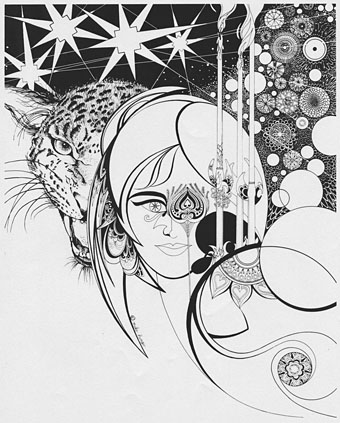
Undated drawing (probably mid-60s).
Something else you can always find more of is Aubrey Beardsley borrowings. Via Tenth Letter of the Alphabet which has a couple more pieces in this style.
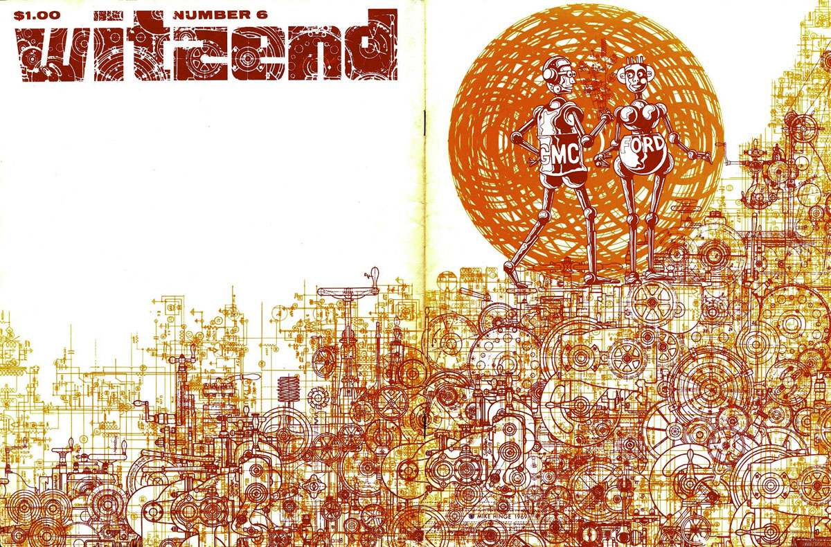
Wraparound cover for Witzend #6, Spring 1969.
Witzend was a magazine of comics, fantasy stories and related art published by Wallace Wood, a complete run of which may be found here.
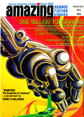
Amazing Science Fiction, November 1970.
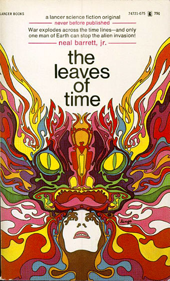
The Leaves of Time (1971).
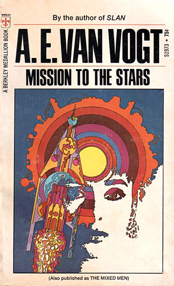
Mission to the Stars (1971).
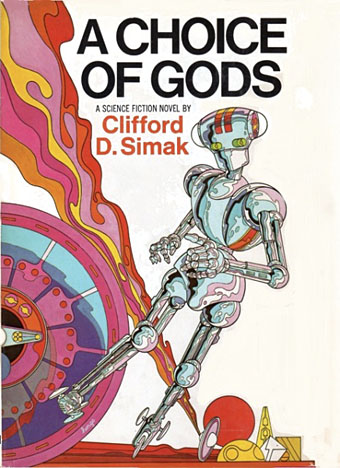
A Choice of Gods (1972).
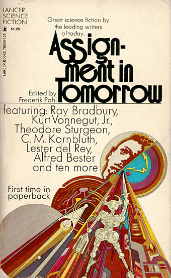
Assignment in Tomorrow (1972).
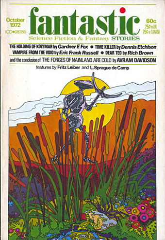
Fantastic, October 1972.
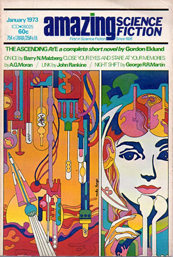
Amazing Science Fiction, January 1973.
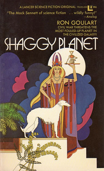
Shaggy Planet (1973).
Erté goes SF? I might have said this was coincidence if it wasn’t for the Beardsley details seen above.
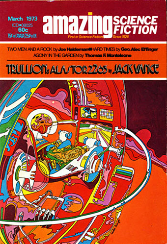
Amazing Science Fiction, March 1973.
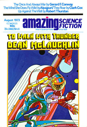
Amazing Science Fiction, August 1973.
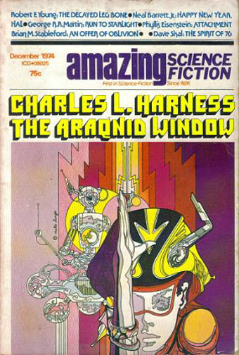
Amazing Science Fiction, December 1974.
Algol, #24, Summer 1975.
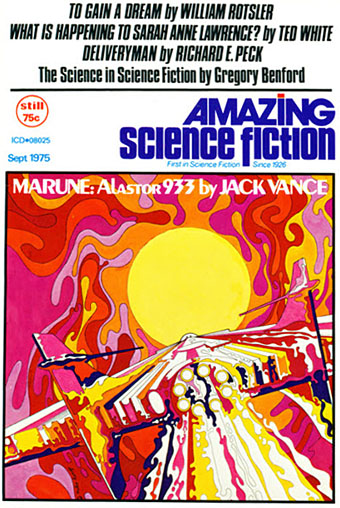
Amazing Science Fiction, September 1975.
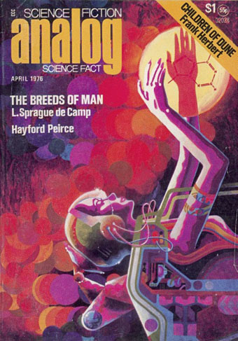
Analog Science Fiction/Science Fact, April 1976.
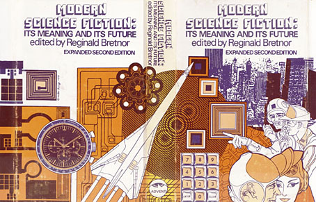
Modern Science Fiction: Its Meaning and Its Future (1979).
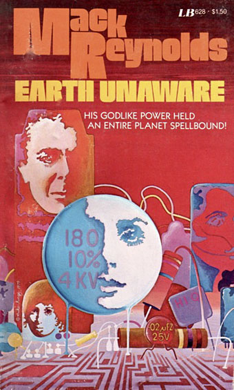
Earth Unaware (1979).
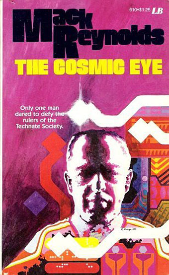
The Cosmic Eye (1979).
Heavy Metal, July 1979.
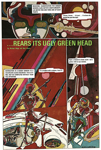
…Rears Its Ugly Green Head was a comic-strip collaboration between Hinge and Neal Adams published in Heavy Metal magazine. Much of Hinge’s art had already been used as cover art elsewhere. Hinge took a similar approach for another Heavy Metal strip, Object, which reused some of his black-and-white magazine illustrations to create an SF story. Both strips may be seen in full here.
Elsewhere on { feuilleton }
• The illustrators archive
Previously on { feuilleton }
• The groovy look
One thought on “The art of Mike Hinge, 1931–2003”
Comments are closed.