
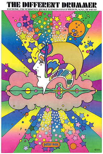
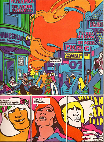
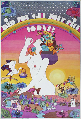
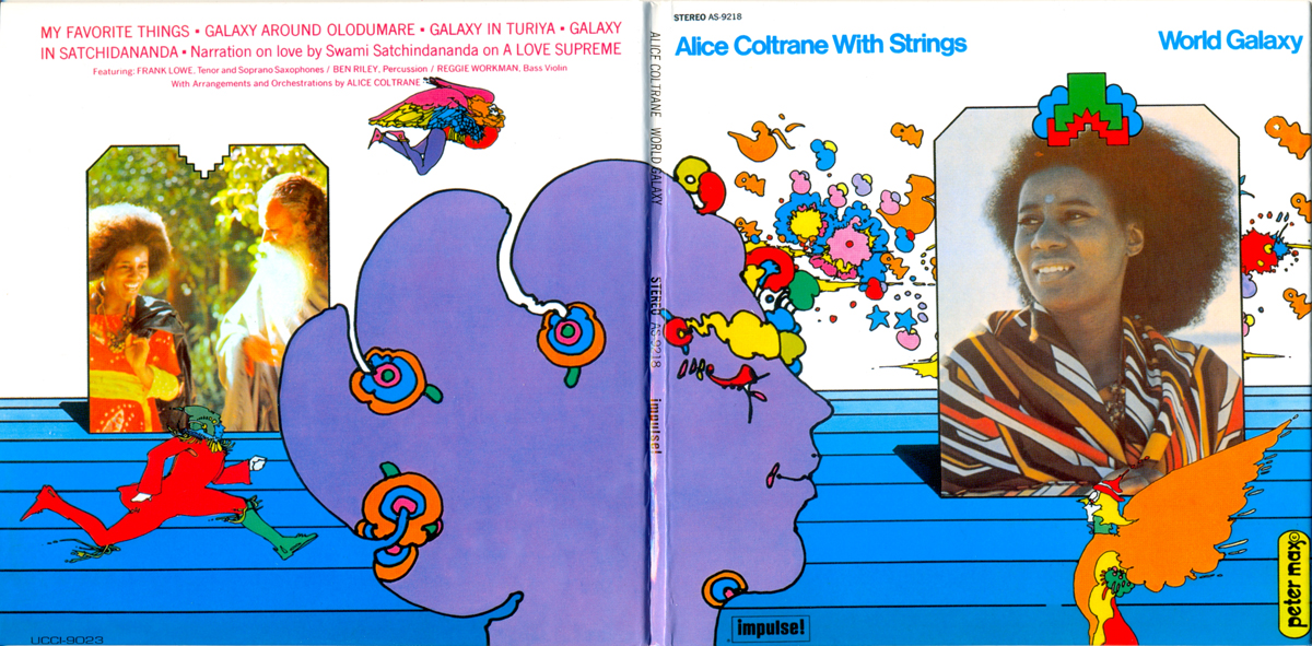
Peter Max, 1968.
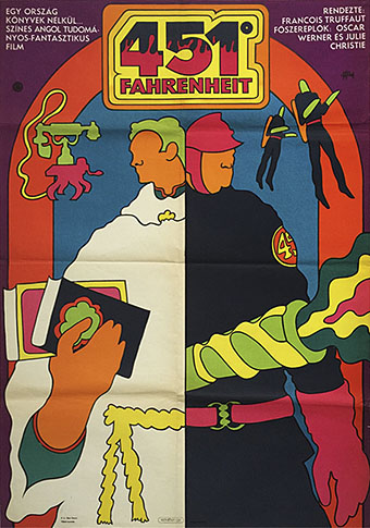
Artists complain justifiably about the constraining effect of labels but sometimes you really do need a label in order to identify a particular idiom. The artwork here is what most people would regard as psychedelic even though the subject matter isn’t always psychedelic at all. I doubt that Citroën intended their new Dyane car to be associated with LSD when they asked Michel Quarez to create a comic book to promote the vehicle, while Quarez’s Mod Love comic is just as hallucinogenically chaste. I tend to think of this style as “groovy”, an unsatisfying term with other associations but “post-psychedelic”, while accurate, feels too cumbersome for such playful graphics. The groovy look is where the purely psychedelic style enters the mundane world, and where the intended audience may be youthful but isn’t always a crowd of experienced lysergic voyagers; a watering down of psych delirium mixed with a dash of Pop Art, all bold shapes, heavy outlines and very bright colours, comic art (or actual comics) with the edges and detail smoothed away and the gain pushed to the maximum. I keep wishing someone would put together a collection of this stuff. There’s a lot more to be found.
Update 1: I knew I’d forgotten somebody. I replaced the book cover by Gray Morrow—an artist who was never really groovy in the manner of these other works—with a contraception poster by Nicole Claveloux, who was very much in the Groove Zone in the 1970s.
Update 2: Added designs by Miguel Calatayud, Mike Hinge, György Kemény, and Tito Topin. Thanks to Vadim for the tips!
• Further browsing: The Peculiar Manicule.
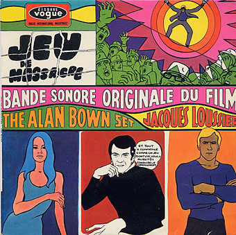
Guy Peellaert, 1967.
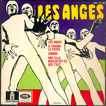
Guy Peellaert, 1968.
Guy Peellaert, 1968.
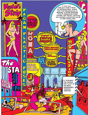
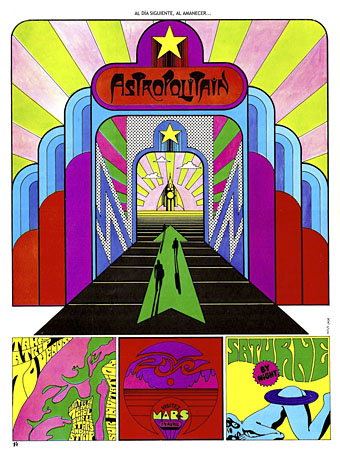
The Adventures of Jodelle by Pierre Barbier and Guy Peellaert, 1966.
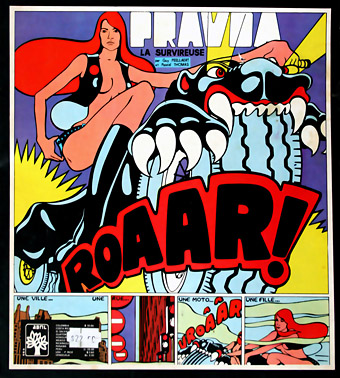
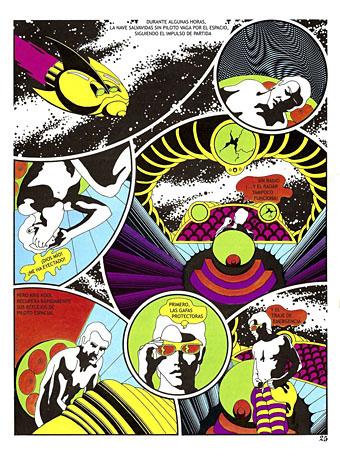
Pravda, La Surviveuse by Guy Peellaert, 1967.
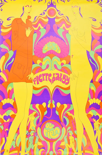
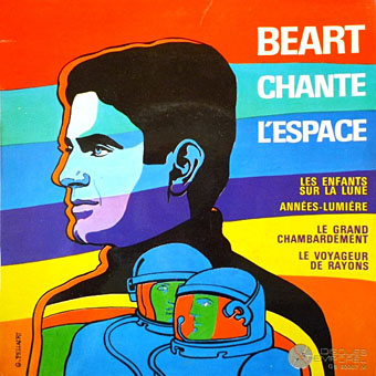
C’est Pierre d’Alby ou rien by Tito Topin, 1967.
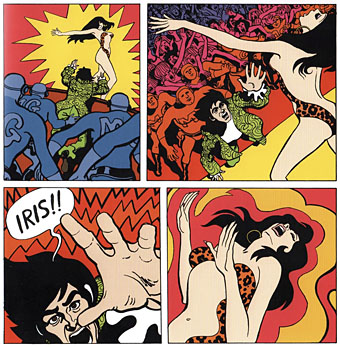
Iris by Lo Hartog van Banda and Thé Tjong-Khing, 1968.
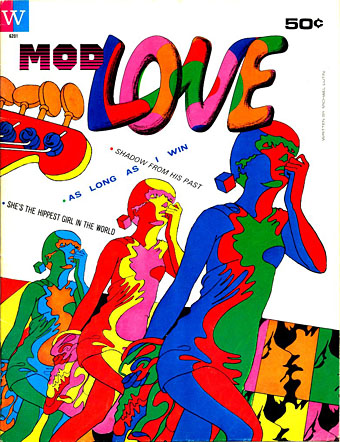
Mod Love by Michael Lutin and Michel Quarez, 1967.
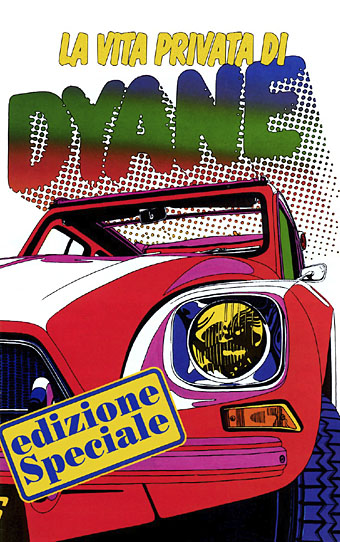
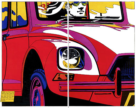
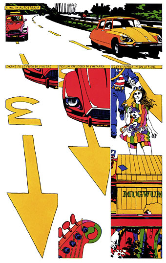
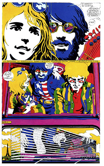
The Private Life of Dyane by Michel Quarez, 1968. What are these young groovers transporting in their crate labelled “Mugwump”?
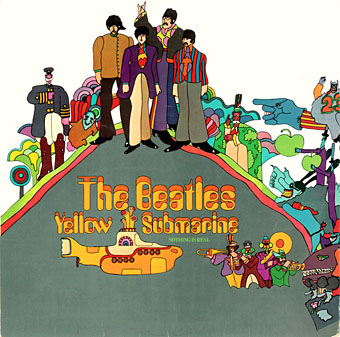
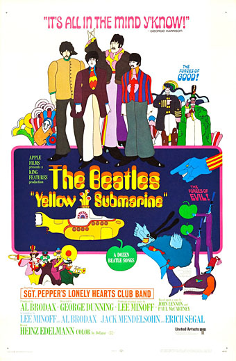
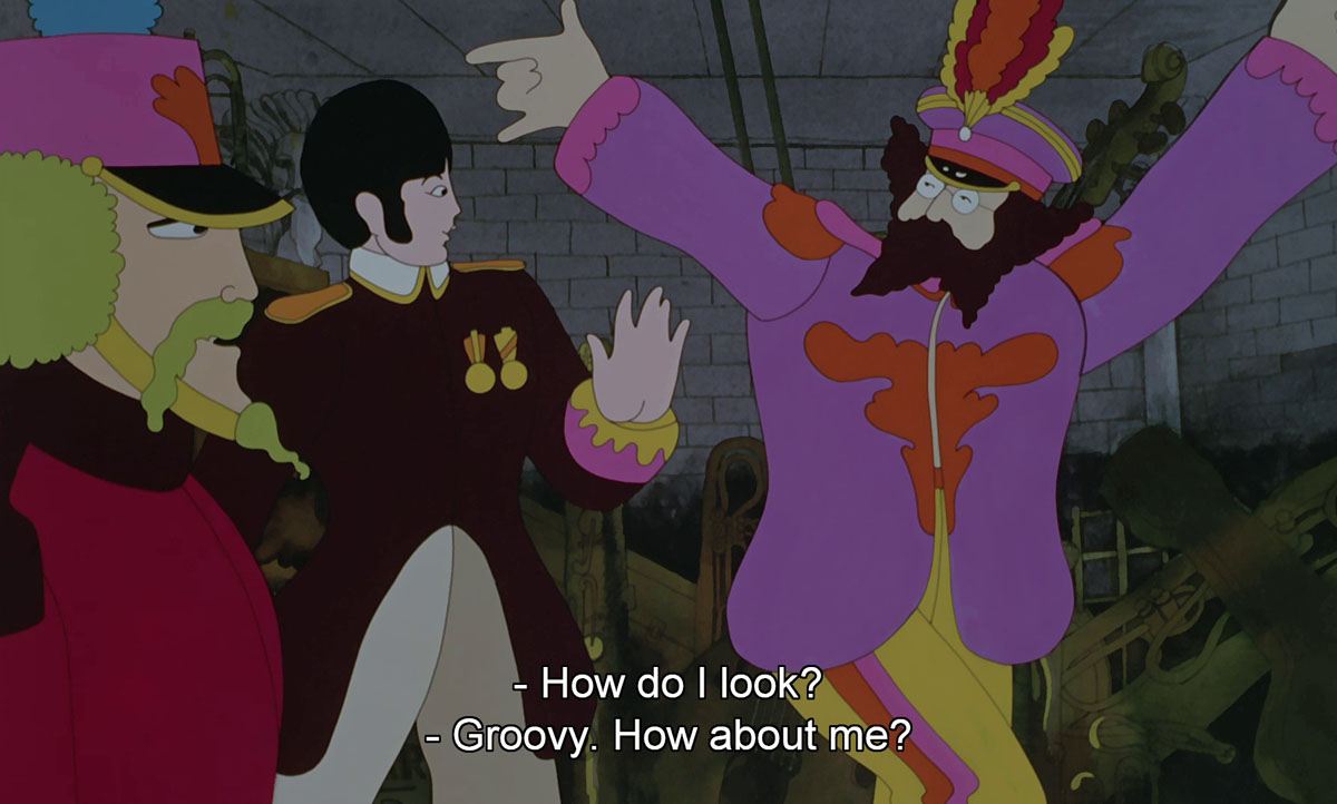
Heinz Edelmann and various animators, 1968.
John Alcorn, 1969.
John Alcorn, 1969.
György Kemény, 1969.
Nicole Claveloux, 1970.
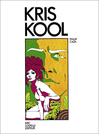
Kris Kool by Philippe Caza, 1970. Caza’s mind-blowing erotic SF comic book was finally published in an English edition late last year.
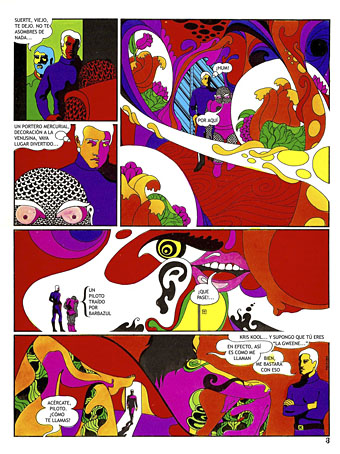
Philippe Caza, 1971.
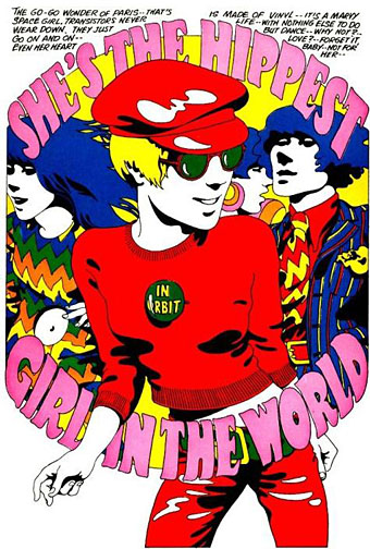
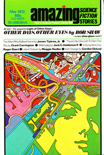
Peter Max, 1972.
Mike Hinge, 1972.
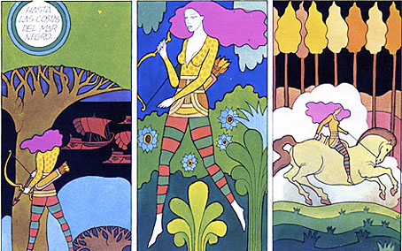
Miguel Calatayud, c.1973.
Previously on { feuilleton }
• The psychedelic art of Nicole Claveloux
• Art that transcends
• Philippe Caza covers
• Saga de Xam by Nicolas Devil
I love this style! Groovy’s as good a descriptor as any though I think of it as an intersection between Pop Art and Pysch (Pop Psych!). Aldrich is a great purveyor of it, and you can find Peelaert’s style leaking into set design on things like the Bee Gees Belgian special for Idea.
Steranko’s romance comic “My Heart Broke In Hollywood” employs it as an effect melding it with his own clean line drawing style.
https://theperiodicfable.files.wordpress.com/2011/10/steranko-love-1.jpg
Seems to be a direct line from this as an aesthetic into glam era designs like the Mr. Freedom boutique.
Yes, I’m not so keen on Aldridge’s later airbrush art but he was definitely part of the Groovy Set in the late 60s. I’ve got this Ballard book he did the cover for in 1967:
https://64.media.tumblr.com/e4f7e73c74b9a869dc426ac1175bce50/tumblr_nm1w6a0QO11qznlfio1_1280.jpg
That Steranko comic looks great! He was always looking at art outside the comics world so you’d expect it of him. In the early 70s you even find the style filtering into comics and books for children. Nicole Claveloux did an amazing children’s book with Guy Monreal in 1970, The Teletrips of Alala:
https://www.peculiarmanicule.com/the-teletrips-of-alala
Never seen that Bee Gees clip before, but it’s great! > https://www.youtube.com/watch?v=oZ9RdE0R-Ts
Keiichi Tanaami was brilliant in this style as well. I looked online for a link to his art for Jefferson Airplane’s After Bathing At Baxter’s, and the very first search result led me straight to… this site.
Yeah, that happens a lot when I’m searching for very niche things…”Ack, me again!” A consequence of having done this for a while.
There’s a chapter about Tanaami and his work in the Electrical Banana book about psychedelic art. A very worthwhile volume that also features Tadanori Yokoo.
I call this style the ”YELLOW SUBMARINE” aesthetic, for obvious reasons, or, rather, I associate it with YELLOW SUBMARINE. It may be the vibrant colours, but it produces in me a curious sense of ”Anemoia”, as I was not alive in the sixties; but I try not to get nostalgic for any era. I become interested in them, perhaps, and might project myself in the form of a detached observer, but I never wish to live in them. I am content with the present.
How is 2021 treating you so far? I trust you are still productive?
The Beatles definitely gave the style global recognition. And without their weight it might not have had such an extended shelf life. The UK Glam scene in the early 70s borrowed some of its visual trappings from late psychedelia, unsurprisingly when so many of the artists had started out in the Mod/Beat/Psych world.
2021 has been very good so far, thanks, quite a contrast to this time last year when work was drying up while people were fleeing their offices and reorganising their schedules. I work from home so I’ve been unaffected by the exodus which is a fortunate position to be in. Lots of interesting things on the go at the moment, including a substantial commission that I’ll be working on for most of the year.
*sob!* I miss psychedelic art and music. Given that everything old is new again, hope for its comeback in my lifetime.
As for the Steranko story, my recollection is that prior to his comics work or simultaneously with it, he had a day job as an art director at some local ad agency in or around Reading, PA. So, yeah, he was hip on design, which he has acknowledged over the years. So a romance story drawn in the late 60s, of course he would use psychic colors and, to a lesser degree, design.
There’s a really good book that I have of Tanaami’s 60’s/early 70’s work called “Killer Joe’s” and also one called “Portrait Of Keiichi Tanaami” that includes a DVD of his animated work which, whilst great isn’t quite as retina melting. They’re both worth hunting down but “Killer Joe’s” is the must-buy of the two. The Bee Gees’ “Idea” show used to pop up on bootleg DVD at record fairs in good quality but with a timecode superimposed. Just under half an hour of it’s running time is taken up by Julie Driscoll, Brian Auger and The Trinity (they also feature heavily in The Monkees’ “33&1/3 Revolutions Per Monkee” TV special of the same year) and it’s 27 minutes of unadulterated Hammond B-3 grooviness. Most of The Bee Gees’ songs are on Youtube although chopped into individual segments but the Jools & Brian bits have been assembled into one sequence so here ‘tis: https://youtu.be/iVzdB8loc5M
Modzilla: Wow! I’d seen a couple of those Julie Driscoll clips before–I think I even linked them here in the past–but not the rest. I really like those cover versions.
Film & TV graphics are a whole other world when it comes to the groovy style. It took me years to realise that Thames TV’s magazine series for kids, Magpie, had a title sequence based on the Sea of Time counting sequence in Yellow Submarine. And the Spencer Davis Group sang the theme tune:
https://www.youtube.com/watch?v=tkd-1hBK9fI
Sorry but it’s not fair to present all these as a hotchpot of “cool” or “groovy” pics as if they were all the same. There are enough on Pinterest and they’re just disheartening. It would be nice to give Guy Peellaert proper credit. He invented this, the “Jodelle Style” in 1966 (actually in late 1965) and it immediately became one of the most widely imitated styles in advertising and graphic design throughout Europe. All these examples are blatant rip-offs, and they’re not nearly as sophisticated (see Jodelle, Pravda La Survireuse and Jeu de Massacre for the very distinctive aerodynamic draughtsmanship that is the Jodelle style —it’s much more than just those colors!) or inspired. When Peellaert was concerned with diluting his singular work by agreeing to more than a handful of projects (most of the times for fellow artists) a deluge of mediocre record and magazine covers, comics and adverts was immediately produced in a would-be similar style, and even though those “artists” (commercial or otherwise) were fans, they never gave Peellaert proper credit and so he was never in a position to really “own” his own creation in the collective imagination, in the way that Lichtenstein or lesser artists were able to make lifelong lucrative signatures out of their own breakthroughs. Pseudo-Peellaert was everywhere by 1967 (as your examples attest, but there are too many more to count) and it was sickening to him : as early as 1969 he felt he had no choice but to break the mould and he ended up creating another hugely influential style and technique with Rock Dreams, which would ironically launch many more imitators by the mid 1970s.
So many artists find ONE thing and are happy to stick with it for the rest of their careers, you’ve got to admire someone who could have so easily done the same and had the guts to reinvent himself several times over. He was such a maverick, and people only know about 20% of what he created.
Hi Daniel. I’m not sure how to respond to your complaint when it doesn’t seem very coherent. There are six pieces by Guy Peellaert in this post so he’s certainly not being ignored. I also didn’t try and identify any one artist as being the originator of anything. Whether Peellaert invented this look is a matter of opinion, as these things usually are when people claim one person as an originator of an idiom where the edges are blurred enough to have multiple origins. Peter Max was also creating vibrant coloured art in 1965 so he might also be counted as an inventor of this style (and his name appears on a sign in one of the Pravda pages I posted above). But in this case I don’t think you can point to a single inventor of the look when it was very obviously in the air in the mid-60s, not least in the work of the Pop artists whose prints and paintings pre-date the work of both Max and Peellaert. Eduardo Paolozzi is one artist whose prints come immediately to mind.
One of the hazards of working in popular culture is that people steal and dilute things all the time. If an artist wants to avoid this then they really shouldn’t be publicising their work at all. Art is often a dialogue between different modes, eras, trends and other artists. Sometimes the dialogue involves theft; even if it does you can’t use that as a reason to avoid referring to the existence of the work that ensues. Some of the musicians that Guy Peellaert painted in Rock Dreams have been accused of stealing (or profiting from) the work of Black artists; The Rolling Stones, for whom Peellaert painted a record cover, even took their name from a song by Muddy Waters. Following your argument, Muddy Waters and Howlin’ Wolf were the originators of a form of Chicago Blues that the Stones copied so we shouldn’t ever mention the Rolling Stones, or try and describe the evolution of Black R&B into white blues, freakbeat, psychedelia, and the rock music that the Stones were playing in the 1970s. This doesn’t strike me as a realistic or desirable proposal.
It’s not a “look”. It only became a “look” after graphic designers and illustrators / commercial artists discovered The Adventures of Jodelle (which was NOT popular culture, but a very subtle subversion of the comic form, made in response to American Pop Art—and not inspired by it, as goes the oft-repeated misconception—for an elitist audience of a few thousands in a small Paris bookshop/publisher) and immediately proceeded to rip it off and milk the cow for all it was worth until it became just that, an empty fashionable “look” with no artistic value. It was not a “dialogue” at all. Of course you’re right in pointing out that artists have references and borrow stuff from each other constantly, but they need to take it further, have a point of view, create something new with it, maybe take it to a different realm and mix it with something completely new like Peellaert did when he took pinball machines and dizzying cinematic compositions and Matisse colors and aerodynamic characters and put it all in a coffee-table books for a sophisticated adult audience like Godard and Gainsbourg or Fellini. That was radical at the time, it didn’t borrow anything from the same medium. Advertising artists in those days just ripped it off mindlessly and without credit, and today people who do not know the backstory are not able to provide context, and they just present all these images in a mood-board style where people are led the believe they are all the same—just because they have “vibrant colors” as you suggest. Is that really all there is to see in Peellaert’s work from this period? Vibrant colors?! I have hundreds of these examples of “groovy psychedelic pop” images from 1966-1970 where entire characters or panel compositions have been ripped off straight from the pages of Jodelle or Pravda. It’s too literal to be a “dialogue” and it’s a bit much to see Michel Quarez and Peellaert side-by-side with no distinction.
I think (hope) that people are able to see the difference and are curious enough to dig deeper than that because all thing are not equal, and yes they are originators and there are followers, many of whom are just bad.
Hi John
I’d forgotten the Magpie title sequence – the only thing that I’d recalled from it was the walking Murgatroyd. The theme tune is available in full on an RPM CD called, appropriately enough, “Magpie” which also includes amongst other nuggets, the equally groovy theme for “Ace Of Wands”. In the same vein as “The Teletrips of Alala” is a book illustrated by Heinz Edelmann called “Andromedary -SR1”. The art isn’t as striking as that for “The Yellow Submarine” and some of the pictures are printed in greyscale but it’s worth looking into. Talk of YS brought to mind the Freddie and The Dreamers TV show “Little Big Time” which had a weekly segment called “Oliver In The Overworld” featuring their bass player dressed like a psychedelic grandfather clock and was a kind of school pantomime version of Yellow Submarine. The music, if I remember rightly, was like Sgt. Pepper’s albeit recreated by people who’d never heard actually it but had had it described to them during a session smoking banana skin joints… Back on topic but not quite so colourful as some of the other examples here is this cover for the hardback edition of Moorcock’s “The Final Programme” from 1969 by Mal Dean:: https://themelnibonemiscellany.weebly.com/uploads/1/1/8/2/11827088/5920561_orig.jpg
Ha, I didn’t remember Little Big Time even though I know I used to watch it. No memory at all of Oliver in the Overworld but this album cover is using Yellow Submarine‘s Amelia typeface:
https://www.discogs.com/release/8248636-Oliver-In-The-Overworld/images
Crystal Tipps and Alistair is another one from kids’ TV in the 70s that seemed derived from the post-Edelmann style, albeit watered down. I was more taken with the Krofft productions like Banana Splits and HR Pufnstuf. And Ace of Wands was a big favourite, I’ve mentioned it here a couple of times in the past.
The Mal Dean Moorcock cover is very familiar, I had to incorporate a panel from it when I was doing the design for Eduardo Paolozzi at New Worlds:
http://www.johncoulthart.com/bibliopoesy/paolozzi.html
I used to watch “Crystal Tipps And Alistair” avidly as a child but on buying a DVD I found it rather too simplistic plot-wise. It does make for pleasant eye candy whilst listening to music though and I’d definitely watch “Crystal Tipps & Aleister”, an “Ace of Wands”-style kiddie’s sitcom about a young girl and her creepy Uncle’s magickal shenanigans if such a thing existed. I loved “H R Pufnstuf” but now wonder how they slipped such a blatant reference to smoking pot past the suits at the TV company at the time. I also liked its follow-up, “Lidsville” (another reference, a lid being American hippy parlance for an ounce of weed) which had the same premise as “Hatty Town”, a British show from a year or so earlier:
https://youtu.be/btpd8zg5VWA https://youtu.be/rdpd-tXkUlQ
It’s amusing to see Eddie Munster/Milo from “The Phantom Tollbooth” with long hair.
St. Thomas’ Hospital used to have a set of Paolozzi’s collage screenprints on display which I enjoyed whilst a guest there following passing out and breaking my jaw attending a Steve Hillage concert at the Marquee Club in ‘78 (Hillage very kindly sent me an autographed copy of his “Getting Better” single as a get well soon present!)
As an aside, I’d like to ask if it’s worth getting the new edition of “Voices Of Fire” apart from your rather fine cover since I too, own the original paperback. I particularly liked the proto-hauntological aspect where some of the events that happen and characters that die in the earlier stories reappear as ghosts or echos in the ones set in later times.
To finish, the stars are finally right so your “Psychedelic Wonderland” calendar has been getting another well deserved airing due to the the dates aligning once more – the only other one to get this treatment is the one I got with my vinyl copy of “Killer” featuring a blood-spattered and cat-suited Alice Cooper hanging from a noose. However, it must be said that my wife much prefers your one.
I’m sure the Krofft shows were aimed at druggy teens as much as at small children even though they wouldn’t have ever admitted as much. And by coincidence, I’ve been listening to Steve Hillage this week. One artist I’ve never seen live even though I have almost all his albums.
I’m fairly sure the interior of VotF will be the same as the first edition, minus the spot illos, so it depends really whether you want two copies of the same book. Alan said he wanted to make some minor corrections although I don’t know what these would be, I didn’t notice anything awry when I read through it again. I imagine the hardback will go fairly quickly knowing how eager comics fans are when it comes to collectible things. And by another coincidence, I also have the Alice calendar on the wall this year. I recycle calendars fairly often if the dates match and I don’t have anything new to put up.