
Today’s post at Wormwoodiana reminds me that David Lindsay’s unique novel of philosophical fantasy, A Voyage to Arcturus, was published a hundred years ago today. I designed a lavish reprint for Savoy Books in 2002, an edition which unfortunately used the re-edited text from earlier reprints instead of going to the original publication. This wasn’t done for lack of a first edition, it was more out of ignorance—nobody bothered to look into the history of the text—as well as convenience; Savoy’s earlier reprinting of Anthony Skene’s Monsieur Zenith the Albino had involved many weeks of text preparation, scanning pages from a photocopy of Skene’s very scarce novel, then running the copy through rudimentary OCR software and proofing the result. In Savoy’s slight defence, the reprint of Arcturus did correct a couple of typos that everyone else had missed.
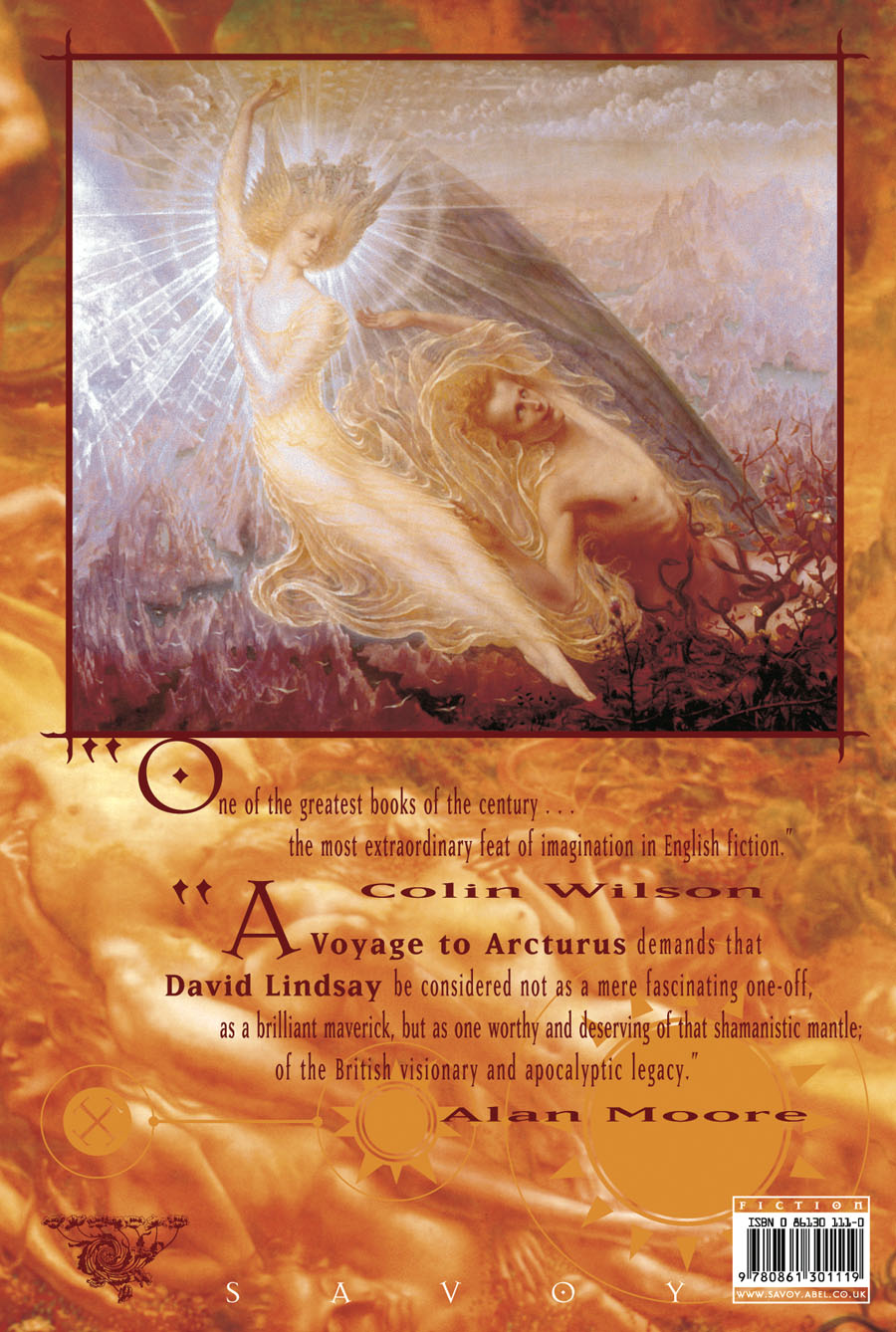
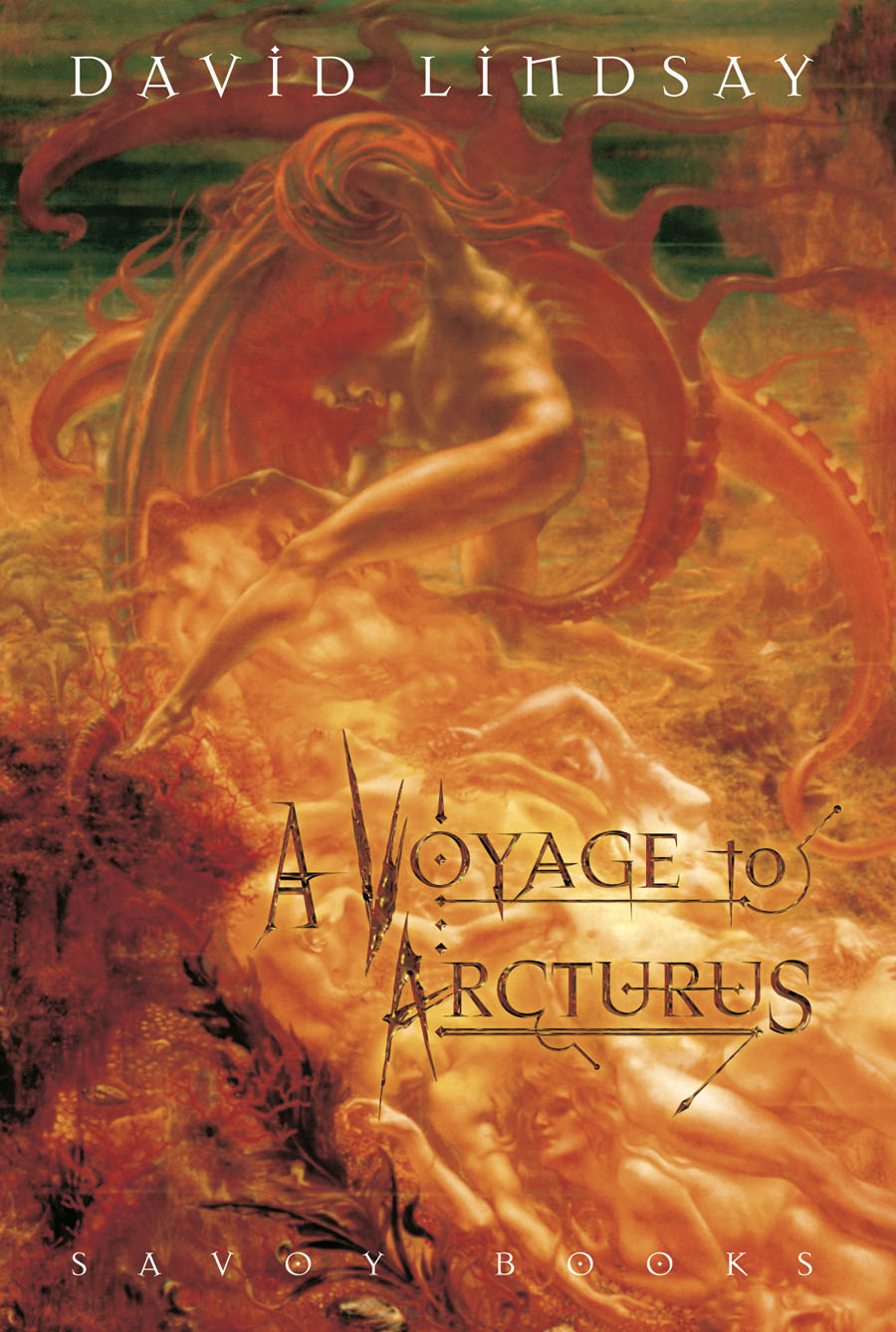
I still think the best feature of my design was the selection of Jean Delville’s remarkable Symbolist painting, The Treasures of Satan (1895), a picture used with the permission of the Brussels Museum of Fine Art. (They supplied us with a print of the painting together with a photo of Delville’s Angel of Splendour (1894) for the back cover.) With the exception of Bob Pepper’s artwork for the 1968 Ballantine paperback, previous reprints of the novel seldom reflected the contents on their covers. I’m no longer happy with the type layout on the rest of the dust-jacket, however, although the front cover looks okay. The Savoy edition included an introduction by Alan Moore, an afterword by Colin Wilson, a collection of philosophical aphorisms by David Lindsay, plus a couple of photos of the author which I don’t think had been published before. Despite its flaws, the book was well-received. The paper was heavier stock than is generally used for hardback fiction which made for a heavy and expensive volume but the edition still sold out.
Penguin are reprinting the novel next year in an edition which continues the tradition of unsuitable cover art. According to Lindsay site The Violet Apple the figure on the cover is from an illustration for a Dostoevsky novella, so what is it doing on Lindsay’s book? Cover art aside, the novel is in a class of its own, and very highly recommended.
Previously on { feuilleton}
• The art of Bob Pepper
• Masonic fonts and the designer’s dark materials
My recollection is that the Savoy text did not come from one of the corrupted editions, but from a reprint of some Gollancz edition which was mostly sound.
Thanks, Douglas. I’m fairly sure the core text was taken from whatever electronic version was at Gutenberg.org in 2002 then checked against older Gollancz editions; my own copy of the latter is one from 1978 that Mark Valentine gave to me. If the Gutenberg text was sound (aside from the errors we spotted) then the Savoy edition may be better than I thought. I don’t think anyone at Savoy was aware of these discrepancies until Sandy Robertson mentioned the existence of different texts in an email.
I have to say, of course I lack the professional eye, but I love the look of this new Penguin Science Fiction Series; maybe it’s just a nostalgia fix on my part.
The books look good together but some of the covers are far more successful than others. If the idea is to apply pre-existing art with a minimal appearance to each cover then the one for Arcturus is still a poor choice because it suggests nothing at all about the novel, and could easily be applied to many other books. I’m pleased to see a novel by the Strugatsky Brothers on the list; I read some of their works earlier this year.
The new Penguin cover exhibits a very pervasive trend in modern cover design to repress the fantastic or exotic elements of a novel and present it as though it falls within the genre of realism. Never really understood this tendency, since fantasy books tend to outsell realism anyway.
I think that’s right, it’s a way of selling genre books to general readers who may be curious but who might be embarrassed to be seen reading something with cover art that reveals too much about the disreputable contents. I don’t object to that so much–Penguin paperbacks didn’t use to have any cover art at all–my complaint is more when the minimal art or design still doesn’t work. The drawing by Jean Arp on the Lovecraft book is another example of this: an outline that looks like a stylised woman’s body for a writer whose work contains few female characters at all.
I’ve added a note to posting about various editions of Arcturus and which text they contact. The Savoy edition does indeed have the corrupted text as a basis.
Thanks, I suspected as much but it’s good to have it confirmed.