
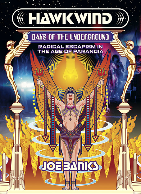
As mentioned at the weekend, Joe Banks’ account of the first ten years of Hawkwind will be published by Strange Attractor Press later this year with a wraparound cover of my design. I never expected to be doing anything else for Hawkwind after moving on to other things in 1985, but it was the group’s first decade of music that fuelled the drawings which brought me to their attention, so this cover design brings everything full circle. The earliest of my Hawkwind drawings dates to 1979 which means this cover is also an anniversary piece.
The design combines Barney Bubbles’ Space Ritual template with elements of the art he created before and afterwards, notably the inner and outer sleeve of Doremi Fasol Latido, and the futuristic Art Deco of his tour poster for The “1999” Party. All the Bubbles Hawk-art up to and including Space Ritual is a blend of the ancient (Egypt, tribal motifs, characters that resemble pirates or barbarians), the previous century (Art Nouveau in particular), and the far future as depicted in comics and pulp magazines. I wanted to reflect this blend without being too imitative of the details, so the cover works a variation on Space Ritual, with a similar hieratic woman as the focus, and a margin of stylised flames separating the foreground from Laurie Lewis’s photos of the band (the latter are unused shots from the same session used for Space Ritual).
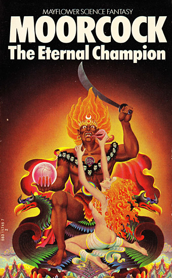
Art by Bob Haberfield, 1970.
All the background elements run across the wrap but this hasn’t been revealed yet so you’ll have to wait a while to see the full design. The flames are based on Tibetan designs in a nod to the ancient side of the equation, as well as Bob Haberfield’s covers for the Moorcock novels published by Mayflower in the early 70s, many of which featured art derived from Tibetan Buddhism. (And one of the Mayflower Moorcocks, The Black Corridor, is the origin of the monologue of the same name on Space Ritual.) The full wrap shows a futuristic city whose Frank R. Paul-derived architecture is either on fire or menaced by a wall of encroaching flames. Many of Hawkwind’s songs of the period concern flight from cities or from the Earth itself—Born To Go, Time We Left (This World Today)—so the back cover also has a number of vehicles fleeing the scene: the radical escapism of the book’s subtitle in literal form. “Sign my release from this planet’s erosion,” as Nik Turner sings in Brainstorm.
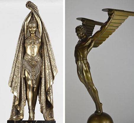
Antinea by Demetre Chiparus; Icarus by Otto Schmidt-Hofer.
Among the other details, the male figures are adapted from an Art Deco statue of Icarus; this provides a very tenuous connection to the Hawklords album which mentions Icarus in The Only Ones. The titles are set in Stop, a typeface used a few times by Hawkwind during the 70s, and Amelia, one of several “futuristic” computer-styled type designs from the 1960s. I wanted to use Data 70 for the subtitle, this being the one used on Space Ritual, but the letters are wider than Amelia so it wouldn’t work as well.
As before, the limited edition of the hardback will not only feature the widescreen cover design but will also come with a bonus book of interviews, Sideways Through Time: An Oral History Of Hawkwind In The 1970s, a print of Michael Moorcock & Jim Cawthorn’s Sonic Assassins comic strip from Frendz (featured here in 2008), and postcards featuring the Laurie Lewis Space Ritual photos. Pre-order it here.
Previously on { feuilleton }
• The Chronicle of the Cursed Sleeve
• Rock shirts
• The Cosmic Grill
• Void City
• Hawk things
• The Sonic Assassins
• New things for July
• Barney Bubbles: artist and designer
Have to get in the queue for this straightaway!
I also see the cover as a tribute to the band’s dancer Stacia featured here w/His Nibs LK on vox
>https://www.youtube.com/watch?v=HdTFeW8FCto
Yes, Stacia is in the mix, and also in one of the photos on the wrap. There’s a small nod to Barney B’s letterhead design for Stacia in the triangles on the pendants of the Space Witch:
https://missstacia.bigcartel.com/product/miss-stacia-poster-barney-bubbles-design-hawkwind