
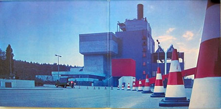
Gatefold interior for Doppelalbum (1974), a double-disc compilation album by Kraftwerk.
More Kraftwerkiana. “Leitkegel” is the German name for traffic cones, and it’s immediately obvious to anyone browsing Kraftwerk’s pre-Autobahn recordings that Ralf and Florian had a fixation with these objects. The closest thing I’ve found for a rationale is in Tim Barr’s history of the group, Kraftwerk: From Dusseldorf to the Future (1998), which features some musings about the influence of Joseph Beuys and the Düsseldorf arts scene of the late 60s. Prior to Kraftwerk, Florian Schneider was a member of a short-lived art collective/music outfit with the very un-Kraftwerkian name of Pissoff. Recordings exist of the group performing with Beuys. A more straightforward explanation might be to look towards Pop Art (something that Barr also suggests), with the traffic cone serving as a symbolic objet trouvé that’s also the first inkling of the future Kraftwerk obsessions with roads, trains and cycling. Whatever the impulse behind its adoption, between 1969 and 1973 the traffic cone was turning up everywhere that Ralf and Florian went.
Cover design by “Comus” (Roger Wooton).
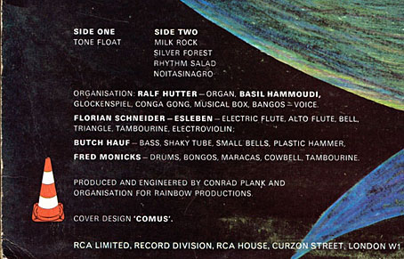
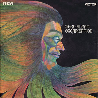
The first instance is on Tone Float (1970), the pre-Kraftwerk album by Organisation, a collection of freeform improvisations that’s very much of its time. The album wasn’t very successful, and matters weren’t helped by the poor cover artwork. That multicoloured head and Ringlet typeface are also very much of their time but if you look on the back of the sleeve you find a traffic cone beside the album credits.
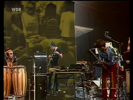
Organisation live (1970).
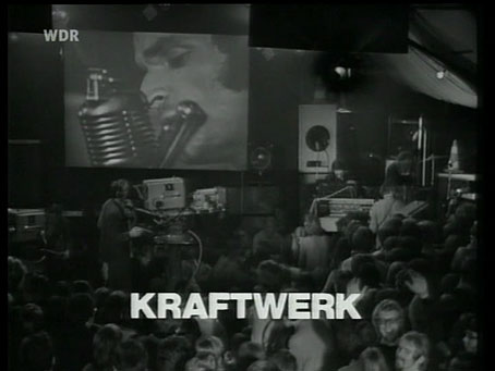
Before the group split they were recorded by German TV, a performance that gives a good idea of the Organisation sound and of how odd they all look together. Ralf Hütter isn’t visible but you do glimpse a traffic cone for a moment when Florian is moving his microphone stand. I suspect the proliferation of cones around Florian (see below) is an indicator that their adoption was his doing.
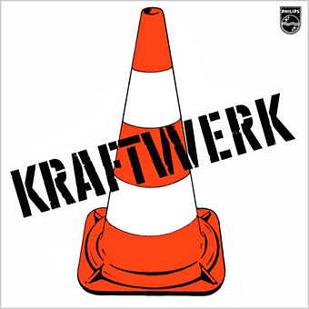
Kraftwerk (1970). Design by Ralf Hütter.
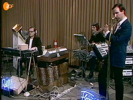
The cone comes to the fore on the cover of the first album, of course, and it’s also visible again behind drummer Klaus Dinger during one of the group’s first television performances.
Ruckzuck (1970).
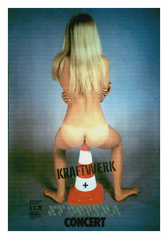
The most surprising appearance would have to be this ridiculously sexist poster for a concert at the Oststadthalle, Karlsruhe, in July 1971. No designer credited but I can’t imagine this was the group’s work. Et Cetera are a band described in the Freeman Brothers’ Krautrock book as playing psychedelic jazz. More TV appearances follow below, all of them without Ralf who left the group for a couple of months in 1971.
Köln II (1971).
Köln II (1971).
Köln II (1971).
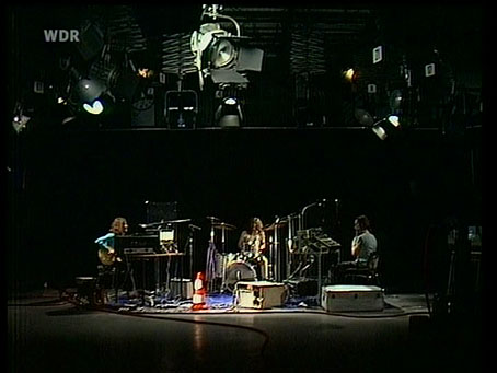
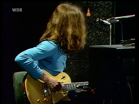
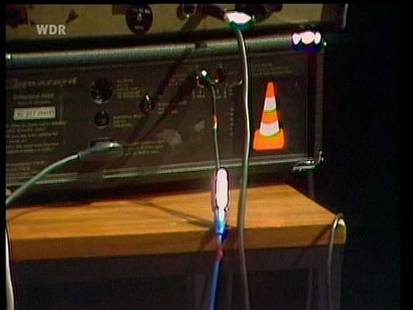
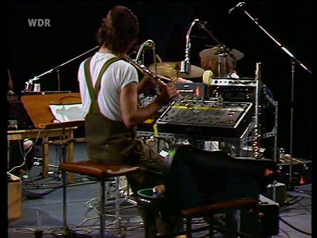
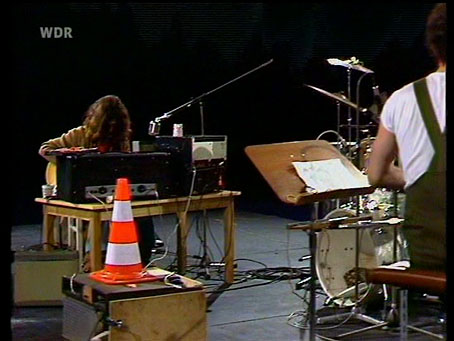
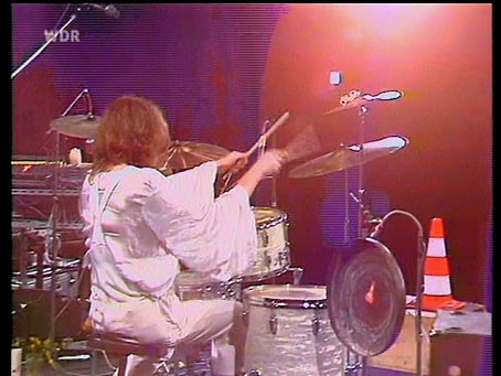
These performances feature Klaus Dinger on drums again, and Michael Rother on guitar. Dinger and Rother left shortly after (when Ralf had returned) to form Neu!, another group with a very distinctive sound and visual identity. The TV clips show a profusion of traffic cones, both real and in sticker form: Florian has one on his violin case while Klaus stuck one inside a gong.
Rückstoss-Gondolier (1971).
Rückstoss-Gondolier (1971).
Rückstoss-Gondolier (1971).
Rückstoss-Gondolier (1971).
Kakteen, Wüste, Sonne (1971).
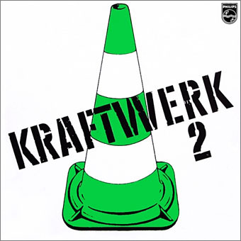
Kraftwerk 2 (1972). Design by Ralf Hütter.
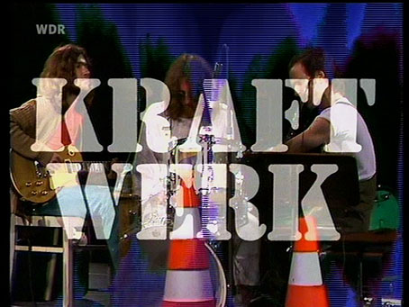
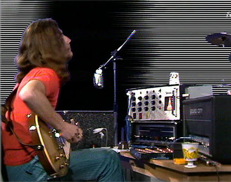
The cone appears again on the second album. It made a final appearance on the sleeve of the third album, Ralf and Florian (1973), although there are other sporadic instances such as the TV appearance below (the first with Wolfgang Flür on electronic drums) and the gatefold sleeve of the compilation album above.
Tanzmusik (1973).
Given the connection with roads it wouldn’t have been surprising to find a cone or two in the design for the Autobahn album but the autobahn sign is the dominant symbol there. The traffic cones are permanently wedded to the early group history that Kraftwerk continues to ignore. If the first three albums were ever reissued together the cone would be an obvious focus for the design although I’m increasingly doubtful that we’ll be seeing this any time soon.
Previously on { feuilleton }
• German gear
• Autobahnen
• Ralf and Florian
• Reworking Kraftwerk
• Autobahn animated
• Sleeve craft
• Who designed Vertigo #6360 620?
• Old music and old technology
• Aerodynamik by Kraftwerk
Allow me to suggest the road-cone related work of Jeffrey Smart for future Kraftwerk cover art.
http://uploads5.wikiart.org/images/jeffrey-smart/bus-terminus.jpg
Konrad Klapheck’s style would lend itself too, but road-cones seem to be the only industrial artefact he *hasn’t* painted. Perhaps he takes commissions.
All the recent Kraftwerk design has stripped the symbolism to a bare minimum so a re-packaging of the first three albums would no doubt follow suit. I’d envisage all-white sleeves with a vector graphic of an orange cone (side elevation, no 3D) for the first one, a green cone for the second, and the neon lettering (on white) for Ralf and Florian. In fact I’m tempted to put some roughs together myself!