
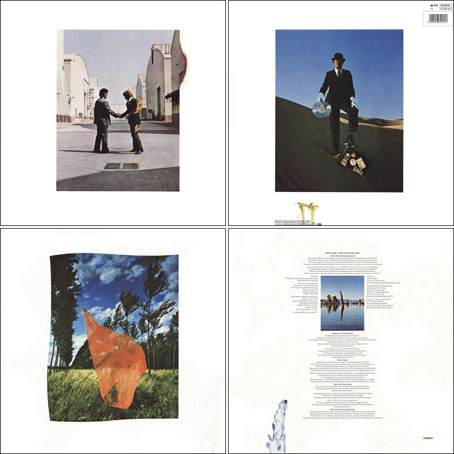
Wish You Were Here (outer and inner sleeve, 1975) by Pink Floyd.
Whenever people ask questions about your work, at some point the subject of influences always turns up. Influences for me are usually few, they’re those things which skew your perception to such a degree—or which enlarge the range of possibilities—that they make you follow a path you might otherwise have never pursued. I’ve said on many occasions that the window of our local record shop in the 1970s was an art gallery whose contents changed every week, with gatefold sleeves offering an endless variety of fantastic visions and smart designs. I was often indifferent to the music the sleeves were intended to advertise, if a favourite band happened to have a great record sleeve then so much the better. It wasn’t that I wanted to be a record sleeve designer as such, more that the views (as Roger Dean called his first book) were incredibly stimulating, and they excited me enough that I wanted to have the creation of images like that in my future.
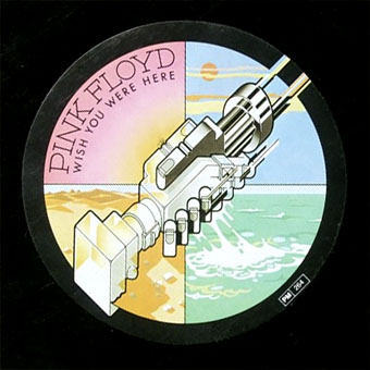
Wish You Were Here shrinkwrap and George Hardie’s sticker design.
I’ve written at some length about Roger Dean and Barney Bubbles but it was Hipgnosis that dominated those window displays during the golden age of record sleeve design. Obituaries of Storm Thorgerson have rightly been acknowledging the contributions of his Hipgnosis design partners Aubrey Powell and Peter Christopherson, but Thorgerson always came across as the driving force, a position reinforced by his text for the group’s first book collection, An ABC of the Work of Hipgnosis: Walk Away René (1978), and by his post-Hipgnosis career which continued to generate even more startling images. Walk Away René is like the designs of Hipgnosis themselves: witty, clever, and beautifully produced, while Thorgerson’s commentary is refreshingly honest both about the details of album production, and in its lack of the affectation which afflicts many design books. Working in the music business probably helped maintain a no-bullshit attitude; it’s difficult to imagine many other designers cheerfully announcing in their first public showcase that their studio is so primitive that everyone has to piss in the sink. Or, as I noted in December, drawing attention to your least favourite covers in an even more lavish showcase.
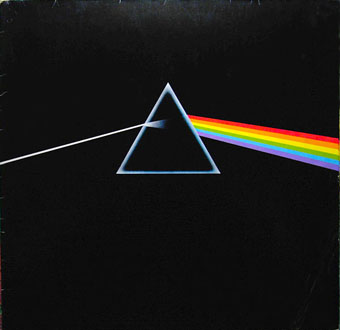
The Dark Side Of The Moon (1973) by Pink Floyd.
The cover examples here have been chosen via the essays in For the Love of Vinyl: The Album Art of Hipgnosis (2008) where several people were asked to choose their favourite sleeves. I’d find it impossible to choose a favourite, although at a push I’d probably go for Wish You Were Here. With its absence/four elements concept, in its original package—the postcard insert, the unlabelled sleeve shrink-wrapped in black cellophane then stickered with a George Hardie drawing which I once laboriously copied—it comes close to perfection when you’re discussing album designs as works of art.
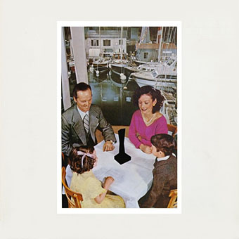
Presence (1976) by Led Zeppelin.
The Hipgnosis Covers site is the place to see more work by Storm Thorgerson and company.
• Storm Thorgerson, Pink Floyd and the final secret of the world’s greatest record sleeve designer
• The Guardian: “The best album designer in the world”
• Storm Thorgerson remembered by Aubrey Powell
• Adrian Shaughnessy at Creative Review
• Mark Blake at MOJO
• Telegraph obituary
Go 2 (1978) by XTC.
Elsewhere on { feuilleton }
• The record covers archive
Previously on { feuilleton }
• Hipgnosis turkeys
• Peter Christopherson, 1955–2010
• Storm Thorgerson: Right But Wrong
• Battersea Power Station
Thank you.
Sad now.
What a pity, and only 69, it’s a shame he didn’t live to see and design for the return of the 12′ LP? – One of my fantasy futures revolves somehow around the return of the LP as the only format in existence for listening to music – and that mainly for the design possibilities. I wonder how many people bought records just because of the sleeve design – I know I did – at least half my collection. I only wish I had had more money at the time – and living in the US, what a revelation on discovering the difference between US and UK LP pressings. UK far superior…thanks to Thorgerson and others – Wish I was there…
Vinyl is certainly doing well at the moment, I recently designed my first gatefold sleeve after thinking I might never have the opportunity:
http://www.johncoulthart.com/decalcomania/material.html
One odd thing about UK releases versus elsewhere was that Canada often had sleeve variations you didn’t find in other countries. I still don’t know why this is unless it’s to do with the provision that all Canadian music releases have to be manufactured in Canada, and not imported. The Pink Floyd albums are a good example, Meddle and Wish You Were Here have slightly different artwork–Meddle has a blue tint I always preferred–while the later pressings of Atom Heart Mother all have the album title above the cow.
http://pinkfloydarchives.com/DCaLPPF.htm
Great work John, love the design, and what a cool project all around – the sleeve fits the music like a hand in glove (I heard a few samples on youtube). I have had some really bad experiences ordering import LPs (severe damage), but I may chance the postal services again and get a copy of Material – also saw some really neat video done for emptyset { } on youtube – some for the same project I think – reminded me of early German abstract films…Eggeling perhaps? Go vinyl!
Thanks, I don’t really do much with these recent releases except arrange the typography and prepare everything for print but that still requires care. I think of Emptyset’s video things as being more like transmissions from something like The Stone Tape. The earlier Medium album was all about capturing the audio atmosphere of an allegedly haunted building.
Incidentally, what I said above about the alternate sleeve of Wish You Were Here is nothing to do with Canadian strictures. I looked in the first Hipgnosis book and Storm T says they changed the fire man picture on a whim.