

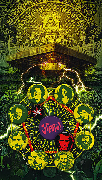
Continuing this occasional series. The above motif is the Golden Dawn’s Wedjat or Eye of Horus emblem as reproduced in the hardback edition of The Confessions of Aleister Crowley, an “autohagiography”. Crowley was under discussion here a few days ago and the eye in a triangle symbol can also be seen on the sleeve of the single featured in that posting, forming a part of the seal of the Ordo Templi Orientis, the occult order which Crowley joined in 1910. Crowley’s use of the eye in a triangle caught the attention of writer Robert Anton Wilson and the first part of his Illuminatus! trilogy (written with Robert Shea) is titled The Eye in the Pyramid. That latter symbol appears on the reverse of the American dollar bill, of course, and some of the conspiracy theories surrounding that usage are explored in the novel. Wilson went on to make the eye in a triangle something of a personal symbol and his obsessive use of the motif caught my attention in turn when I began reading his books.
All of which leads us to Hawkwind and a person whose name keeps turning up on these pages, designer Barney Bubbles.
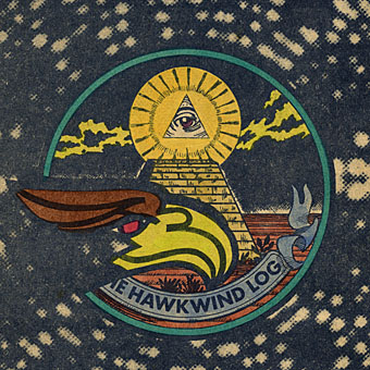
Hawklog cover (detail) by Barney Bubbles.
The booklet which BB designed for Hawkwind’s second album, In Search of Space (1971), featured a version of the dollar bill symbol on its cover. This is the only eye in a triangle design I’ve seen among Barney Bubbles’ work although he was so prolific there may well be others. When I began producing my own significantly inferior Hawkwind graphics in the late Seventies I incorporated eyes in triangles partly as a way of avoiding having to draw hawks all the time but mainly because of Robert Anton Wilson. BB had already established a precedent and it so happens that the eye in the Golden Dawn/Crowley version is the eye of a hawk-headed Egyptian god.
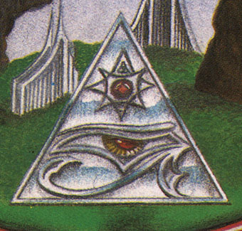
Church of Hawkwind booklet (cover detail).
My first published work for Hawkwind outside fanzines was in another album booklet, for Church of Hawkwind in 1982. The first three pages each feature the eye in a triangle motif.
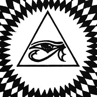
Church of Hawkwind booklet (detail).
The design above may be crudely drawn but it went on to have a life of its own, as we’ll see below. Be thankful you’re spared the rest of the shoddy drawing.
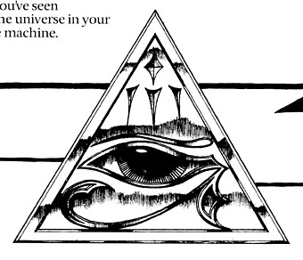
Church of Hawkwind booklet (detail).
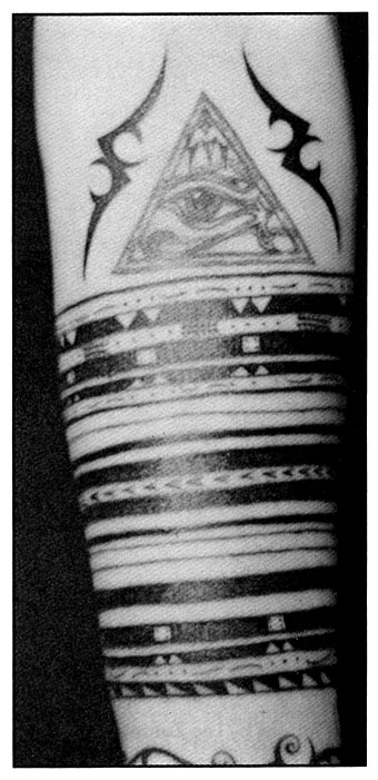
This more finely-rendered illustration surprised me when it turned up in the 1989 RE/Search book Modern Primitives (below) which catalogues contemporary tattooing and piercing trends. I’ve no idea whose arm this is, the only credit is for the tattooist, “Morbella in Amsterdam”. This makes me wonder just how many tattoo versions there are, and whether it was one of the tattooist’s available designs or something brought in by the tattooee.
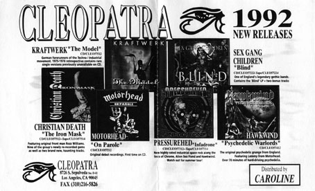
Browsing in a record shop in 1992 I came across a pair of Hawkwind and Kraftwerk compilations on a new American label, Cleopatra, and was surprised (again) to see my crudely drawn eye from the Hawkwind booklet being used as the label logo. They never asked me about this and I doubt they asked Dave Brock either. Not that I’m too concerned, it was rather satisfying to see something of mine on a Kraftwerk release (below) and on their later reissues of the Chrome albums, a cult band of mine for many years. The label is still active and still using a slightly more streamlined version of this eye design as their logo.
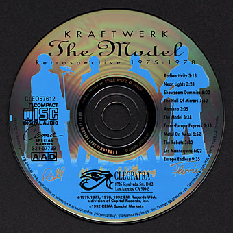
Kraftwerk: The Model—Retrospective 1975–1978 (1992).
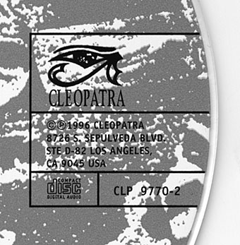
One of the Cleopatra Chrome reissues (1996).
The other eye in a triangle from the Church of Hawkwind booklet was resurrected next in digital form in 1994 on the cover of 25 Years On, a 4-CD Hawkwind box set from Griffin Records. If nothing else this seemed to confirm that the symbol had become one of the secondary Hawkwind icons after the ubiquitous hawk silhouette.
Out, Demons, Out! (2004).
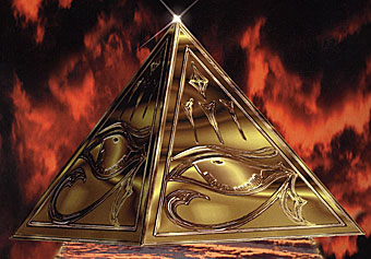
And so to my most recent dalliance with this ancient symbol which brings us back to the dollar bill pyramid. This was my cover illustration for issue 13 of Arthur Magazine with its feature on the 1967 exorcism/levitation of the Pentagon. I wouldn’t say this was necessarily the last appearance of the eye in a triangle in my work either. As the examples above demonstrate, some things creep back into your life in the most unexpected ways and some symbols are far more durable—and more flexible—than others.
Elsewhere on { feuilleton }
• The album covers archive
Previously on { feuilleton }
• Aleister Crowley on vinyl
• Design as virus 6: Cassandre
• Design as virus 5: Gideon Glaser
• Design as virus 4: Metamorphoses
• Design as virus 3: the sincerest form of flattery
• Design as virus 2: album covers
• Design as virus 1: Victorian borders
• Chrome: Perfumed Metal
• Barney Bubbles: artist and designer
• Robert Anton Wilson, 1932–2007
the eye of horus is a slightly recurring motif for Barney Bubbles (but not within a triangle).
off the top of our heads we can recall that it appears on the back panel of Dr. Z’s Three Parts to My Soul, in artwork Barney did for Oz, and on an Elvis Costello Armed Forces T-shirt (which was a particularly interesting find!)
The Illuminati really are everywhere.
I have a photo, alas not digital, of a church in Mistra (near Sparta) with an eye in the architrave. Lots of Illuminati jokes were bandied about at the time, as I recall.
Yes, it seems to be a more common religious symbol in the Mediterranean. Years ago a friend sent me a photo of some graffiti she saw in Rome of an eye in a triangle on a wall. Also an Italian matchbox which features one as (maybe) another logo. I may still have those somewhere…
I use to draw a lot of eyes myself, including when I’m painting on canvas. It’s the part of the body (and I’m not only referring to the human one) that seems, to me at least, to be the real guardian of the soul, and by that I’m referring specifically to humans (it’s telling when you talk to someone and that someone does not, or cannot, look you in the eyes, better stay away, ’cause something’s not right).
Yeah, that Cleopatra’s label eye do remind me of your ones on the Hawkwind covers, I still have those CD, including the ’25 Years On’.
Well, anyway I just wanted to state that we’re seing eye to eye in this issue.
Best regards, friend.
camden electric ballroom small ads in the back of melody maker etc had a pyramid and eye graphic… was it their logo… don’t know their history too much
and…
the adverts barney bubbles did for glastonbury fayre have an eye/pyramid. you can see one of the ads here:
http://davidwills.wordpress.com/2008/11/04/four-quid-for-faire-fare-is-fair/
:-)
Ah yes, the Glastonbury one I remember. Makes sense appearing there since they had a pyramid stage then as now, albeit less permanent.
Did Barney design that stage? He said he had a lot to do with the first Faire, but never went.
Hi David. I wasn’t implying as much (if that’s what you think) although I expect BB’s Egyptophilia would have appreciated the pyramid.
how i can open 3eye?