
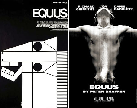
A juxtaposition of old and new theatre posters in the New York Times caught my eye this week, part of a feature about the current Broadway run of Peter Shaffer’s play. The news there, of course, has been Daniel Radcliffe’s on-stage nudity; understandable, perhaps, but celebrity trivia has overshadowed appraisal of Shaffer’s work as a piece of art.
What struck me seeing these was the two very different approaches to the same design problem. Given the subject matter, using an image of a horse is somewhat unavoidable as well as being immediately attractive since horses nearly always look good. The freight of historical and cultural association they carry is also one of the themes of the play. I really like the spare treatment of Gilbert Lesser’s 1976 poster for the National Theatre (left) and much prefer it to the new version used for the London and New York shows. The Lesser poster has the quality of a puzzle, matching the psychological piecing together of the story and Alan Strang’s accusation that Dysart the psychiatrist is always “playing games”. It also has a sinister quality lacking in the contemporary version; Shaffer’s Equus is an unforgiving god and the black eyes could refer to the blinded horses. The Photoshop horse looks altogether too mundane and is it my imagination or is the horse head misshapen slightly in order to fit the torso?
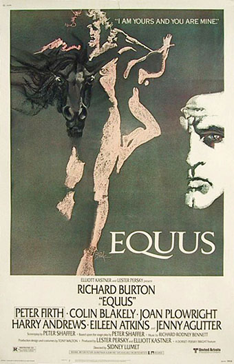
The poster for Sidney Lumet’s 1977 film version was the work of Bob Peak and his horse is a suitably ferocious presence. His rendering of the figures as primitive shapes swimming in shadow is the kind of thing no Hollywood studio would allow today. The Bob Peak site has several intriguing variations on this design which show how the poster might otherwise have appeared. Peak was particularly good with horses, as his brilliant designs for The Black Stallion show. And Carroll Ballard’s film might be seen as the flip-side of Equus with its tag-line “A boy. A myth. A god.” Or maybe it’s the pre-adolescent version, before the boy’s passion for horses becomes intensified by sex.
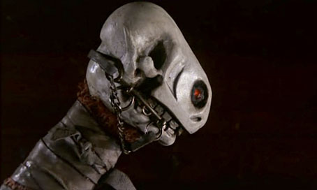
The sinister shadow behind all these images is the skull of the horse which the National Theatre poster hints at and whose presence is explicitly evoked in the opening shot of Lumet’s film where we see a knife with a carved handle (above). The ancient icon of a horse skull is the principal element of the Welsh folk figure of the Mari Lwyd, described thus:
The Mari Lwyd consists of a mare’s skull fixed to the end of a wooden pole; white sheets are fastened to the base of the skull, concealing the pole and the person carrying the Mari. The eye sockets are often filled with green bottle-ends, or other coloured material. The lower jaw is sometimes spring-loaded, so that the Mari’s ‘operator’ can snap it at passers-by. Coloured ribbons are usually fixed to the skull and to the reins (if any).
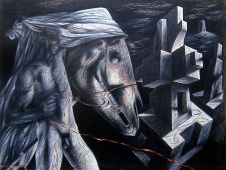
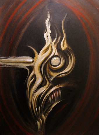
Red Halter by Clive Hicks-Jenkins (2001).
These various themes—horses, their skulls, sexuality, death—find potent expression in the Mari Lwyd series of paintings and drawings by Clive Hicks-Jenkins, a succession of stylised, Picasso-esque figures and the horses they encounter. As in Equus, the horse in Hicks-Jenkins’ work—whether alive or dead—is the connecting bond between the present and an ancient, primal past:
The sexy muscled young man, emerging more and more from the sheet as the series goes on, could be one of the dancers Clive directed. But the menacing horse’s death-head he carries is a powerful metaphor for AIDS. He seems to be offering and taking away at the same time, an alluring invitation and a deadly threat. There is ancient as well as contemporary menace here, too – the severed horse’s head as a sacrificial object from the iron age. The head is also a memento mori.
All of which has served to remind me of a painting of my own which I produced just over ten years ago and which receives its first public showing here.
This was little more than a sketch in acrylics based on the horse in Henry Fuseli’s The Nightmare. It too owes a debt to Picasso and there’s something of the Mari Lwyd about it, especially the teeth. I’ve no idea now why I painted this but then art doesn’t always justify its existence with a reason. I never gave this a title at the time. Perhaps Equus would be fitting?
Update: Daniel is very taken with the actor who plays one of the horses.
Previously on { feuilleton }
• The poster art of Bob Peak
• Perfume: the art of scent
Extremely creepy painting, John. Frightening (in a good way).
Thanks, Nathalie. That was done very quickly. When you work like that sometimes something appears which you didn’t expect. Was certainly the case with this one.
Thank you John for mentioning my work on your site. Most kind of you. And the Equus connection with that 2001 Mari Lwyd series of mine, came full circle when Callum James suggested to Nicolas McDowall at the Old Stile Press that I’d be a good choice of artist should the press ever decide to produce an illustrated edition of Peter Shaffer’s play. They did, and I’ll be completing my part of that project shortly. The book will be published next year.
I greatly enjoy reading your blog. Keep up the good work.
Hi Clive. I feel a bit embarrassed now since I really like those paintings and drawings and reading back I see I didn’t say much about them.
That’s very curious about the Equus connection. I know that Callum has an obsession with the play but I don’t recall him mentioning your work, unless he did and I missed it. Great news about the Old Stile edition in any case, I’ll have to order one of those.
No embarrassment necessary. And no critique either. I was just happy to see the drawing there. I kind of assumed that you wouldn’t be so perverse as to put up something on your own site which you hated!
Callum posted a set of my Mari Lwyd drawings on Front Free Endpaper last year, to accompany some of his own words. He also wrote of my large-scale drawing Deposition III, which he’d seen at the home of some friends. And last but not least, it was his recommendation to Nicolas McDowall at The Old Stile Press, that brought me the commission to illustrate Equus! I’d always wanted to direct the play when I worked in the theatre, but never got closer than directing one by Shaffer’s brother Anthony. (And not a particularly well written play at that!) So thanks all round to Callum, who achieved for me, in a slightly elliptical way, the very thing my theatrical agent didn’t manage all those years ago!
Click here to see one of the finished Equus drawings:
Clive Hicks-Jenkins – Biography
Oooops! I don’t think that link is working in the message box. Go instead to my website and click on NEWS in the navigation box. There’s one finished image on that page. And if you go to the WORKS page and click on DRAWINGS, the first two images in the slideshow are studies for Equus.
C
Thanks Clive, that second slideshow image is marvellous, the kind of bold thing I always like. Looking forward now to seeing what you do with the rest of the book. Maybe it should be featured here when it’s published?
Thanks for posting these artwork with equines. I like the way that horses influence people in different ways. Dark horses — these are way past what most people would picture if you said horse, but they make you see past the common view and stir your mind.