There’s nothing new about drawing attention to the viral nature of design, whether in the repeated use of motifs and styles or the way in which typefaces breed and proliferate; Jonathan Barnbrook alludes to this process directly by calling his font house Virus.
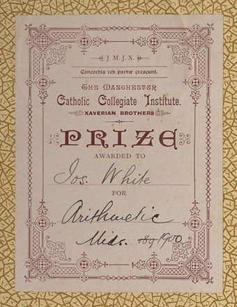
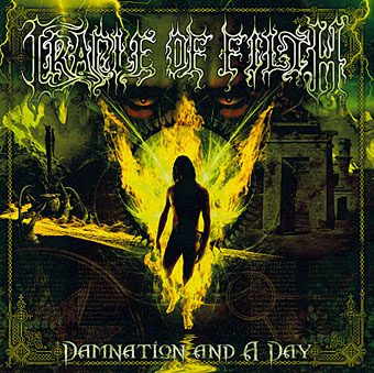
The plate above comes from a Victorian book I bought several years ago, The Pictorial Cabinet of Marvels, a reasonably lavish volume for children concerning places and things of interest around the world. Since I like playing with excessive Victorian flourishes now and then I’m always on the look out for new examples and the border here immediately caught my eye. I have a decent selection of clip art books from Dover and Pepin containing this kind of thing but nothing quite like this particular design. When I was putting the Damnation and A Day album together for Cradle of Filth I took one of the corner pieces as a starting point for a border design I used on the front and back of the booklet and the tray.
The poor old Xaverian Brothers of Manchester’s Catholic Collegiate Institute would no doubt be mortified to see part of their prize bookplate being used to decorate such a blasphemous artefact. The album was released by Sony Music in 2003 so this little border motif has travelled the world by now. I seem to recall sending the record company the border design separated from the artwork so they could make up some posters.
And so we come to what I’m assuming is its latest manifestation, a poster design for Manifest Destiny, a Los Angeles music event organised by Tee Pee Records.
I say “assuming” since I’ve no idea whether this example is from my design or not. But it seems a safe bet seeing as the original is from such an obscure source. Not that I mind if it is, of course. I can’t very well complain when I swiped the thing in the first place, now can I?
Update: Tee Pee designer Sarah MacKinnon writes to say her Victorian motif is from one of Dover’s clip art books. Now I know that I wouldn’t mind finding the book for my own collection. This makes the occurrence of the original more unusual, at least from my point of view, since it’s the only time I’ve spotted one of these reprinted elements in its period setting.
Previously on { feuilleton }
• Masonic fonts and the designer’s dark materials


The art of collage, so easy in our digital world
I recently scanned some of the plates in the Harter’s Victorian designs’ book I have and started to play around with some of the pictures there and I am really sure that these indeed will spread like a virus…
I’ve got several of Jim Harter’s Dover books. Also mentioned him in the essay I wrote about Wilfried Satty for Strange Attractor since Harter is a collage artist himself in the tradition of Satty and Ernst.
The only trouble with those Dover and Pepin books is you start to spot their designs in use when you’re familiar with them. The Art Nouveau flourish on my web pages is from a Pepin book and I saw that recently on a poster design. This is one reason why I look for motifs from period sources as well.
i want to know how to design a VIRUS
i came across your site after googling “traditional flourish poster design”.
love the cradle of filth designs. (I picked up the new album the other week)
\m/