
Fat type
| The New, New, New (etc) Typography puts on some weight.
The art of Michael Goro
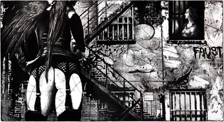
Voyage de Nuit (etching/engraving; no date).
Michael Goro’s etchings and engravings are rich with the kind of gritty urban verisimilitude I love. His site has several more examples and there’s a good interview with the artist here.
Michael Goro, a prominent intaglio printmaker, has lived and worked in Russia, Europe, Israel, and the U.S. His work has received a number of prestigious international awards including Special Prize at the 1998 International Print Triennial in Kanagawa, Japan and Excellent Prize at the 2006 14th Seoul Space International Print Biennial at the Seoul Museum of Art (Korea). He describes his art as a “continuous creative search for raw authenticity in urban environments and human forms that are constantly changing.” Utilizing the full spectrum of printmaking techniques, ranging from Renaissance engraving to digital photogravure, he shares his unique personal experiences through imaginative imagery.
Thanks to PK for the tip!
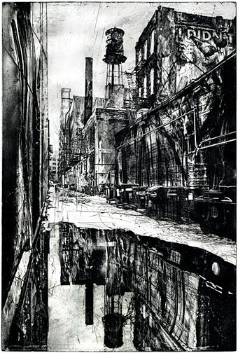
Reflections (etching; no date).
Previously on { feuilleton }
• The etching and engraving archive
Chris Nash
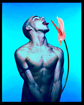
Dancer Javier de Frutos (1998).
Dance photography by Chris Nash.
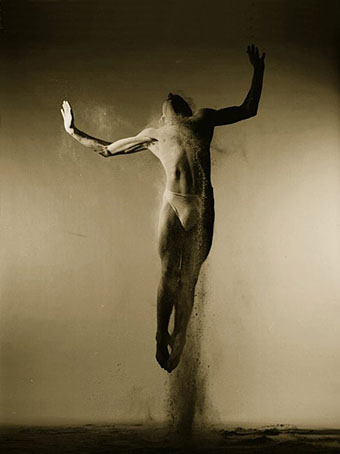
Bread—Bedlam Dance Company.
Previously on { feuilleton }
• Peter Reed and Salomé After Dark
• Felix D’Eon
• Dancers by John Andresen
• Youssef Nabil
• Images of Nijinsky
• The art of Hubert Stowitts, 1892–1953
Lalique’s dragonflies
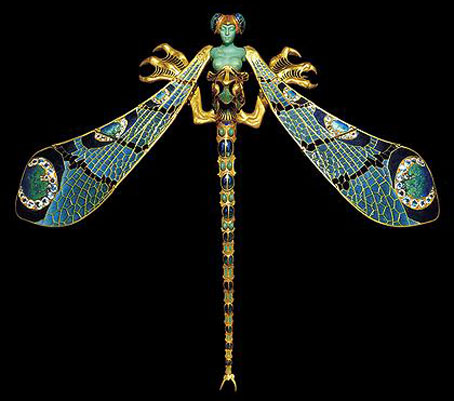
Dragonfly woman corsage ornament (1897–1898).
Gold, enamel, chrysoprase, moonstones, and diamonds.
Seeing as dragonflies emerged as a theme this week I can’t resist mentioning my favourite of all, this bizarre confection by glass artist and jeweller René Lalique (1860–1945), a dragonfly with female torso and gryphon claws. This was owned by wealthy Armenian collector Calouste Gulbenkian (in whose museum it now resides) and was worn once by Sarah Bernhardt. You can barely tell from this picture but the delicate gold wings are hinged at several points so they wouldn’t be obtrusive for the wearer.
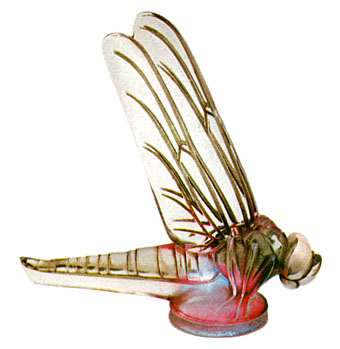
The Lalique company made more glassware than they did jewellery and these included a range of unique automobile mascots whose pedestrian-puncturing potential saw them banished to museum cabinets as road safety laws evolved. The dragonfly design was an especially splendid example, being placed above a multicoloured disc lit from beneath which rotated in accordance with the speed of the car. The faster the car travelled, the faster the colours changed.
Previously on { feuilleton }
• Lucien Gaillard
• Wesley Fleming’s glass insects
• The glass menagerie
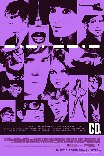
CQ
A belated shout of appreciation for this film whose distribution appears to have been so limited that everyone missed it, me included. That’s a shame as Roman Coppola’s debut (he’s the son of Francis) has a lot to commend it although it helps if you’re familiar with pulpy European spy/science fiction/horror movies of the late Sixties and the po-faced works of auteurs such as Jean-Luc Godard and Michelangelo Antonioni. CQ pays loving homage to both styles of filmmaking which probably explains why the studio didn’t know what to do with it.