Graphic design in Heat

heat4.jpg

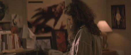
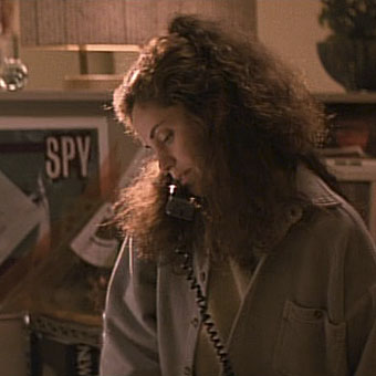
Amy Brenneman.

In which Neville Brody’s early record sleeves lurk in the midst of a Michael Mann crime drama…

I picked up some cheap DVDs last week, among them a copy of Mann’s Heat (1995) which I hadn’t seen for over ten years. I like Mann best when he’s doing his high-tech thriller thing (although I also have a soft spot for The Keep), and enjoy this one despite its being too long for the thin story and characterisation. Something I’d completely forgotten when re-watching it was the scene where Eady (played by Amy Brenneman), a part-time graphic designer, is on the phone to her bank-robbing boyfriend, played by Robert De Niro. This is one of those cinematic moments where some stray cultural reference that no one is meant to notice leaps to your attention and for a few seconds upsets all interest in plot and dialogue. Offhand I can think of the moment in Alan Pakula’s Presumed Innocent where a copy of a Ramsey Campbell novel is seen on a bookshelf during a conversation. Much worse, since it’s an error as well as a distraction, is Picasso’s Les Demoiselles d’Avignon being shown onboard the Titanic in James Cameron’s fatuous disaster movie when the real painting has been hanging safe and sound for years in the Museum of Modern Art in New York.
heat1.jpg

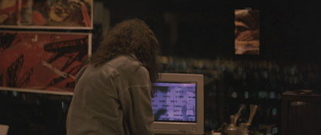
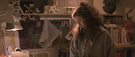
In Heat we have a scene in Eady’s apartment where the walls are covered with what I assume are meant to be examples of her design work. 99.9% of the audience will pay no attention to this but anyone with a copy of The Graphic Design of Neville Brody would recognise a number of familiar designs. Something I hadn’t spotted before was the word “FUSE” on the computer screen, Fuse being the name of the experimental typography magazine created in the 1990s by Brody and Jon Wozencroft. On the window to the left of the computer there’s pinned a copy of Brody’s design for Wipe Out, a single by Z’ev on the Fetish label. Brody designed nearly everything for Fetish during the label’s brief existence in the early 1980s, and the most visible Brody examples in this scene are all Fetish designs. This seems an odd choice for a film made in the mid-90s although in an earlier conversation Eady mentions having designed some music CDs. Brody’s later design work was very influential and overshadowed his work for Fetish which I’ve always liked a great deal.
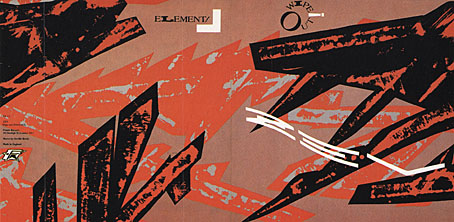
wipe_out.jpg

Wipe Out by Z’ev.

heat2.jpg

In another part of Eady’s apartment there’s a large reproduction of the sleeve for a Fetish compilation, The Last Testament.
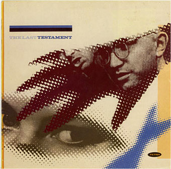
testament.jpg

heat3.jpg

While further along the same wall there’s the sleeve for Diddy Wah Diddy by 8 Eyed Spy, yet another Fetish single. On the far right of the shot above there’s a face from one of Brody’s theatre posters which confirms that Mann’s set decorators must have plundered a copy of Brody’s book.
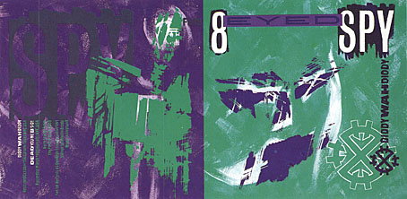
diddy.jpg

This isn’t a complaint, of course, I’d commend Mann and co. for their excellent taste, and for having used work by a real graphic designer rather than trying to fake something. It’s even possible to find a tenuous connection between the record sleeves and Mann’s eclectic soundtrack. Many of the Fetish artists—Throbbing Gristle, 23 Skidoo, Clock DVA, Stephen Mallinder—were in the first wave of Industrial music, and Mann briefly uses a great piece by Einstürzende Neubauten from their own Industrial phase. I’d have suggested he also use Blue Heat by Cabaret Voltaire (from an album with another Brody cover) but that’s just my obsessions showing.

Previously on { feuilleton }
Neville Brody and Fetish Records
Alex in the Chelsea Drug Store
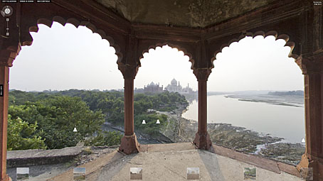
Taj Mahal panoramas

tajmahal1.jpg

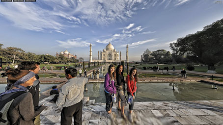
The standard view plus tourists by Michael Maniezzo.

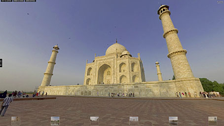
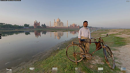
Jeffrey Bartholet has a lengthy piece at Smithsonian Magazine entitled How to Save the Taj Mahal?, a brief history of the monument and also an examination of the preservation problems the site faces. Reading his essay it occurred to me that despite the Taj Mahal being one of the world’s most famous and recognisable buildings the pictures we’re shown of it are nearly always the same, showing a view along one of the canals that runs through the gardens towards the monument. The panoramas at 360cities immediately rectify this with some stunning shots showing the site up close or from a considerable distance. The latter selection are unlike any I’ve seen before, and give a great sense of the river which runs around the Taj Mahal complex and the countryside around the city of Agra. Bartholet notes that five million people visited Agra between March 2010 and March 2011, many of them adding to the damage the monument has already sustained. People may rail against virtual tourism as an iniquity but where sites such as this are concerned it’s a lot less polluting and destructive than the alternative.

tajmahal2.jpg

Sunset by Justin Imhoff.

tajmahal3.jpg

The Yamuna River by Justin Imhoff.

tajmahal4.jpg

A view by Roger Berry from nearby ruins.

Elsewhere on { feuilleton }
The panoramas archive

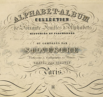
Joseph Balthazar Silvestre’s Alphabet-album

silvestre01.jpg

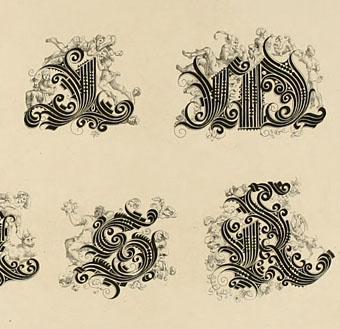
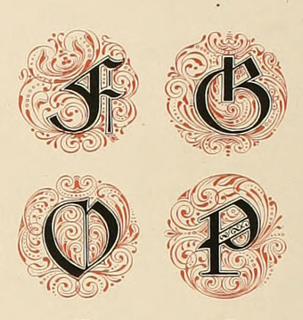
Monsieur Silvestre’s Alphabet-album, a collection of decorative alphabets, has a lengthy subtitle—Collection de Soixante Feuilles d’Alphabets Historiés et Fleuronnés, tirés des Principales Bibliothèques de l’Europe—and is a good example of how the 19th century, always characterised as a period of over-elaborate decoration, contains the seeds of 20th-century design. Silvestre’s book dates from 1843 yet contains several examples of sans serif or rectilinear lettering which wouldn’t have looked out of place a hundred years later. There’s also some fine examples of over-elaborate lettering, of course, with the usual embellishments and calligraphic flourishes, and also a page of letterforms based on tree shapes, a common sight in Victorian graphics.

silvestre02.jpg

silvestre03.jpg

Continue reading “Joseph Balthazar Silvestre’s Alphabet-album”

The art of Edouard Martinet

martinet1.jpg

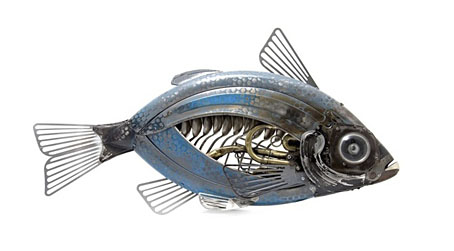
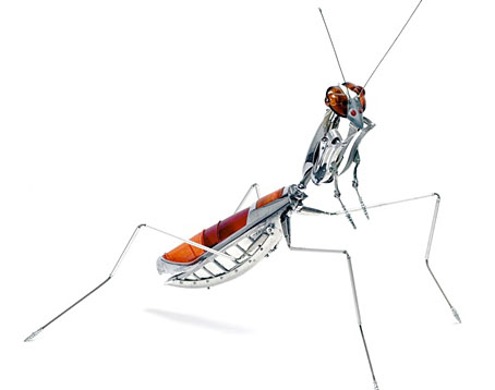
A couple of gorgeous pieces by French sculptor Edouard Martinet who creates insects and other animals from car and motorcycle parts, kitchen utensils, old typewriters and similar detritus. These are so good I’m surprised his work hasn’t already done the rounds of all the sites which favour this kind of sculpture. I covet that mantis. Photos by Ian Sanderson.

martinet2.jpg

Previously on { feuilleton }
Geoffrey Haberman’s brass insects
Kitchen insects
Elizabeth Goluch’s precious metal insects
The art of Sergei Aparin

Anna & the Juniper Dog

juniper.jpg

The Juniper Dog strained its twisted roots against an ember red sky, snarling out swarms of night moths, barking flocks of owls from its splintery jaws. It howled the sea. Spat stars. Clouds roiled and clotted through the tree dog’s teeth.

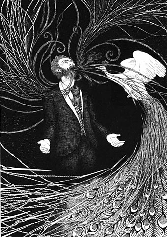
Anna & the Juniper Dog was published this summer although it’s a tale which seems more suited to the gloom of autumn. (Having said that, summer this year was so persistently cold, wet and dreary it’s been autumn in all but name.) The story is by Geoff Cox, and the slim clothbound volume from Blackmaps Press comes profusely illustrated by Rohan Daniel Eason, and with an accompanying CD containing 30 minutes of beautiful instrumentals by Martin Roman Rebelski. This is the second book in a trilogy of tales about Cox’s Anna character, wherein we follow Anna through a succession of dream-like episodes freighted with mysteries, epiphanies and ritual moments.

eason.jpg

“Thorns burst from the Old Man’s mouth.”

The combination of another character named Boy, and various encounters with anthropomorphic animals, reminded me of Mervyn Peake’s wonderful Boy in Darkness, while the illustrations bring to mind the cross-hatched art of Edward Gorey. Eason’s drawings add a great deal to the fairytale atmosphere without merely replicating Cox’s evocative descriptions. The icing on the cake is a book design by La Boca with the attention to detail this kind of self-contained project requires: the typesetting uses the ligatures common to better typefaces but which one seldom sees employed today. A great example of the book as an object to be treasured, and ideal reading (and listening) for longer and chillier evenings.