Herbert Loebel’s crystals

crystals.jpg

Given the year it was made, Crystals (1968) has unavoidable, if inadvertent, psychedelic connotations, especially when you see these iridescent forms blooming against vivid backdrops. The same can’t be said for the music that accompanies Herbert Loebel’s photography, however, so once again I’d recommend watching this with a soundtrack of your own choosing.

Weird metal

shadow1.jpg

Weird metal isn’t A Thing, is it? I reckon it ought to be A Thing, especially when so much black/death/doom/drone metal intersects with The Weird. I mentioned last month that British doomsters The Wounded Kings had used my De Profundis piece for the gatefold and poster insert in their reissue of The Shadow Over Atlantis. My copy of the album arrived this week; it’s a handsome production that sounds tremendous so I’m very pleased to be associated with it. The relationship to Cthulhu isn’t as overt as more well-known compositions such as The Call of Ktulu by Metallica or Cthulhu Dawn by Cradle of Filth. But those are one-off pieces whereas The Shadow Over Atlantis sustains its atmosphere of cosmic dread throughout. It’s available from Ván Records, and I recommend it highly.

shadow2.jpg

All of which reminded me that my Lovecraftian art has featured sporadically in the metal world over the past few years. In the margins of my discographic work you’ll find the following releases.

otao.jpg

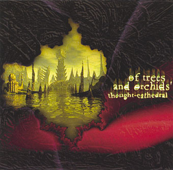
Thought-Cathedral (2000) by Of Trees and Orchids.

The perennially popular view of R’lyeh is featured on the cover of the second album by a German death metal band who later changed their name to Ingurgitating Oblivion. Inside the CD there’s also a detail from a Cthulhu drawing of mine.

azathoth.jpg

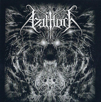
Azathoth (2007) by Azathoth.

There are many bands named after Lovecraft’s chaotic deity. This group is from the US, and this EP is their only substantial release to date.

portal.jpg

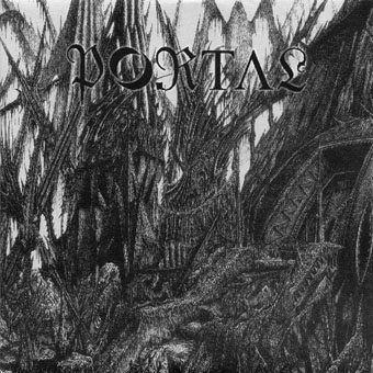
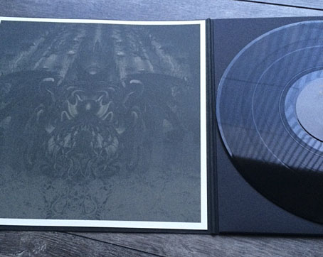
Demonstration 1998 (2009) by Portal.

And there are many groups named Portal. This lot are Australian, and have been going longer than most. Demonstration 1998 is a reissue on 7-inch vinyl of a cassette demo from 1998; the sleeve art shows a fuzzy detail from my R’lyeh spread from The Call of Cthulhu. Nobody asked permission to use the artwork, I only discovered this release since I get a credit for it on Discogs. So there may well be other releases out there that I haven’t seen yet. If you know of one then leave a comment or send an email.

Previously on { feuilleton }
The Shadow Over Atlantis by The Wounded Kings
Rock shirts
De Profundis

Liénard’s grotesques

lienard01.jpg

Yesterday’s book was from the Internet Archive scans of the Sterling and Francine Clark Art Institute Library. The majority of the books in the collection are related to textiles or crafts but the archive has a few design books of which this is one example. Spécimens de la Décoration et de l’Ornementation au XIXe Siècle (1866) presents baroque designs by French sculptor Michel Liénard (1810–1870). Most of the book is familiar decorative work but the opening section contains some marvellous grotesques and animal designs. All the plates feature careful shading and detail, and are worth viewing at a larger size.

lienard02.jpg

lienard03.jpg

Continue reading “Liénard’s grotesques”

The Book of Delightful and Strange Designs

stencil01.jpg

As is evident, the designs in question are Japanese stencils from a book of 100 stunning examples published in 1893. Author Andrew White Tuer adopts a surprisingly disingenuous tone in his explanatory introduction which is “dedicated to that most capricious, never-to-be-understood, weathercocky, provokingly incorruptible, and absolutely necessary person, the gentle reader”. Leaving aside such eccentricity, the stencils are astonishing things, especially when many of them are not only finely detailed but also form repeating patterns. Once again, I recognise some of the designs from bad reproductions in cheap books so it’s good to find them in such high quality.

stencil02.jpg

stencil03.jpg

Continue reading “The Book of Delightful and Strange Designs”

The original Gandharva

gandharva1.jpg

Cover art by Wilfried Sätty. Lettering by David Singer.

Collage artist Wilfried Sätty has been in my thoughts this month, it being ten years ago that Jay Babcock, Richard Pleuger and I drove up to San Francisco and Petaluma to talk to Walter Medeiros and David Singer about Sätty’s life and work. Looking today at the Sätty cover art for Gandharva (1971) by Beaver & Krause reminded me that the original pressing of this album came with the sleeve in a predominantly pink colouration rather than the more familiar blue. I have three copies of the album—vinyl and two CDs, one of which pairs it with Beaver & Krause’s In A Wild Sanctuary (1970)—but I’ve never seen one of the pink variations, and didn’t even know they existed until they started appearing on the web. The CD reissues favour the blue version, as do I, although this may only be a result of familiarity. I’ve enthused about Sätty’s cover a couple of times already but the music is worth hearing for its connections backwards to Cammell & Roeg’s Performance (for which B&K provided the ominous synthesizer tones), and forwards to Robert Fuest’s The Final Programme. Fuest asked Gerry Mulligan to score his film after hearing the Gandharva suite (described in the sleeve notes as “a score from a non-existent film”) which occupies side two of the album.

gandharva2.jpg

Elsewhere on { feuilleton }
The album covers archive

Previously on { feuilleton }
The Occult Explosion
Wilfried Sätty album covers
Nature Boy: Jesper Ryom and Wilfried Sätty
Wilfried Sätty: Artist of the occult
Illustrating Poe #4: Wilfried Sätty
Gandharva by Beaver & Krause