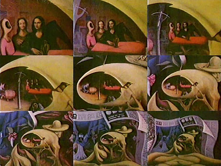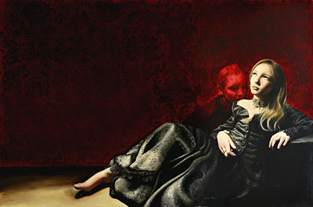
Invisible Light by Margo Selski.
The Glass Garage Fine Art Gallery has an online collection of paintings by Margo Selski, many of which feature her cross-dressing son, Theo. Coilhouse profiled artist and model earlier in the week. Some of these paintings mix oil with beeswax which is something I’ve not come across before.
• The Periwinkle Journal‘s first issue will be available online, free, from March 22nd until mid-June, featuring work by filmmaker and artist Hans Scheirl (Dandy Dust), artwork and collages by Genesis Breyer P-Orridge, a 7-page colour comic by Mavado Charon, artwork by Timothy Cummings, artwork and installations by Cody Chritcheloe/SSION, photos by Megan Mantia, Science-Heroes by Peter Max Lawrence, an illustration portfolio by Diego Gómez, selections from the queer photography pool on Flickr, reviews and other stuff. More later.
• The Quietus wanted to remind us that this year is the 25th anniversary of the NME‘s C86 compilation tape, a collection that sought to capture a moment of ferment but which inadvertently inspired too much dreary sub-Velvet Underground pop. I’d rather celebrate the 30th anniversary of the NME‘s C81 compilation, a far more diverse collection and musically superior. If you want to judge for yourself, both tapes can be downloaded here.
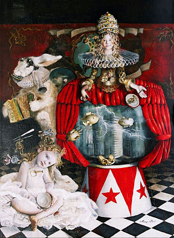
Machine in the Garden — Our Island Shall Know Abundance Without End by Margo Selski.
• Rick Poynor continues his exploration of Ballardian graphics with a piece about the paintings of Peter Klasen. Related: Where Will It End? JG Ballard interviewed by V. Vale & introduced by Michael Moorcock (Arthur No. 15/March 2005).
In his autobiography, Miracles of Life, JG Ballard suggested that illustrated versions of The Arabian Nights helped prepare him for surrealism.
Robert Irwin, author of The Arabian Nightmare, on the illustrators of The Arabian Nights.
• Another Coulthart cult movie surfaces, Jerzy Skolimowski’s Deep End (1970), out of circulation for many years but newly restored by the BFI. A re-release is scheduled for May so I’m hoping now that a DVD release will follow soon after.
• Thom Ayres’ photostream at Flickr, and more long-exposure photos.
• Fuck You, A Magazine of the Arts, number 5, volume 8.
• Nicolas Roeg: “I don’t want to be ahead of my time.”
• MetaFilter looks at the films of René Laloux.
• The Eerie covers of Frank Frazetta.
• Indie Squid Kid.
• Requiem (for String Orchestra) by Toru Takemitsu.