In print

magazines1.jpgBattling through the Xmas post, two new volumes arrived here this week, from Black Velvet and Black Dog Publishing respectively. First up was Serpenti & Scale, the Italian edition of Snakes & Ladders by Alan Moore and Eddie Campbell. This has been available for some time in English, of course. The translated version features some of my artwork for the Moon and Serpent CDs by Alan and Tim Perkins in the lengthy interview section that precedes Eddie’s comic strip. Thanks to Smoky Man for that.

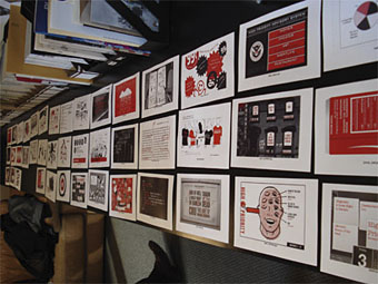
Inevitably overshadowing this was 100 Years of Magazine Covers which author Steve Taylor very graciously had sent to me. A heavyweight book in all senses of the word, with a solid cover, thick paper stock and tremendous design by Neville Brody. Taylor navigates the overcrowded field of 20th-century magazine design with great skill, managing to cover all the principal areas of magazine as news medium, fashion journal, literary forum and vehicle of cultural transgression, whether that be the Sixties’ underground, Seventies’ punk or the disparate worlds of gay life and feminism. Illustrations range from the elegance of early Collier’s and Vogue to the garish incoherence of today’s celebrity rags such as Heat. Given such a broad field of study there are bound to be omissions; I would have liked to have seen something from the New Worlds of the late-Sixties, for example, and maybe one of the Non-Format covers for The Wire. But they got Lilliput in there which is pretty impressive considering that magazine now seems to be largely forgotten. Essential stuff.

Previously on { feuilleton }
It’s a pulp, pulp, pulp world
A few thousand science fiction covers
Vintage magazine art II
Neville Brody and Fetish Records
View: The Modern Magazine
Vintage magazine art
Oz magazine, 1967–73

Atelier 2.3

It’s just over a year since I refashioned the main site with a better, all-CSS layout. I’ve made some cosmetic changes to this design over the past week that are now complete and uploaded, the new look being a variation on the old, presented in the style of pages from a layout application. I’m sure I’ve seen this done this somewhere before but I forget where so don’t go thinking it’s wildly original. Still needs testing properly across a range of browsers but I’ve not played with the underlying structure very much so everything should work as it did previously.

High Priorities 2

hp_second_round_01.jpg

I didn’t win but I made the second round apparently (along with 120 others…middle row in the above picture, second from the right). Congratulations to Spencer Fruhling whose winning design you can see at the bottom of this page. An interesting choice, there were a number of pastiche-based entries which I thought might be rejected in favour of something more abstract. You can see the rest of the entries here and my attempt in larger form here.

Previously on { feuilleton }
High Priorities

High Priorities

high_priority.jpg

In which your humble narrator enters a contest…

Speak Up, in collaboration with New York magazine, is proud to announce the first-ever open contest to design the visually acclaimed, graphically exhilarating, by-invitation-only “High Priority” feature illustration in the magazine’s year-end, December 18, 2006 double issue.

High Priority highlights five activities, suggested by New York writers, that are not to be missed. Every week designers and illustrators from around the world are invited to create an interpretive typographic illustration to open “The Week” – the listings section of New York Magazine. New York readers place great weight on these five recommendations, and this page is a regular destination for many.

For examples of past editions of High Priority please visit:
New York‘s High Priority archive
Design Observer’s Variations on a Theme: New York‘s High Priorities

I knew about this listings feature from having read the Design Observer piece (I’ve never seen a copy of New York), and liked the idea for what amounts to the design equivalent of a “standard” in jazz, with different designers having to present a riff on the same brief in each issue. The restrictive nature of the problem is part of its appeal; only two colours are allowed (red and black), the box must be the shape it always is, and the design has to incorporate five categories—Movies, Theater (sic), Art, Nightlife and Restaurants—with the date, the words “High Priority” visible somewhere, and the accompanying critics’ recommendation for each category. Aside from that, anything goes.

My attempt can be seen above. I was going to do a couple of different designs then pick the best one but in the end I ran out of time. The initial idea was to do something along the lines of the cover for Physical Graffiti by Led Zeppelin (below) but—as is often the case with first ideas—making it work wasn’t so easy.

led_zep.jpg

Led Zeppelin’s building is a great photograph of a New York brownstone (the original vinyl sleeve had slots cut in the windows through which the lettering and various pictures on the inner sleeves could be seen); mine had to be pieced together from separate pictures of New York in the 1930s. It doesn’t quite work because there’s not much justification for having the category lettering arranged like rows of birthday cards on the window sills. But maybe I’m being too hasty in pulling it apart when the winner won’t be announced until December 4th. Until then you can browse the 186 other entries. I have to say that the quality of these is really exceptional, if I were one of the judges I’d have a hard time choosing only one. Most of the time I wouldn’t give a second glance to an online contest but this one was fun and the high standard of the other entries has made it worthwhile.