British Book Illustration – Yesterday and To-day

illustrators01.jpg

The “to-day” in the title is a sign that this volume dates from the years before the Second World War when the hyphenated “today” was still a common sight. British Book Illustration – Yesterday and To-day was published in 1923, one of many such books produced by The Studio magazine. Studio editor Geoffrey Holme is also credited as editor of the book which follows the history of British illustration from Thomas Bewick, in 1795, to Randolph Schwabe in 1923, with each artist being represented by one or two pieces considered to exemplify their work. (Harry Clarke, who appears near the end, was Irish but the newly-minted Irish Free State was only a year old at this time so Clarke had technically been a Briton for most of his life.) Being a Studio publication, each illustration includes a note of the medium used (pen, wood engraving, etc), something you don’t always see in books of this kind. A lengthy introductory essay by Malcolm C. Salaman examines the work of each artist in turn. Two hundred pages isn’t anything like enough to do justice to the subject, and I could quibble over many of the selections, as well as the omissions. But the book is worthwhile for some of its unusual choices as well as showing drawings by artists who weren’t as well known as Beardsley and company. Among the unusual selections is the original drawing for The Facts in the Case of M. Valdemar that Harry Clarke produced for his Poe collection. This was rejected by Harrap for being too horrible even though it accurately depicts the moments from the end of the story. The drawing is much more detailed than the one that replaced it but you don’t see the first version reproduced very often. Looking at it again it occurs to me that it really ought to be included in future editions of Clarke’s Poe illustrations.

illustrators02.jpg

illustrators03.jpg

illustrators04.jpg

illustrators05.jpg

Continue reading “British Book Illustration – Yesterday and To-day”

Led Zeppelin IV: Jimmy Page versus Little Bo-Peep

lz4.jpg

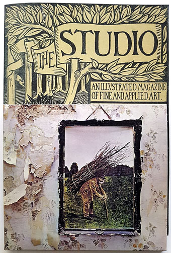
Background graphics by Aubrey Beardsley, 1893.

You’d think by now that everything would be known about an album with a Godzilla-sized cultural footprint like Led Zeppelin IV. I certainly thought so until last week when I turned up the source of something that the more obsessive Zepp-heads have been pondering for years. If this puts a bustle in your hedgerow then read on.

symbols.jpg

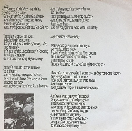
Led Zeppelin’s fourth album has been around now for half a century which means there really is a lot known about every detail of its production. Mysteries that used to confound friends of mine when we were teenagers have long been solved, questions such as what the hell the four symbols assigned to each member of the group actually signified; not only do we know the origin and meaning of those symbols, the enigmatic “Zoso” sigil chosen by Jimmy Page has an entire website dedicated to its various manifestations. We know where the photo on the cover was taken (Birmingham), and why the sleeve is devoid of identification (Page was annoyed with the press reaction to the previous album); we know that the hermit painting inside the gatefold is based on the Tarot card by Pamela Colman Smith, and we also know a great deal about the writing and recording of Stairway To Heaven. Erik Davis logged much of this in his 33 1/3 study of the album, and while he examines the band symbols in some detail he doesn’t say much about the rest of the hand-written inner sleeve beyond this comment:

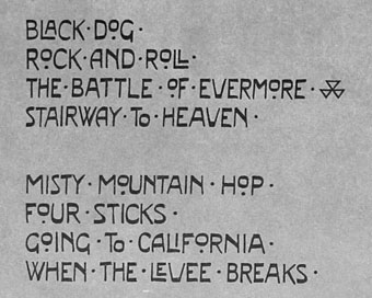
Is there a meaning to the nifty Arts and Crafts typeface that Page lifted for the Stairway To Heaven lyrics on the other side of the sleeve? Or just a vibe?

The source, if not the meaning, of this script has been intriguing Zeppelin fans for many years, but I wasn’t aware of this until I happened to be reading the Wikipedia entry about the album and found myself equally intrigued. The game was afoot, Watson.

soh1.jpg

It makes them wonder: the hand-lettered lyrics.

A persistent question you see in fan circles is “What font was used to create X?” People will ask this question even when the design is a one-off, like Syd Mead’s logo for Tron, or something that’s obviously been lettered by hand. Led Zeppelin IV is an album guaranteed to raise the “What font?” question because the lyrics of the group’s most famous song, Stairway To Heaven, cover an entire side of the inner sleeve. On one of the fan forums I was reading someone was eager to identify “the font” because they wanted to apply the words to a bedroom wall. Many more people must have copied out those lyrics since 1971; I once had to do this myself for a female friend who was so besotted with Jimmy Page that she wanted the lyrics in a frame on her own bedroom wall.

tracks.jpg

According to the Wikipedia entry, Page revealed the source of the lettering to be an issue of The Studio, the British art and design magazine which helped launch Aubrey Beardsley’s career and did much to develop and promote the Art Nouveau style in the 1890s. I’m very familiar with The Studio, many posts here refer to it, and I happen to have a complete collection of issues downloaded from the journal archive at Heidelberg University. Seeing the magazine mentioned in this context immediately made me want to find the design that Page had adopted, but before I started flicking through thousands of pages I looked around to see if any of the Zepp-heads had tried searching for the magazine themselves. Evidently not; all the discussion I’ve seen about the inner sleeve tends to recycle the Wikipedia entry, nobody seems to have bothered looking for copies of the magazine. Okay then…

Continue reading “Led Zeppelin IV: Jimmy Page versus Little Bo-Peep”