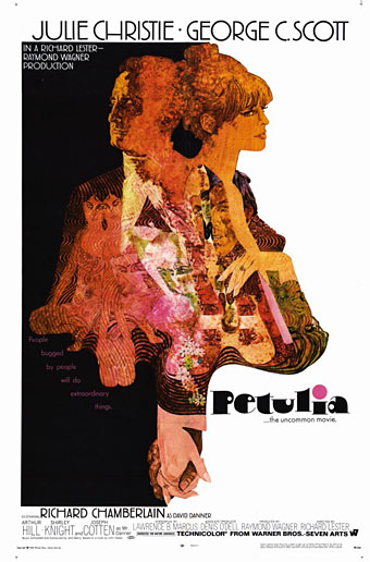
Illustration by Bob Peak.
Further examples of those things you find when you’re searching for something else, these posters for Richard Lester’s Petulia (1968) are a good example of just how differently the same film can be presented by its advertising materials. Petulia (“the uncommon movie”) is a fascinating, unjustly neglected gem, a serious adult drama quite unlike the comedies (or comic dramas) Lester was making before and after. Nicolas Roeg photographed Petulia shortly before embarking on his own directing career, capturing San Francisco just after the Summer of Love in a more documentary fashion than the exploitation films of the period. There are nods to the psychedelic scene with party appearances by Big Brother and the Holding Company, and the Grateful Dead, but the narrative concerns the flipside of hippiedom with a group of middle-class professionals ensnared in adultery and marital failure.
A commonly remarked feature of Petulia is Antony Gibbs’ fragmented editing style which flashes backwards and forwards throughout, even showing events that never happen. The technique is usually taken to be derived from Alain Resnais although Gibbs had earlier edited The Knack…and How to Get It for Lester which is often as fragmented, albeit for a more comic effect. What’s notable about the technique is that Gibbs went on to edit Nicolas Roeg’s first two features, Performance (co-directed with Donald Cammell) and Walkabout, both of which take the fragmentation even further, creating the style which Roeg made his own.
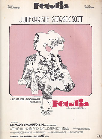
The poster that caught my attention was the marvellous one by Bob Peak who manages to depict the awkward relationship between the two leads—holding hands yet facing away from each other—whilst alluding to the psychedelic backdrop in the details. It’s difficult to tell at a small size but the sheet music design above shows that Peak’s drawing is a complex arrangement of blended faces, the reflected figure of a woman and a pattern of Bridget Riley swirls. If I was still collecting film posters I’d be sorely tempted to buy one of these.
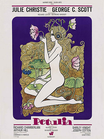
Illustration by Jean Fourastié.
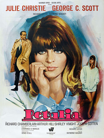
Compared to which this pair of French designs veer off in opposite and unsatisfying directions. Jean Fourastié seems to have been under the impression that the story concerned a San Francisco flower child not a bored housewife, while Jean Mascii’s painting isn’t inaccurate but is more suited to a romance paperback. Big heads were apparently Mascii’s métier even if there were no people in the film.
Illustration by Jean Mascii.
Petulia has been available on DVD for a while now, it’s well worth seeking out. Watch the trailer here.
Previously on { feuilleton }
• Lucifer Rising posters
• Wild Salomés
• Druillet’s vampires
• Bob Peak revisited
• Alice in Acidland
• Salomé posters
• Polish posters: Freedom on the Fence
• Kaleidoscope: the switched-on thriller
• The Robing of The Birds
• Franciszek Starowieyski, 1930–2009
• Dallamano’s Dorian Gray
• Czech film posters
• The poster art of Richard Amsel
• Bollywood posters
• Lussuria, Invidia, Superbia
• The poster art of Bob Peak
• A premonition of Premonition
• Metropolis posters
• Film noir posters


The Fourastié made me think of Spinrad’s Child of Fortune — and that’s not a good thing.
The thing that bugs me about the Mascii is that I want to move the Scott figure higher and to the left. Scott seems an imp floating in front of Big Julie, whereas Little Julie seems to occupy a different space than Big Julie’s. The dynamic should be between the two little figures, right? I’m not a good enough judge to say whether the small figures could be re-drawn to preserve their eye-lines (looking at each other just above Big Julie’s left eye) without looking unnatural while preventing Scott crowding Big Julie.
Never heard of this film or seen that Bob Peak poster before, love it. Love his 60’s posters, which have a handful of dirt thrown in rather than the too airbrushed style of his 70’s work, Rollerball, Apocalypse Now etc
Matthew: Mascii’s work is so perfunctory–and his approach so similar regardless of the film–I’d imagine he was one of those artists who would work fast from a handful of stills and an outline of the plot. In which case any idea of composition falls victim to haste.
Alfie: I like Peak’s airbrushed posters as well but it’s true that his work from the 60s has an extra quality from the accumulation of detail. Many of them have a Klimt-like appearance that no one today would be allowed to do.
I dare say you’re right, John. It just seems that obviously having given the thing a little thought, he could have given it a little more – it would have taken much less time than it took to paint the thing, after all. I’m sure I still wouldn’t have liked the result, so I don’t know why it bothers me.
Prompted by you post, I had a quick flick through some other Peak stuff. Most of it was of much less interest that the Petulia, but a guy’s got to make a living, I suppose. My eye was caught by this fashion illo: http://bit.ly/Tg3dVA. Those young women look like a definite afterthought, and not necessarily a good one.
Apologies for the typos above – I’m not usually quite such a sloppy typist. (The sloppy thinking is less easily fixed.)
Plaid trousers…yuck. Fashion shoots are still replete with what often appear to be superfluous women overlooked by a pair of shirtless hunks; that trend no doubt started back in the 70s.
Horrible trousers all round (gingham turnups?!), but an echo of the back-to-back, arms-inline handclutching of the Petulia poster.