
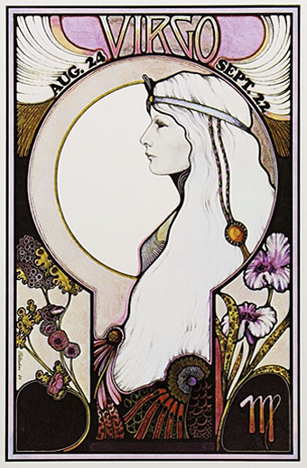
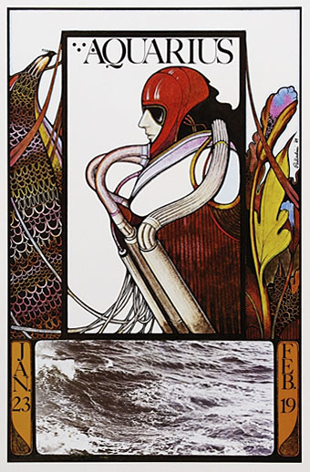
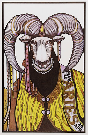
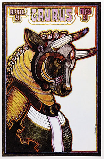
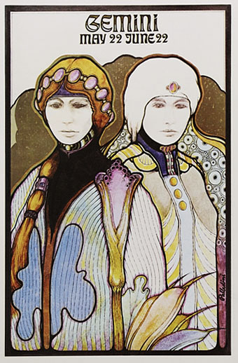
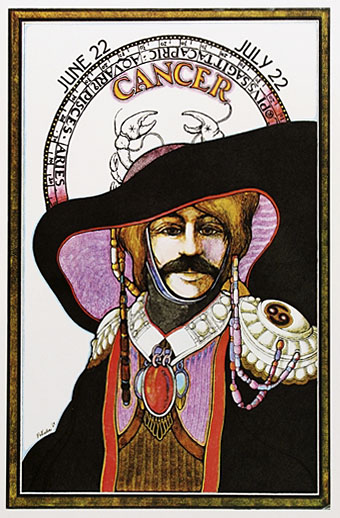
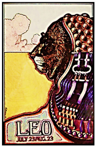
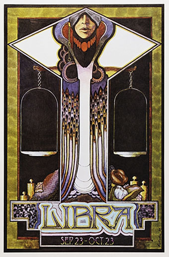
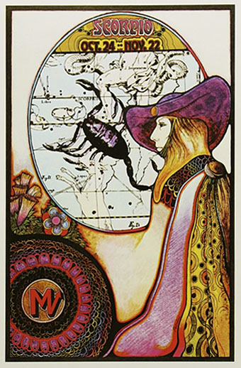
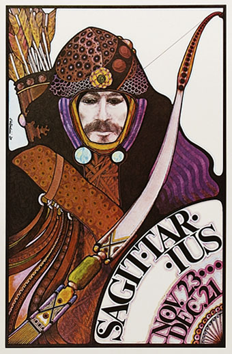
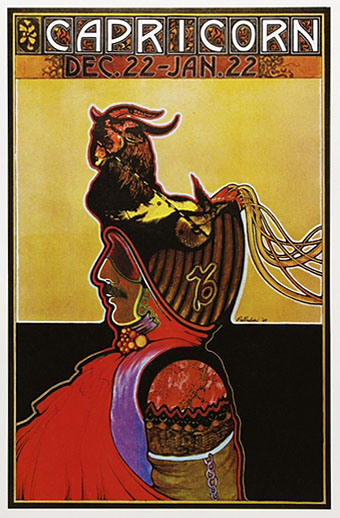
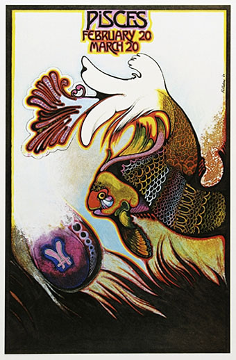
David Palladini’s poster for Werner Herzog’s Nosferatu the Vampyre has been mentioned here twice in the past week so it seemed only fair to see whether any of his other work matched that splendid piece. The artist has worked for years as a book illustrator but seems to receive most attention these days for his Aquarian Tarot deck, first produced in 1970 and still being sold today. Many of the card designs show something like the kind of stained-glass window approach he used for his film poster but with less decoration. Far closer to the Herzog piece is a series of posters he made in 1969 depicting his own interpretation of the signs of the zodiac. Every mention I’ve seen of these notes their scarcity which is a shame when many of them are such striking designs. Of particular interest to this Aubrey Beardsley obsessive is seeing that the scale shapes which Palladini put into the “N” of his Nosferatu lettering may, as I guessed, go back to the similar shapes which Aubrey borrowed from Whistler’s Peacock Room; see the peacock-like bird in Aquarius below.
This page has some examples of the Major Arcana designs from Palladini’s Tarot. More of his zodiac posters follow, all of which are courtesy Meibohm Fine Arts.
Elsewhere on { feuilleton }
• The illustrators archive
Previously on { feuilleton }
• Druillet’s vampires
• The Art Nouveau dance goes on forever
• The Sapphire Museum of Magic and Occultism
• The art of Pamela Colman Smith, 1878–1951
• Layered Orders: Crowley’s Thoth Deck and the Tarot
• Whistler’s Peacock Room
• The Major Arcana
I had the Nosferatu poster on my wall for many years as a teenager – bought in WH Smiths in Eltham Hihg Street for £1.99 if I remember correctly.
It then languished under my bed for the next few decades, until I recently gave it to my girlfriend after introducing her to the film on DVD (English and German versions) a few years ago.
It has spent the last few years on her wall, only to be replaced by Johhny Depp as Captain Jack Sparrow.
Not sure how I feel about that…
My poster is the horizontal one from the UK cinema release. I think the distributors may have chopped up the vertical design to make it–I can’t imagine him doing two near-identical pieces of art–but if they did they made a very good job of it.
I like the PotC films so can’t complain on that score. By coincidence one of the jobs this week has been designing a CD for the Bristol musician who works under the name Jack Sparrow.
I wonder if Palladini was an influence on Yoshitaka Amano or vice versca.
That’s difficult to say unless Amano has spoken at length somewhere about his influences. I see his work as owing more to 19th century and early 20th century artists and illustrators but they have some things in common, especially the use of colour wash.
There’s probably a study to be made (there are no doubt several) of the way artists like Whistler and Beardsley borrowed from the Japanese then Japanese artists took back that influence a century later.
The Nosferatu design is also used for the cover of the vinyl issue of Popol Vuhs’ soundtrack (first Popol Vuh i heard!)
Love the zodiac images, especially Aquarius (because thats my birthsign!)
The images for Cancer and Scorpio have a few noticeable similarities with Amano’s designs for the central character in Vampire Hunter D.
One of my favourite Palladini illustrations is a cover he did for a (mass market edition) biography of Lucrezia Borgia in the 70s. Sadly, it has gone the way of all old paperbacks & I can’t seem to find a scan of it anywhere online.