
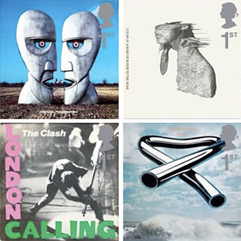
top row: The Division Bell by Pink Floyd; A Rush of Blood to the Head by Coldplay.
bottom row: London Calling by The Clash; Tubular Bells by Mike Oldfield.
The Royal Mail follows its series of British Design Classics postage stamps with a series dedicated to what they call “classic” album covers. The design classics in the earlier series deserved the term—a Mini motor car, a Penguin book cover, the London Underground map, etc—whereas here we have the word “classic” being used in its lazy journalist sense where it becomes a synonym for “popular” and “familiar”, two attributes which often diminish with time.
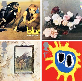
top row: Parklife by Blur; Power, Corruption and Lies by New Order.
bottom row: IV by Led Zeppelin; Screamadelica by Primal Scream.
It should be noted that the choice of cover art was limited to releases by UK artists, and the designs had to be readable at the very small size of a postage stamp. Even so, I can’t help but regard this as a missed opportunity. There was no need to feature the Beatles since they’d been given their own set of stamps in 2006, but I’ve never thought of the cover of Let It Bleed (below) as a classic, even though musically it’s one of the best Stones albums. I’d rather choose Andy Warhol’s cover for Sticky Fingers but you can imagine the upset at stamp users being forced to lick a picture of a bulging pair of jeans. As for Pink Floyd’s Division Bell, it’s a typically striking design from Storm Thorgerson but does anyone really think it’s more classic than earlier Floyd covers, not least the Dark Side of the Moon prism which even people who hate the band can instantly recognise? Nearly all these choices seem confused or compromised; the Clash cover is the token punk offering—Royal Mail wouldn’t dare choose Never Mind the Bollocks—but Ray Lowry’s design was copied from an Elvis Presley sleeve; Led Zeppelin’s IV is a great album but other releases had far better covers; Primal Scream, another great album but the whole sleeve design is perfunctory; the Blur choice is merely bewildering.
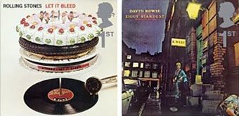
left: Let It Bleed by The Rolling Stones; right: The Rise and Fall of Ziggy Stardust and the Spiders from Mars by David Bowie.
As far as designers go, Hipgnosis (via Storm T), Peter Saville (New Order), and Stylorouge (Blur) are included here but there’s nothing from Barney Bubbles, Malcolm Garrett, 23 Envelope, Neville Brody, Designer’s Republic or any of the other pioneering British designers of the past 30 years. The trouble with those names, of course, is that many of the artists they worked for aren’t popular or familiar enough to the average British stamp purchaser so their work can’t be deemed “classic”. A best of British, then, which could have been a lot better.
Classic Album Covers will be issued on January 10th, 2010.
Elsewhere on { feuilleton }
• The album covers archive
Previously on { feuilleton }
• British Design Classics
• Stamps of horror
• Endangered insects postage stamps
• James Bond postage stamps
• Please Mr. Postman
They have missed a trick here, Dark side of the Moon would have worked as it has always been intended by the designer. Led Zeppelin 1 is far more iconic, by LZ 4 the details was getting too busy – It seems just able to work as a CD, but not a stamp. Storm must be very proud that he has made it onto the Royal Mail. Perhaps great British Labels will be next. I look earnestly to Linda Glover’s Vertigo logo!
Nowadays, the choices of what Royal Mail decides to have as (and include in) commemorative stamp sets are driven by themes and subjects of interest dictated by the global philatelist collector market. There are some other factors too, all driven by that market, such as ‘what will appeal to younger people and stimulate a new generation of collectors’.
This thirst to appease ‘the typical and average’, and generate revenue from stamps that will never be used (and hence for which no postal service has to be given in return), explains in part why the set you are discussing above is more about ‘popularism’ and less about a well-curated series of good record sleeve design.
In fact, with the exception of Christmas, no commemorative stamps are created with the intention of them being stuck on envelopes and being used as postal currency (the profit-margins are too small for them to be used for this now). Seemingly non-existent stock levels of commemorative stamps at Post Offices confirms this. And with this loss of function, the notion of commemorative stamps as well researched erudite pieces of communication has gone out of the window too.
Unfortunately it’s very unlikely that Deepinder’s ‘dream set’ will ever see the light of day.
A message will be sent to Mr Thorgerson. He should be able to cast futher light on Licker’s insight. I always refuse to accept printer generated Postage Paid sticky labels when I post letters and packages from a Post Office. I insist on stamps. If the counter staff get a bit shirty, I say that the recipient is a stamp collector. I would ask any readers to join me in my struggle.
The chances are they’ll give you definitives if you dare ask for stamps, even though there are (theoretically) commemorative stamps ‘available’ throughout the entire year.
I’d be surprised if Royal Mail discuss their wider marketing outlook with the designers of the albums that appear on these stamps… but maybe…
I’m no fan of the earlier ‘British Design Classics’ set either, they are so boring to look at; lacking even the most basic level of imagination, but, they do contain many collectable themes: buses, aeroplanes, cars, books, maps, fashion and so on… so that’s another ‘job done’.
I know this is kinda outdated post already , im just impress with the art . even old design excels
Strangely enough, I too, found this page today. I stumbled upon it searching Led Zeppelin…I too am impressed with this product. Such a clever idea.
I love Blur band and Gorillas because they’re one of the best unique band in the world. Their album are also one of the greatest one I’ve seen so far.