
Yes, it’s been a busy year. These are books three and four respectively of the titles I’ve been designing for Tachyon Publications, and there are more on the way.
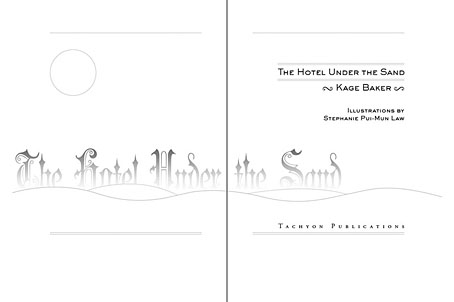
Kage Baker’s The Hotel Under the Sand is a charming fantasy for children concerning the hotel of the title and its curious inhabitants, which include a ghost bellboy and a pirate captain. The illustrations were by Stephanie Pui-Mun Law and I tried to complement these with the lettering design and graphic elements. I always enjoy working on illustrated books.
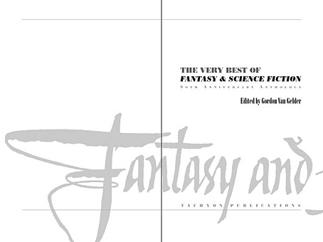
The Very Best of Fantasy & Science Fiction is a very different beast, a big (480 pages) selection by Gordon Van Gelder of some of the many first-class stories from the sixty-year history of the fiction magazine. F&SF has published so many classic stories over the years the book could easily have been twice as big. As it is there are pieces by Alfred Bester, Ray Bradbury, Shirley Jackson, Philip K Dick, Harlan Ellison, Stephen King and Neil Gaiman, among others. The design in this case came from studying a copy of the magazine from 1967; I was already thinking of using Bodoni for the story titles and that choice was confirmed when I saw it used for the same purpose in the magazine. The calligraphic titles were also scanned from there, their design going back to the very first issue.
Both these books are on sale now, and Keith Brooke gave a glowing appraisal to the latter in The Guardian at the weekend.
Previously on { feuilleton }
• Medicine Road by Charles De Lint
• The Best of Michael Moorcock
I am usually not one for minimalism, if one can call this that, but whatever it may be, you handle the style much better and with a far more engaging layout than most artists/designers can manage from what I’ve seen.
Something about the ‘hotel under the sands’ layout is almost subtley striking, I don’t know what it is about it.
Thanks. There’s usually several things supporting these kind of design decisions. First thing with theTachyon books is that apart from Jeff’s forthcoming Booklife, I haven’t been doing the covers–those are designed by someone else–so I try and match the interior style to the cover design.
Second thing in the case of title pages is working across a spread which I feel “announces” the book in a more satisfying manner than the old way (very old) of having a single title page on its own. I think of the first few pages of a book in a similar way to movie title designers, it’s the place that leads you into the book as a whole, and I try to make it all cohere rather than being a disparate collection of individual pages.
The third thing I bear in mind is to not show off too much since you don’t want the design at the front to make the book seem top-heavy. I’ve done that a couple of times but only when the content justifies it, the most notable example being the Lambshead Disease Guide which was a crazy book that demanded a crazy design.