
Day: 30 September 2008
Dark horses
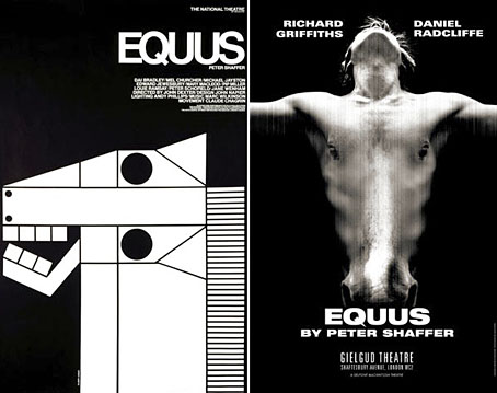
A juxtaposition of old and new theatre posters in the New York Times caught my eye this week, part of a feature about the current Broadway run of Peter Shaffer’s play. The news there, of course, has been Daniel Radcliffe’s on-stage nudity; understandable, perhaps, but celebrity trivia has overshadowed appraisal of Shaffer’s work as a piece of art.
What struck me seeing these was the two very different approaches to the same design problem. Given the subject matter, using an image of a horse is somewhat unavoidable as well as being immediately attractive since horses nearly always look good. The freight of historical and cultural association they carry is also one of the themes of the play. I really like the spare treatment of Gilbert Lesser’s 1976 poster for the National Theatre (left) and much prefer it to the new version used for the London and New York shows. The Lesser poster has the quality of a puzzle, matching the psychological piecing together of the story and Alan Strang’s accusation that Dysart the psychiatrist is always “playing games”. It also has a sinister quality lacking in the contemporary version; Shaffer’s Equus is an unforgiving god and the black eyes could refer to the blinded horses. The Photoshop horse looks altogether too mundane and is it my imagination or is the horse head misshapen slightly in order to fit the torso?