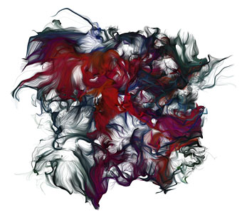
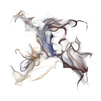
Deva-loka (2007).
Big new paintings by one of my favourite Japanese artists at Galerie Michael Janssen, Berlin, until February 29, 2008. The wild details in Deva-loka are completely lost at this size but there’s a larger version on Amano’s site.
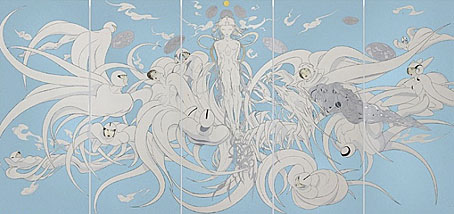
Creation (2007).
These works are being sold as fine art but Amano’s reputation rests upon his commercial art which embraces anime, manga and book cover illustration. As is often the case, the art world has a problem with this, regarding work for hire as lower than work for galleries, the latter being no less commercial in the sense that the works are sold to collectors who frequently demand more of the same; Andy Warhol’s studio was named The Factory with good reason. A comment at Creative Europe acknowledges the dilemma:
“There are two reasons why it is necessary to bring Yoshitaka Amano’s immensely successful professional biography into the equation here: on the one hand, the work he has done as a creator of mangas and animes (animations) provides an undisputed frame of reference for his pictures; on the other, it has become difficult where Amano’s oeuvre is concerned to uphold the differentiation popular in German speaking quarters between a more commercial applied visual art and the personally expressive variety.” (My italics.)
Amano’s non-commercial work at Galerie Michael Janssen is for sale, prices on request.
Previously on { feuilleton }
• The art of Takato Yamamoto