
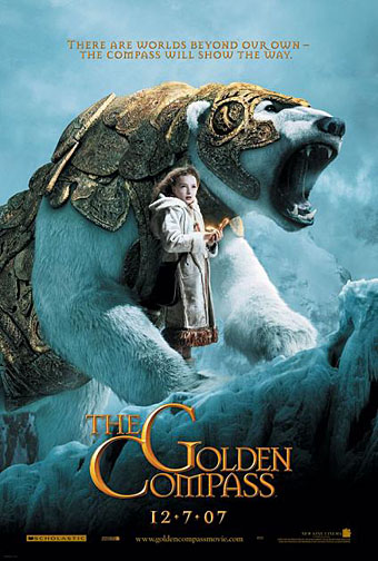
The trailer for The Golden Compass turned up this week, the first part of Philip Pullman‘s His Dark Materials trilogy, and I can’t help but note that the film’s designers have chosen Jonathan Barnbrook’s Mason font for the titles and the rest of the typography. This isn’t so surprising given that Mason has been used on the covers of several editions of the books already but I wonder if this flush of even greater popularity will spell (as it were) the end of a stylish typeface.
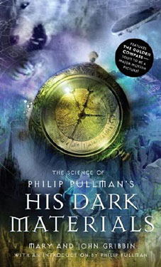 Mason (originally named Manson) was one of Barnbrook’s earliest published type designs, appearing in 1992 via the Emigré foundry, and over the past fifteen years has been widely imitated and become the default font for fantasy works, especially book jackets. The attraction for the genre is obvious in the way the design uses elegant and traditional serif letterforms that have been amended slightly to give them a distinctive quasi-ecclesiastical flavour, with flourishes derived from Greek, Renaissance and Biblical letters. The Gothic arch of the letter A has also helped make the font a popular choice for New Age or occult books. Mason was designed as a set of serif and sans serif variations but it’s Mason Serif Regular which is used the most. (The cover for The Science of His Dark Materials shown here is using both the sans serif variation and Mason Regular Alternate.)
Distinctive fonts take a while to get around and I don’t recall seeing Mason until at least 1994. From 1995 to 2000 it began to appear everywhere, even in newspaper ads for a while, before finding a permanent place in the book world. The trouble with this kind of ubiquity is that the novelty the design once possessed quickly vanishes and it begins to runs the risk of becoming a design cliché. Many typefaces go this way, especially in the publishing world where the choice of typeface is often dictated by genre expectations. So Orbit-B and its variants used to signify “science fiction” or “the future” in the 1970s, Caslon Antique and Rubens have become associated with horror while FF Confidential has been over-used for crime novels.
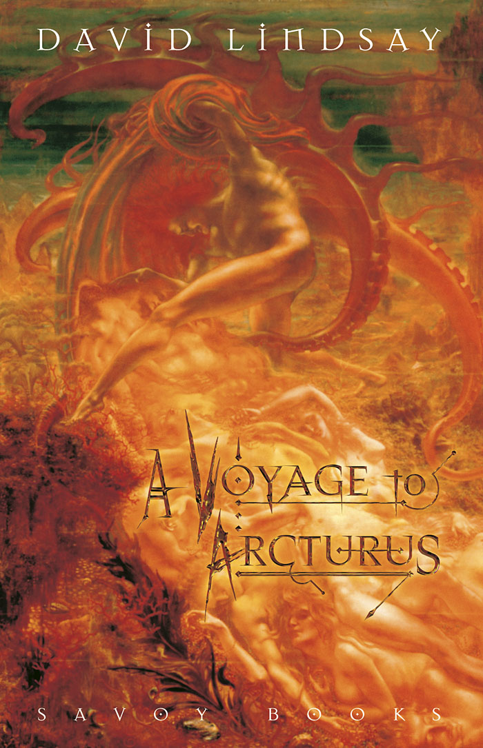
 It was the very ubiquity of Mason as a fantasy font which led me to use it in 2002 as the typeface for the chapter headings in Savoy’s edition of A Voyage to Arcturus. David Lindsay’s novel of allegorical philosophy had been poorly-served in the past by terrible cover art which often made it look like another sword & sorcery title. Using Mason helped give the book a nudge towards the fantasy world—it has a fantasy setting, after all—while the use of Jean Delville’s marvellous painting, The Treasures of Satan (1894), was a nod to the Penguin tradition of using classic paintings to illustrate novels. For the layout I used the alternate style of Mason since I prefer the more angular look of the letter A. The title lettering was my own design. This was probably the one and only time I’ll use the font (although never say never…) and I’m still happy with that decision although I wish now I’d done a better job of the layout on the rest of the jacket; the spine looks particularly bad.
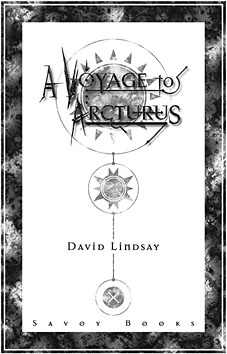
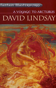 Mason, Jean Delville and David Lindsay were brought together again when Gollancz produced a paperback edition of Arcturus a year later in their Fantasy Masterworks series. Savoy’s newly-typeset book was used for the text (they requested it) and they also decided to follow my choice of cover art although they flipped the picture for some reason. And, of course, the Fantasy Masterworks lettering is set in Mason Regular.
Decorative typefaces which achieve this level of visibility tend to run out of steam eventually as fashions change. Otto Weisert’s Art Nouveau-styled Arnold Böcklin typeface, named after the German Symbolist painter, was designed in 1904 but found its greatest popularity in the 1970s when there was a resurgence of interest in Art Nouveau. That identification with a particular decade caused it to become deeply unfashionable in the 1980s, so much so that it’s taken twenty years for it to start appearing again. I’d be willing to bet that Mason may have achieved a similar saturation point now it’s become attached to a specific set of novels, spin-off books and a major feature film. A generation of children (not to mention designers…) are going to see Mason as the “His Dark Materials font” which may well weigh against it in the future. Time will tell.
Elsewhere on { feuilleton }
• The book covers archive
Previously on { feuilleton }
• Friendly Fire: Jonathan Barnbrook
• Angels 4: Fallen angels
• Helvetica: the film
• Jonathan Barnbrook interviewed
• Arnold Böcklin and The Isle of the Dead
One thought on “Masonic fonts and the designer’s dark materials”
Comments are closed.