

The new masthead designed by Luke Prowse, with a coat of arms
by wood engraver Edwina Ellis.
So, in today’s Neville Brody news (no, I’m not intending on posting about him every day…) it seems the designer has been busy with colleague Luke Prowse making The (London) Times look better. Not before time (so to speak), it was starting to look very out-of-date beside the recent makeovers at The Guardian and Independent. Brody is evidently first choice for these kind of projects at the moment, confirming that he’s still one of our most important print designers.
Among the changes are a new typeface, Times Modern, which has been applied to a new design for the masthead. Considering that this is one of the most famous newspaper mastheads in the world, I hadn’t realised it had changed so much over the years. The Times website has a nice online gallery showing the development from its earliest days as “The Daily Universal Register” through to the present.
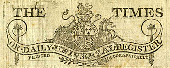
An early edition from 1788.
Brody has said of the new typeface, “Times Modern is a contemporary answer to the needs of compact newspapers. With pinched proportions, it allows more copy in the headline without compromising legibility. It is both authoritative and elegant, while robust at smaller sizes.” Since he’s on record expressing his dislike for Times New Roman, he must have enjoyed being given the opportunity to supplant an ugly and over-familiar font with something more suitable.
Previously on { feuilleton }
• 100 Years of Magazine Covers