The Twilight Magus

twilight.jpg

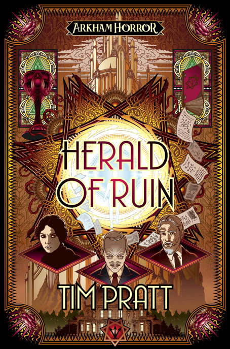
Presenting my latest cover for Aconyte’s Arkham Horror line, and the third and final book in a trilogy by Tim Pratt.

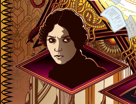
Carl Sanford, once the Silver Twilight Lodge’s great leader and now presumed dead, lives in anonymity in Spain, plotting revenge against those who betrayed him. Alone, he calculates his first move to achieve power abroad is by being initiated into the mysterious ancient society called the Red Coterie to secretly take it over. Despite Sanford’s reputation, the Red Coterie demands proof of his occult prowess, sending him on a quest to vanquish The Blood Moon, a reclusive blood magus manipulating humans and monsters alike to achieve their own ends. As Sanford uses every scrap of cunning he possesses to outwit his enemies and prove his worth, old foes from Arkham have discovered his existence and are coming to finish him off once and for all.

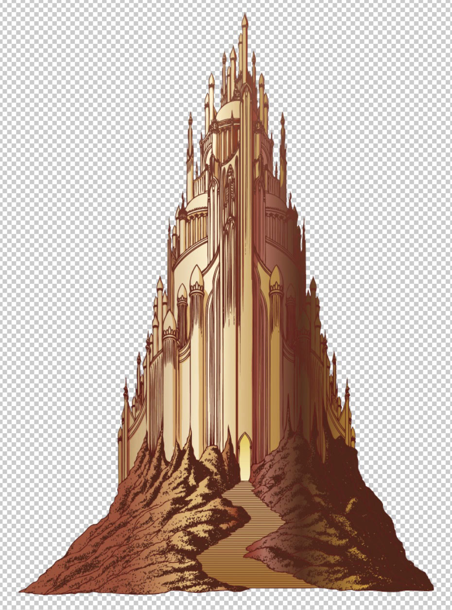
The brief for this one was for a design that would continue the form of the previous two volumes while incorporating details of Antoni Gaudí’s architecture, Barcelona being one of the story’s locations. I’ve admired Gaudí’s architecture for a long time but I’ve never had the opportunity to use any of it in an illustration before. Most of the details are tiny ones but the unfinished porch of the Sagrada Família is recognisable, as is the iron dragon from the entrance gate of the Park Güell. The windows behind Sarah van Shaw and Carl Sanford are also Gaudí designs.

tile.jpg

Less recognisable, but also a Gaudí creation, is the background pattern which is more visible on the back cover of the book. My previous covers for Aconyte have all used Art Deco mofits to complement stories set in the 1920s, with several of them having elaborate background patterns. The Gaudí design was one I hadn’t seen before, a hexagonal tile in which portions of three organic forms—starfish, ammonite and algae—become whole when the tiles are placed together. It’s a beautifully simple and clever design with the additional bonus for this cover of creating a series of spirals and tendrils which suit the Lovecraftian nature of the story. If you search around you’ll find a number of places selling reproductions as either ceramic tiles or coasters in a variety of materials.

The Twilight Magus will be published in July.

Elsewhere on { feuilleton }
The Lovecraft archive

In the Hands of Madmen

madmen.jpg

My latest cover for the Arkham Horror series from Aconyte continues the Art Deco trend of the other books in this series while also recycling some of the art from the previous covers. In the Hands of Madmen is an omnibus collection of three previously-published novels for which I was given the tricky task of combining portions of three covers into a single design. This wouldn’t be so difficult in other cases but my Arkham Horror covers have been heavily structured, with borders within borders, background patterns and isolated details. I was fortunate that two of the books in the new volume had cover designs that were reflections of each other which could be welded together and laid over the third cover without too much trouble. The original covers are presented below for comparison.

sidor.jpg

litany.jpg

coils.jpg

My last Arkham Horror cover, Herald of Ruin, featured a drawing of a fantastic city which was mostly covered over in the final assembly. The new one does the same with a Deco grille design that I worked up from a photo of a grille in the Squibb Building in New York City.

squibb.jpg

The design is more visible on the back cover so the effort wasn’t entirely wasted. When I’m working on covers like these I prefer to copy (or adapt) authentic period designs when I can. You can find no end of Deco motifs in the form of clip-art but they tend to be Deco-ese, lacking the invention you find in the original designs. I like this grille, it reminds me of a printed circuit. I may use it again one day.

Elsewhere on { feuilleton }
The Lovecraft archive

Previously on { feuilleton }
Herald of Ruin
The Ravening Deep
Diamonds
The Devourer Below
Litany of Dreams
The Last Ritual

Herald of Ruin

herald1.jpg

New year, new book cover. Herald of Ruin is my latest for Aconyte, a sequel to Tim Pratt’s The Ravening Deep, which featured my last cover in this series of novels spun from the Arkham Horror games:

Chaos is coming to Arkham, and its herald is Randall Tillinghast. The dapper older gentleman has recently arrived in the city and his establishment of a new occult bookshop draws the ire of Carl Sanford, the head of Arkham’s secret, esoteric order, the Silver Twilight Lodge.

Sanford expects to crush the newcomer like an ant and take what he wants from the wreckage… but Randall Tillinghast isn’t quite as humble and harmless as he seems. In possession of an array of magical artifacts, Tillinghast begins to consolidate his dreams of power before turning his sights on the Lodge.

All six covers to date have followed a similar style, combining Art Deco graphics with various kinds of Lovecraftian weirdness, views of significant architecture and pictures of the main characters. With the new book being a sequel the cover was designed as an inverse companion to The Ravening Deep. The general structure is the same but with earth tones replacing the aquarian colours, and with the character shots and interlaced septagram flipped around.

herald2.jpg

That towering edifice in the background is supposed to be the city of Sarnath which I spent some time drawing even though I knew most of it was going to be covered over. The way I work I often have to do this since I like to create all the different elements with only a vague composition in mind, after which I can shuffle things around until they assume a satisfying appearance. I also like to keep my options open in the early stages. This is something you can do more easily in Illustrator than in Photoshop, the Illustrator interface being an artboard upon which you assemble the various components of your design. Vector graphics aren’t always ideal when you’re trying to create something this complex, but the hard edges suit the Deco style and the general appearance which is more of a poster design than a picture window.

herald3.jpg

Among the other details, the eye-in-a-triangle, a device I’ve used a lot in the past, was prompted by the source material for a change. And the woman’s face is based on a photo of Musidora, one of the stars of early silent cinema in her role as Irma Vep from Feuillade’s Les Vampires (1915–16). The visual source for this character wasn’t very informative but she’s a cat burglar, and Feulliade’s serial happens to concern a group of Parisian cat burglars. I think Irma Vep may have been the first cat-burgling woman in cinema history so Musidora was a good choice with the right look for the cover.

Herald of Ruin will be published in July.

Elsewhere on { feuilleton }
The Lovecraft archive

Previously on { feuilleton }
The Ravening Deep
Diamonds
The Devourer Below
Litany of Dreams
The Last Ritual

The Ravening Deep

ravening.jpg

Presenting my latest cover in the Arkham Horror spin-off series for Aconyte. The Lovecraftian menace this time is oceanic:

When dissolute fisherman Abel Davenport discovers an ancient temple in the deep ocean, he falls under the influence of a long dead god. In his attempts to restore the god’s cult, Abel unleashes a plague of twisted doppelgangers on Arkham. Horrified by the consequences, Davenport realizes that he alone cannot stop the monsters from resurrecting the Ancient One.

Sometimes the only way to end one cult is to start another… Teaming up with redeemed cultist Diana Stanley and notorious thief Ruby Standish is the first step. The second is convincing Carl Sanford, the powerful leader of Arkham’s Silver Twilight Lodge, to join their cause. Together they might be the only hope of averting a cataclysmic eldritch invasion.

This was more of a challenge than some of my earlier covers for the series since there was a lot to fit in. That star shape in the background is an interlaced pattern like the sigil underneath the author’s name but it ended up being covered over, something I wasn’t intending but I always let these things grow organically rather than try and force everything into a preconceived design. As before, everything has been put together in Illustrator which presents its own challenges when you’re trying to achieve Photoshop-style airbrush effects. I like the way Illustrator restricts the graphical treatment to shapes, colours and hard edges, something which is perfect for these Deco-style covers. With Photoshop there’s always the temptation to start making everything more like a painting. A few of the aquatic details are adapted from Maurice Verneuil’s L’Animal dans la Decoration (1897), a book for artists showing stylised treatments of various animals and plants. I’ve had Verneuil’s book for a while as a Dover reprint but never found much use for it before.

This isn’t the last cover I’ve done this year, there’s another one still to be made public but it won’t be ready now until early in the new year. The Ravening Deep will be published in August 2023.

Elsewhere on { feuilleton }
The Lovecraft archive

Previously on { feuilleton }
Diamonds
The Devourer Below
Litany of Dreams
The Last Ritual

Diamonds

coils.jpg

I’ve finally found time to update the website a little so here are the last two book covers I was working on last year. In the Coils of the Labyrinth by David Annandale is another tale of Lovecraftian horror for Aconyte:

Professor Miranda Ventham is having bad dreams—nothing new in 1920s Arkham—but hers are horrifying glimpses of a dark future. Now seriously ill, she books herself into the new sanatorium, Stroud Home. With luck, the town’s eldritch taint won’t reach her there. And yet the nightmares worsen. Aided by her friend, Agatha Crane, they delve into the background of the sanatorium’s enigmatic director, Donovan Stroud. Plagued by doubts, delusions, and terrifying visions, Christine must unravel the shrouded history of the Strouds before she is trapped in a labyrinthine nightmare. Something sinister lurks at its heart, and it longs to be set free.

otzi.jpg

Otzi’s Odyssey by Neil Perry Gordon is a metaphysical drama which posits a fictional life and afterlife for the neolithic iceman whose body was discovered in the Alps:

Ötzi’s Odyssey – The Troubled Soul of a Neolithic Iceman, opens in the year 1991 with the remarkable sighting of a mummified man, half frozen in glacial ice, whom two hikers stumble upon. Along with this profound archeological discovery, the soul of this five-thousand-year-old iceman is awakened.

?Ötzi the iceman’s adventure takes him to the modern era, where his observant soul tries to comprehend why it remains tethered to the frozen mummy, as well as to make sense of a technologically advanced world. The story then returns to 3300 BCE, to the life and times of clan chief Bhark as he lives with his family in a peaceful village upon stilt homes clinging to the shore of the great Lake Neith, located in the shadows of ominous Similaun Mountain.

Both these covers use an elongated diamond shape in their designs, a repetition that I wasn’t intending. I did this first on Otzi’s Odyssey since the story has four infernal realms that the character’s soul travels through. A diamond shape subsequently became necessary for In the Coils of the Labyrinth when a central panel was required that wouldn’t cover too much of the background imagery while also connecting the upper and lower levels and providing a graphic link with my previous covers in this series. There’s a similar shape on my cover for The Voice of the Fire so I should probably avoid doing this for a while…

Still to be announced from last year is an album cover design that I managed to fit in despite several months of serious overwork. This was my first proper album cover for some time (as opposed to the layout I’m usually doing on albums where the artists provide their own art) but the release seems to have been delayed for some reason. More about that one when/if it appears.

Elsewhere on { feuilleton }
The Lovecraft archive

Previously on { feuilleton }
The Devourer Below
Litany of Dreams
The Last Ritual