Christopher Dresser’s Art of Decorative Design

dresser10.jpg

Studies of decorative design are numerous but this one stands out for the quality of its colour plates, all of which show a variety of designs derived from plants and flowers. The Art of Decorative Design (1862) is one of a number of design books published in the wake of the Great Exhibition of 1851, the most celebrated being Owen Jones’ lavish Grammar of Ornament. Christopher Dresser was a professor of ornamental art and botany who here continues where The Grammar of Ornament ends, exploring the floral design that’s a recurrent feature of Victorian decoration. What’s most remarkable for me about some of these designs is the way they prefigure the forms of Art Nouveau, a style that wouldn’t emerge for another thirty years.

dresser02.jpg

dresser03.jpg

Continue reading “Christopher Dresser’s Art of Decorative Design”

Fleurs by Serge Gladky

gladky01.jpg

More from the Glasgow School of Art book collection at the Internet Archive. Fleurs (1929) by Serge Gladky might be described as flowers à la mode, with the mode being Art Deco on the one hand and late Cubism on the other. Twenty-six plates present a variety of floral motifs and designs with some very striking arrangements of shapes and colours. Gladky produced a lot of work in this style, examples of which can be found in a Dover collection, Jazz Age Art Deco.

gladky02.jpg

gladky03.jpg

Continue reading “Fleurs by Serge Gladky”

Kunstgewerbliche Schmuckformen für die Fläche

stoll01.jpg

Kunstgewerbliche Schmuckformen für die Fläche is another collection of decorative plates intended as a reference book for designers, and it’s proved its usefulness by providing me with a motif I can use in one of the things I’ve been working on this week. This book differs from others by being the first in a series that runs to at least eight volumes, going by the uploads at the Internet Archive. The first number is vaguely Art Nouveau in style, the later volumes feature designs that are much more bold and abstract. Anyone wishing to see the full set is advised to search for the title to compensate for the inconsistencies of the Internet Archive’s cataloguing system. This volume and the others are part of a recent batch of uploads from the library of the Glasgow School of Art so I’m looking forward to browsing some of the other titles. Via Beautiful Century.

stoll02.jpg

stoll03.jpg

Continue reading “Kunstgewerbliche Schmuckformen für die Fläche”

Towers

tower1.jpg

The building from street level.

Since returning from Providence I’ve found the imposing bulk of the Industrial Trust Building increasingly occupying my thoughts. It doesn’t take much to get me fixating on a particular building, especially if it’s big and old and sufficiently distinctive in its styling. The Industrial Trust Building fulfils these criteria with the added bonus of being mentioned in HP Lovecraft’s The Haunter of the Dark. Photos of the place as it is today are numerous, but you can also find some older views which show the building as it was before being crowded by more recent structures. There’s also a very detailed photo showing the lantern/beacon design which is covered in bas reliefs, and seems to sport an air-raid siren.

tower2.jpg

An ad from a page with a number of views from the building’s earliest days. I was hoping that favourite architectural renderer Hugh Ferriss might have produced a drawing but Ferriss tended to work on more grandiose projects for companies in New York and elsewhere.

tower3.jpg

An undated postcard.

tower4.jpg

Two prints from a screen print series by Ian Gilpin Cozzens.

Previously on { feuilleton }
The Metropolis of Tomorrow by Hugh Ferriss

The Cramps at the Haçienda

cramps1.jpg

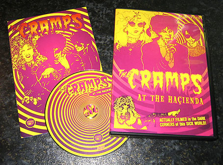
At last: something that has no connection with HP Lovecraft… This was one of several design jobs during a very busy summer, a long-delayed DVD release by Savoy of the Cramps playing Manchester’s trendiest club of the 1980s, the Haçienda. The posthumous reputation of the Hac (as it was locally known) has been inflated in recent years; you’ll hear much about its thriving dance nights but little about the early days when the huge and often chilly space was seldom even half full. The Cramps played there twice in 1984, and like many bands with a cult following, managed to fill the floor with eager fans; Savoy’s video captures the second performance on May 23rd. It was standard policy at the Haçienda to film every event, and some of the more popular performances—William Burroughs’ reading, a concert by The Birthday Party—were later released by Ikon, the video wing of Factory Records. Two cameras on either side of the Haçienda balcony covered the stage but on the night of the Cramps’ performance none of the Ikon staff wanted to assist Linda Dutton in filming the gig. So this recording is a rudimentary one—a single U-matic camera and mono sound—but Linda captured a tremendous hour-long concert with an outstanding Iggy Pop-like performance from Lux Interior.

cramps2.jpg

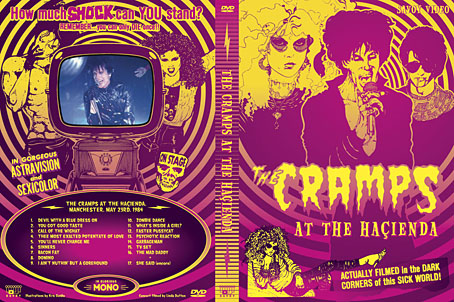
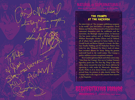
For my design I wanted to avoid Goth clichés and create something in keeping with the band’s trashy rock’n’roll aesthetic. All the portraits are by Kris Guidio from the comic strips he was producing in the early 1980s for Lindsay Hutton’s Next Big Thing zine; the lurid headlines are lifted from film posters found in back issues of Psychotronic Video magazine. The DVD has an 8-page booklet and an interface which I also designed although this is merely functional, nothing like the elaborate animated affair I created for The Mindscape of Alan Moore. When concerts such as this are routinely put onto YouTube for free it hardly seems worth going to all this trouble, but for Savoy it provides another connection to a favourite band. The PAL DVD is priced at £10, and may be ordered direct.

cramps3.jpg

Previously on { feuilleton }
Haçienda ephemera
Lux Interior, 1946–2009
The Final Academy