
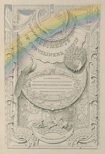
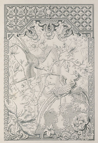
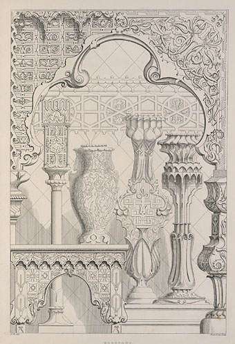
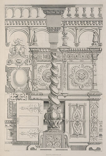
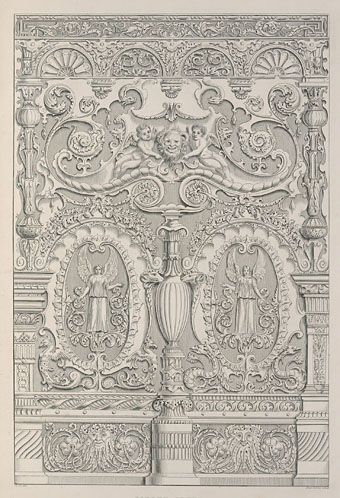
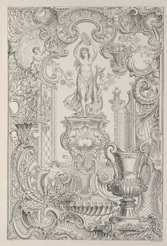
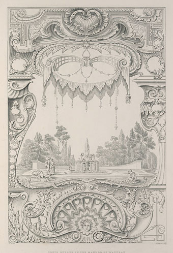
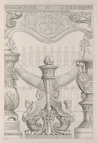
George Phillips’ Rudiments of Curvilinear Design (1839) belongs among a subset of books about historic design in which the desire to provide a faithful record of various styles competes with the imagination of the artist creating the illustrations. The artist in this case is Phillips himself who runs through the catalogue of decoration and ornament in a series of beautiful full-page plates, the engravings being credited to publisher Shaw and Sons. Each plate is a tableau of different architectural features—windows, wall decoration, columns, and so on—which Phillips embellishes in a manner that avoids outright fantasy while also deviating from the more accurate renderings you’ll find in similar volumes. The notes at the beginning of the book describe the author’s aesthetic philosophy, a process which involves “engrafting upon that which may be considered as already excellent, some feature enhancing its value, and extending its usefulness to larger or more opulent classes of the community.”
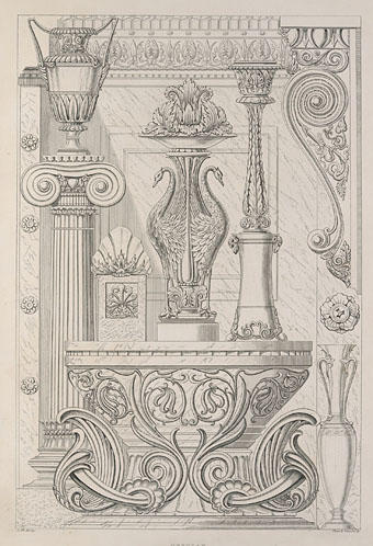
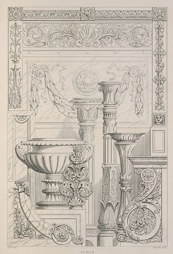
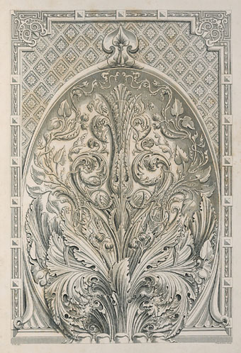
Acanthus leaves abound here, inevitably when so many of the plates feature designs based on Classical styles. The acanthus is a common feature in design books from the 19th century, with some books even showing the correct (ie: Grecian) way to draw or sculpt the leaves if you’re having to create Corinthian columns. Mr Phillips seems to have taken such lessons to heart. For more acanthus, and many fine engravings which aim for greater historical accuracy, see Ornamenti di Tutti Gli Stili (1882) by Camillo Boito.
Elsewhere on { feuilleton }
• The etching and engraving archive
Previously on { feuilleton }
• Wendel Dietterlin’s Architectura
There seems to be something of the powdered wig, the guilded lilly, the overdressed and scented dandy in the plastering of pure classical forms with acanthus. The usual order of columns, from the elegant Tuscan and Doric to the Composite can be read like some kind of Bruegelian analogy to such sins, maybe.
I love it though. Soetimes more is definately more.